We hope you lovely people are all doing fine in these trying times! I’m currently quarantined in my own home, out of a job, and bored out of my mind. So I have been sharing on all my social media my favorite Period Movies (and shows, sometimes) so you can at least feast your eyes on gorgeous Costume Designs until all this finally blows over.
Here I'll briefly expand on those recommendations so you'll be able to make a more informed decision when choosing your choice entertainment for the afternoon!
Recommendation for MARCH 21st
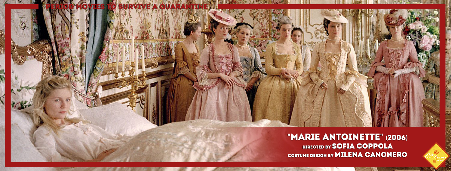
Sofia Coppola’s MARIE ANTOINETTE is an impressionistic take on the character that focuses on the personal, not on the historical. The movie revolves around her personal experience, her feelings. It’s not concerned with action, but with emotion. Precisely because of this, it’s a rather fragmented and episodic narrative that meanders through the runtime as much as the character meandered through her own life.
Here, the lush and amazing costumes by Milena Canonero are a visual means to deconstruct the character and explore her identity through silk, color, and feathers.
I love this movie and this costume design so much that I wrote TWO articles about it! (Marie Antoinette: Telling a story through costume and Marie Antoinette: Working with an historical basis).
Recommendation for MARCH 22nd

1994′s adaptation of Dumas’ eponymous novel is a highly confrontational take on the story. It’s harsh in its imaginary and uncompromising in its interpretation. And all in all, strangely faithful to its source material; both thematically and in tone. It’s a very operatic take on the novel that relishes chaos and thrives on it: it’s passionate, it’s gory and, most importantly for the costume design, it’s oddly anachronistic. The visual designs chose to cast away the codes of a period piece and work on a pictorial and symbolic level. Every single costume design is done with a keen eye for beauty and pictorial sensibilities, creating a world that, though it never existed as shown, it still feels real and grounded.
All these help accentuate the reading of the story as a story that takes place out of time: it’s a universal tragedy that borrows more from the codes of a Shakespeare tragedy than a period drama.
I love this movie and this costume design so much that I wrote a three-part article about it! (Part I: A place calling itself France, PART II: Colliding Factionsand PART III: An Unwilling Participant).
Recommendation for MARCH 23rd

2016′s JACKIE, directed by Chilean director Pablo Larraín, is an insightful look at Jacqueline Kennedy’s life in the three days immediately following JFK’s assassination framed by her famous Life magazine interview. It’s a deep and profound analysis of Jackie both as an icon and a woman. An exciting and subtly emotional portrait of the person behind the public image.
Above all, Jackie is a study of loss and legacy. A deep essay on myth-making and the strength that images have when molding national consciousness.
Costume design plays an essential role in helping the actress build her character and the audience buy into the performance as well. It plays an essential role in bringing uncanny verisimilitude to the narrative of the story.
I highly recommend you give it a watch. I stumbled upon it during my 2017′s Oscar Retrospective and absolutely love it! (Oscars Retrospective 2017: Jackie).
Recommendation for MARCH 24th

Martin Scorsese’s adaptation of Wharton’s classic novel, THE AGE OF INNOCENCE, was hailed back then as “the death of cinema” mainly due to its heavy use of voice over. I couldn’t disagree more.
The movie is a subtle yet thoroughly critical portrayal of the late 19th century that serves as a mirror to our own times. It’s a study of society’s norms, of human hypocrisy and the lies we tell ourselves to keep us sane in the cage those norms and that hypocrisy places us in. It’s a masterpiece.
Here Pescucci’s designs play a pivotal role in this extremely accurate portrayal of the American High Society of the late 19th century. The uncanny realism of the design helps create the feeling within the viewers that they are looking at someone’s memories, at a snapshot of a moment in time.
I absolutely recommend you give it a watch. And we owe it a review…
Recommendation for MARCH 25th

Imposing a western view on a non-western story is a common instance in filmmaking. But it’s very rare to talk about this process in the inverse direction. 2004’s adaptation of William Makepeace Thackeray’s novel; VANITY FAIR is one of those rare instances. So, how does an Indian filmmaker, read the western Regency period?
Nair puts under scrutiny the world of luxury and privilege of British socialites. It takes the classic story of Becky Sharp, the quintessential social climber, and uses to satirize the whole set of values of Western society.
Here, costume design serves not only to underline character and story themes (as any good design should) but also to reinforce the idea that this is a look at Great Britain through the eyes of the colonies and not the other way around.
Also, it’s very refreshing to see a movie that takes place during the Regency and yet does not fall back to the “little white dresses” of the Jane Austen world, and instead paints the screen with loud and vibrant colors and textures that speak of a much more complex world.
I am so fascinated by the visual aspect of this film (and how underappreciated it is, that we dedicated a whole article to it, long long ago. (Vanity Fair and Reverse Colonization).
Recommendation for MARCH 26th

Guillermo del Toro’s 2015 Gothic Horror Film is only collaterally a “Period” Film, but the use of Period as Framing is essential enough that I’m allowing myself to bend the limits of what I consider “Period” to include it in this list.
CRIMSON PEAK is a homage to a classic genre that uses its tropes to explore repressed sexuality, constricting social norms and the ghosts of our past choices (quite literally).
Here, costume design plays a key role to create the two main (and opposite) characters: Edith and Lucille. Its main strength lies in its narrative prowess: its ability to create pieces that speak about character and describe what’s happening to that same character in relation to herself and to the world around her.
I am in absolute love with this costume design, and it was one of the first “deep dive articles” we ever made (Crimson Peak: Dressing Lady Lucille Sharpe. The Moth, and Crimson Peak: Dressing Edith Cushing. The Butterfly).
Recommendation for MARCH 27th

Rappeneau’s version of Cyrano de Bergerac was my first cinematic love. I would watch it all the time, I knew the verses, I would quote it constantly… I was, indeed, a very weird 6-year old, I know. Still, the fact remains that I absolutely adore this movie.
Why? Well, I’ve always loved poetry, classic adventure and period dramas. This classic story has it all, so what’s not to love?
The story is a rather straightforward cautionary tale about looking beyond appearances and inner beauty versus outer beauty, but its simplicity doesn’t diminish its value, as it allows the beauty of the verses (and the acting) to shine through.
The approach to costume design was basically to be as period-accurate as possible. It’s gorgeous to look at and it creates a tableau of stunning images that perfectly complement the verses and poetry of the story.
To this day, we haven’t done a review of the movie because… I don’t have a real reason. But we definitely owe it a review.
Recommendation for MARCH 28th

2009′s BRIGHT STAR focusses on the last three years of the romantic poet John Keats’s life and his relationship with Fanny Brawne, and it’s quite an out of the ordinary biopic. It shies away from a more standard narrative and focuses mainly on emotion. And by doing this, it manages to translate the poetic experience into the screen. It feels and reads as a two-hour drive into the poetic world of Keats and the romantics and it’s worth every minute of it.
It’s a very well blended mix of classical filmmaking with very modern sensibilities and cinematography that manages to immerse you into the world of these characters and bring to you the full experience of love and loss.
The costumes play a key role in this movie; as it centers around a seamstress. As such, she sews her own gowns, and the costume design makes the most out of that: the evolution of the style and color palette as she falls deeply in love is almost crystal clear.
I stumbled upon this film browsing through Netflix a few years back, and I haven’t stopped rewatching it since. So many times actually, that it allowed us to make an article about it (Bright Star: Poetry made Image).
Recommendation for MARCH 29th

Jane Austen adaptations are and always have been a basic cornerstone of the British Industry. Funny enough, the ABSOLUTE BEST of the thousands of adaptations made is not by a British Director.
1995′s Ang Lee adaptation of SENSE AND SENSIBILITY is a must-watch not only for any Austen fan but for any Film enthusiast.
The movie perfectly captures both the titular sense and sensibility of the Dashwood sisters in stunning detail as it meanders through their lives and struggles with a social situation that is not as rose-colored as it often is in most adaptations.
Here the costume design is both incredibly faithful to the period and completely aimed at building contrast between the two sisters. And once again refuses to fall back to the mainstream “little white dresses” of most Auster adaptations.
We definitely owe it a review.
Recommendation for MARCH 30th

It’s really hard to bring something new, or fresh, into works of fiction that have been adapted constantly. Such is the case with Tolstoy’s ANNA KARENINA. And yet, Wright’s 2012 adaptation managed to do just that.
The film is a poetic, conceptual and highly artificial take on Tolstoy’s work. Through the setting and the framing, the movie brings the themes of the story to the forefront: the absurdity and theatricality of a social class focused only on power and parading their wealth and privilege.
To reinforce this vision of decadence and artificiality of Anna’s world, the costume design reimagines the 1870s through the lens of the 1950s, as if to draw a parallel between the stiff social rules and hypocritical double standards of Russia’s 1870s and America’s 1950’s.
This stylistic mash-up adds a sense of extravagance and luxury that connects the story to multiple places and multiple times as if to say: “there have been people like Anna and unjust social systems all through history and they continue to exist”.
A visual feast with some narrative problems, Anna Karenina is still worth a watch. And we owe it a deep dive review.
NEXT WEEK WE'LL BRING YOU MORE! (HERE)
Let me know your thoughts!
---------------------------------------------------------------------------------------------------------------
If you enjoyed this article and would like to support the blog,
consider buying me a Coffee? 💛💛
If you want more content like this, subscribe! Or come say hi on Facebook, Tumblr, Twitter, Instagram and help us grow!
DISCLAIMER: I claim no credit for images featured on this site unless noted. Visual content is copyrighted to its respective owners, and inclusion here is under fair use for criticism, comment, and news reporting purposes. If you own the rights to content here and wish it removed, please contact me.
Comments
Post a Comment