
Agent Carter: 1940's superhero espionage. Part II

The second season of ABC's Agent Carter brought a couple of major changes for our favorite Secret Agent. First and foremost, it changed settings; moving from cold and blue New York to bright and sunny Los Angeles.


Which, at first look, it might seem irrelevant to what we are talking about here: designs. But it couldn't be farther away from the truth. This change of location brought with it a rather substantial change both in the look of the show and the look of the characters. And it was substantial enough that it was reflected in every single one of the promotional images.


And the character that's the most affected by this change is our leading lady; Peggy Carter. So let's have a look and see exactly how and why it affects her.

PEGGY'S MOVING ON

Season 2 marks a rather important change for Peggy, both professionally and personally and, narratively, that change is underlined by her transfer to L.A to help Agent Sousa in a new brand mystery. But it is also marked by several visual changes both in the overall look of the show and the personal look of Peggy herself.

Whilst season 1, at a character level, was defined by her sorrow and guilt towards Steve and her defiance towards the male status quo, this second season is, instead defined by her new-found confidence and determination. "She knows her value", as she claimed at the end of Season 1. And that clearly transpires through her new wardrobe.

The style is still pretty consistent; most of her office wardrobe still mainly consists of the late 1940's A-line skirts and blouses that follow closely the mid-1940's fashion (read Part I for more on post-war fashion). True, she ditches the long sleeves and suit jackets, but that's only a logical change given the change in location. California's climate is hardly appropriate for long-sleeves and thick jackets.


But the main change in style is, actually, not so much a radical change, as is an evolution. Whilst in season 1 she only wore the pantsuits and tracksuits when she was not on official duty, now she wears them whenever she feels like it, even during office time. This is logical, considering her job, but at the time it would have been a gigantic defiance towards the male Status Quo.


And that's why this is probably the best way to show how much more confident she feels about herself in her job after the events of the first season. If she has to go kick some ass she WILL change into pants no matter what or who will see it. She doesn't hide that part of herself anymore, and it feels so good to see her so confident in herself in a way that she wasn't before.

Hand in hand with this subtle shift in the style comes a rather notable change in color. Her new confidence and hopeful optimist is clearly shown by a shift towards a brighter palette and lighter tones for her wardrobe.

Whilst the red, white and blue combo is still essential to her character, there is a considerable addition of new brighter and merrier colors: purple's, greens and oranges are particularly prominent, even pink at some point!


At first glance, the inclusion of brighter colors might seem exclusively related to her being in L.A instead of New York. And while it's true that that is relevant in her new look (lighter and brighter clothes are a good fit for fashionable L.A) it's not the real core reason.

This is also another way to highlight that new found confidence in her job and herself that we were talking about earlier. She's not worried about calling attention to herself anymore and so she wears colors that pop up even more.

Also, the change in color palette helps underline the idea that, somehow, her sadness towards Steve has somehow been lifted. That's not to say that she doesn't care about him or that she has forgotten him, but she's certainly moving on somehow. She's certainly trying to find a balance between respecting his memory and having a life of her own.

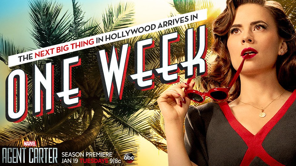
Last but not least, there is another element that defines this newfound value in her character. And it's easily overlooked. Whilst in the first season her defining complement was the red fedora, now it's a glamorous pair of red sunglasses that she sports confidently throughout the season, and that also played a big part in the promotional images.


It might seem like an insignificant addition, but it says a lot about her and how much more confident she is in her status as a female agent. What do I mean by that? Well, if you remember the first part of this article, I talked about how that fedora signified her intentions: she is no less than the men around her, that's why she purposefully sported something that was uniquely associated with her male counterparts.

But, sunglasses, and particularly these sunglasses, are unequivocally feminine. And it's a great way to codify that she knows now that she is no less than the men around her because she is NO MAN. She is not trying to visually assimilate herself to her coworkers. She is a good agent not despite being a woman, but because of it. It's a strength, not a handicap.  She knows her value.

I know that I've really hammered in that line, but that single idea is the main drive behind all of the changes done to her wardrobe for the new season. And it makes it really interesting to watch that change in the costumes as well as in the character itself. It would have been so easy to reuse the whole wardrobe, and it makes me so happy to see that they did not take the easy route.

THE HOLLYWOOD CIRCUS

Character development aside, the design also takes the most out of the location change. Peggy is now working in the most glamorous city of the country; she is at the center of the Hollywood Golden Age. And that means that, whenever she needs to blend in or go incognito, we have the perfect excuse to see her in gorgeous fashionable Hollywood outfits.


And what's best; it's not gratuitous eye candy, it makes a lot of sense in the narrative. If she needs to blend in the Hollywood crowd, she needs to look as good as them. And so, this season brings us an unending list of form-fitting dresses, in bright colors and fabulous shoes.


Also, her undercover missions around Hollywood allows for some truly glamorous hairstyles as well. I particularly adore the Veronica Lake waves she sport in the picture below.


The intention for her undercover looks, according to the designer, was to give her a more "film noir" vibe and feel. And she certainly did. And it's a nice look on her. But more on that when I get around to talk about Whitney Frost (the villain for the season) in future articles, which will come, I promise.

PEGGY BEFORE AGENT CARTER

Last but not least, this second season allowed us a small glimpse of Peggy's old life, allowing us to see how she was before the war and her work on the S.S.R. These flashbacks take place during 1940 and, historically speaking, are very accurate.

Character-wise, they show us a more modest and "conformist" Peggy. She still plays along with what a "lady" is supposed to do and, therefore, look like. Modest clothes and modest colors are the standard for the clothes for pre-war Peggy.


We also get to see her in a beautiful late 1930's wedding dress that looks amazing on her. That dress is the visual image of the life she refused to have after her brother died in the War.

All in all, the designs for her pre-war life are meant to pose a stark contrast with her current look, which allows us to see where she came from and just how much she has changed.

CONCLUSION

The new season managed to make the most out of the new setting and the character changes in a great way. Which allowed for really interesting ideas and developments in the look of the character. It maintained a really high standard for period-accuracy whilst allowing room for character personality to shine through. And in a world that often considers period-accuracy to be a handicap rather than a strength, it feels like a breeze of fresh air to see such an approach.

It really saddens me to think that I won't be able to talk about any more designs for Peggy, but, luckily for me, there are plenty more characters to talk about throughout the two-season run of the show. And I will! You can count on it.

--------------------------------------------

See you next time when I will dive back into Agent Carter to talk about the designs for the male characters of the show during season 1.

---------------------------------------------------------------------------------------------------------------

If you enjoyed this article and would like to support the blog, 
consider buying me a Coffee? 💛💛

If you want more content like this, subscribe! Or come say hi on FacebookTumblrTwitterInstagram and help us grow!

DISCLAIMER: I claim no credit for images featured on this site unless noted. Visual content is copyrighted to its respective owners, and inclusion here is under fair use for criticism, comment, and news reporting purposes. If you own the rights to content here and wish it removed, please contact me.

Comments

  1. Are you planning on doing more tv shows? Because I would love Game of Thrones personally.

    ReplyDelete
    Replies
    1. Sure! There's a long, long list of shows that we are hoping to cover. A list which definetely includes Game of Thrones! I mean, there's just sooo much to talk about in regards to the costumes for that show. Unfortunately, it takes a long time of research to write just one of these articles, which means that we can't tell exactly when we will be able to cover it. But it's coming!!!

      Delete

Post a Comment

Popular posts from this blog

Burning Question: What's wrong with Belle's gown?

Since the first promotional pictures of Disney's new Live-Action remake of Beauty and the Beast hit the internet, there has been a lot of discussion around Belle's iconic ball gown. And, even months after its release in cinemas, there still continues to be a lot of buzz around it. Why? Mainly, because a lot of people feel that it is just doesn't look that good. The thing is, Belle's animated yellow ball gown is, at this point, an iconic staple of animated cinema. Everybody knows it and everybody loves it. And, as a result, everybody can see the new one and say "this is not the costume I know". Therefore, everyone can compare it down to the smallest detail and see that it just doesn't quite look right. Today, my goal will be to try and dissect the design in order to answer the burning question everyone has been asking themselves: what's so wrong with the "new" dress? Or, to put it bluntly, why is it so incredibly underwhelming?

A look into Star Wars: Padme's Dresses. Annex B

Love her or hate her, Padme and her costumes can never be far from our minds. They are too iconic, and probably one of the few memorable aspects of the prequels, so it's really fun to talk about them. And so, I've decided to continue what I started and focus on the costumes I left behind from Episode II . So let's dive back into it! A BRIEF REMINDER What are the Annexes? Well, the Annexes focus on all the costumes that were "left behind" in my selection of Padme Costumes for the A look into Star Wars: Padme's Dresses series. Here, I point out influences, likes, and dislikes, and anything that might feel relevant whilst digging into the gigantic wardrobe of this Galactic Queen. With this out of the way, let's go! ANNEX B: THE ATTACK OF THE CLONES Episode II: The Attack of the Clones brings the character and her designs to a completely different level; she is not a queen anymore, which unfortunately means that she no longer has amazingly weird an

Disney's Cinderella(s) and the evolution of the "princess" aesthetics

Every girl, at some point in life, has wanted to be a princess. It has become undeniable that the concept of the "princess" is, for better or worst, inseparable from girlhood. We live in a "princesses" obsessed era, and we have for a long time now. And a lot has been said about it, with loud people yelling over the internet about the positive and negative aspects of it. So it was about time for me to join the yelling contest, I guess. If I'm going to talk about princesses, the logical place to go is to the Global Mogul Conglomerate that has led the trend and, in many ways, defined it: Disney. They have, undeniably, redefined the fairytale and have turned the term "princess" into a best selling Licensed Entertainment Character Merchandise. The thing is, even though princesses have been part of the fairy tale canon for a very long time, they didn't become the central figure until Walt Disney placed them there. In the tales that the G

Historic Accuracy in Costume Design: The 16th century

I've never been a purist with historical accuracy as long as the changes made have real reasoning behind (generally a narrative or symbolic one). I will always think that La reine Margot (1994) costume design is one of the most gorgeous and smart designs ever, even if said designs' main premise is to purposely bend the period in regards to costume. But there are certain things that bother me in regards to historical accuracy in costume which I realized when I found myself constantly irritated while watching The other Boleyn Girl (2008). This led me to post a question: when is it right to bend history? why is it interesting sometimes? whilst other times it's simply horrendous? To me, when these changes are made for the narrative's sake, I'm usually on board (like the 2012's "Anna Karenina" designs, which mixed the 1870's fashion with 1950's fashion in order to enhance the sense of theatricality and falsehood in Imperial Russia). But wh

Why Oh Why? Peaky Blinders and the mystery of Grace's Crappy Hair

There are many unanswered questions out there. Many, many mysteries that will never be unraveled. But amongst those, the one that keeps me up at night is why was Grace's hair so crappy during the first season of Peaky Blinders ? Don't get me wrong, I absolutely love Peaky Blinders . I'm human, believe it or not. I've watched all its five seasons (twice) and I'm impatiently waiting for its sixth season with bated breath. And I can vouch for it: it's a quality show. Good storytelling, good acting, great photography... and for the most part, great character design both in costume design and hair and makeup. That's why I'm still baffled by the decision of having Grace's character sporting what amounts to limp California Beach Waves for the whole of the first season.  Because, while it is true that the first season had a considerably lower budget than its following installments, a shitty approach to historical accuracy wasn't the general tone for the

Cleopatra or the Most Undeserved Oscar Win ever

There is a reason why I usually do not review movies from the "golden age" of Hollywood (which means any movie prior to the 1970s), and that is because back then they cared even less about historical accuracy in costuming than nowadays, which is saying a lot. Because of this, most of the "historical" movies generally ignored the period and just did whatever was fashionable at the time with a spice of the supposed period. This is something that usually makes me laugh, rather than angry, because it results in very funny outfits (peplums particularly created a lot of funny imaginary). And Cleopatra , 1963's epic about the Egyptian queen, was for most of my childhood one of those movies. I knew the costumes were not accurate, but they fascinated me anyways in their ridiculousness. That is until I heard that the movie had won an Academy Award for Best Achievement in Costume Design, the same year that " Il Gattopardo  was nominated for Best Costume Design. A

Crimson Peak: Dressing Edith Cushing. The Butterfly

"Beautiful things are fragile" - Lucille Sharpe - Opposite Lucille stands our main character in the movie: Edith Cushing, a young and naive American with ambitions to become a writer. She meets and falls in love with a handsome and charming, but impoverished, English baronet: Sir Thomas Sharpe. They eventually marry and return to England, to the Sharpe's dilapidated mansion: Allerdale Hall. There they live with Thomas's sister: Lucille. The deadly apparitions that haunt the house will force Edith to slowly uncover the buried secrets of Crimson Peak. And so, Edith is to become a fragile butterfly caught in a moth's trap. PART II: THE BUTTERFLY Edith has considerably more frocks and gowns than Lucille does. It's only logical. Edith is our protagonist and, as such, has a bigger emotional arc throughout the movie, and she undergoes bigger changes. These are, in part, expressed through the costumes she wears and how these change throughout the mo

The FollowUP: Disney's Jasmine and the evolution of the "princess" aesthetics

Previously in this blog, I talked about how the aesthetics of the Disney Princess Brand have changed through the different iterations of Cinderella (read here ). Since then, Disney hasn't stopped rehashing and remaking its old animated classics. On the contrary, it has doubled down on this business model and its remakes have become more common, more widespread, and more successful. Since the 2015 remake of Cinderella , Disney has remade The Jungle Book (April 2016), Beauty and the Beast (March 2017), Dumbo (March 2019), Aladdin (May 2019), The Lion King (July 2019), Lady and the Tramp (November 2019), Mulan (scheduled for release July 2020) and Cruella (scheduled for release May 2021). Remakes for Snow White and the Seven Dwarfs , Pinocchio , The Little Mermaid , The Hunchback of Notre Dame, and Bambi are in development. Clearly, the live-action remake has become a staple of the brand and it cannot be ignored. Unfortunately. Seeing that this industry trend will not go any

Moulin Rouge and the art of Kitsch

The spring of 2001 saw the release of Moulin Rouge! unexpectedly shake the movie industry and the box office simultaneously. Despite the many awards, including 8 nominations at the Academy Awards, and the impressive box office numbers, the movie quickly became very polarizing for audiences. Love and hate seemed to be the only two possible reactions to the movie itself. But that should not come as a surprise. The film was directed by Baz Luhrman, who has consistently been, throughout his career, one of the most polarizing filmmakers of his generation. I still have to meet anyone who simply doesn't mind his movies (which include Romeo+Juliet , Australia and The Great Gatsby ); it's either absolute love or absolute loathing. There is no middle ground with him. And that's mainly because he himself doesn't compromise when it comes to his style, which is so characteristic at this point (fast and frantic editing, vivid use of flashy colors and sparkle and stories a

A look into Star Wars: Padme's Dresses. Annex C

It's been a while, but I always come back to her in the end. Padmé Amidala, from the Star Wars Prequels, is a Style Icon and my personal standout from the mess that Episode I to III ended up being. Because of it, I've decided it was time to finish what I started so long ago and finally address Episode III . It took me long enough.  So let's dive back into it for one last chance to love, hate, snark and bark at the astonishing monstrosity that is Padmé's Wardrobe! A BRIEF REMINDER What are the Annexes? Well, the Annexes focus on all the costumes that were "left behind" in my selection of Padme Costumes for the A look into Star Wars: Padme's Dresses series. Here, I point out influences, likes, and dislikes, and anything that might feel relevant whilst digging into the gigantic wardrobe of this Galactic Queen. With this out of the way, let's go! ANNEX C: REVENGE OF THE SITH Episode III: Revenge of the Sith brings the prequel trilogy to a close and, ve