Early this year, in early May, we received the sad news that ABC's Agent Carter, was canceled after only three seasons. For those who don't know, Agent Carter was a show that was part of the Marvel Cinematic/TV Universe and focused on the very much awesome Peggy Carter, the British Intelligent Agent that was introduced in Captain America: The First Avenger.
The show is a spy/detective story about a female Agent in the 50's facing off against really wacky science and superhero/supervillain stuff. It's the origins of SHIELD. And it's amazing.
Unfortunately, the viewership ratings for season 2 did not do very well, according to ABC's standards, and the plans for a third season were canceled (dashing and destroying our hearts... But I promise myself I would not rant, and I am truly trying...).
This means that we will not be able to continue to have the amazingly fabulous 50's fashion of Peggy Carter graze our TV screens anymore. Because, yes, the costume design for the show was on point. And it's worth having a look at.
THE SMALL SCREEN
This is the first TV show I've ever covered in the blog, and it might seem shocking considering the long list of current shows with amazing costume designs: Agent Carter, Penny Dreadful, The Hollow Crown, Game of Thrones, Peaky Blinders, The Borgias, Downtown Abbey, and many, many more (which I will come around to review one day or another, and that's a promise).
But you need to remember that ten/fifteen years ago TV was the black pit of despair when it came to any costume design that was not in a contemporary setting. Low budgets meant that most period costumes and sci-fi were cheap and reused. Which doesn't make it very interesting to talk about them.
And it's hard for me to adjust to a panorama of incredibly well-costumed TV shows. This means that when I'm thinking about what to write next, I think about movies by default. But, long story short: that's going to change. So, enough excuses! Let's get down to business.
THE COSTUME DESIGN
Emmy Award-winning Costume Designer Giovanna Ottobre-Melton is the mind behind the designs for Agent Carter, creating a stunning wardrobe (and strangely accurate) for the late 1940s in which the show is set. She has an extensive career on TV on her shoulders, having worked on Numb3rs, My Name is Earl and many more. She also worked on the miniseries Mob City, which was set in the 1940s and which has certainly helped her in managing such a daunting project as this one.
The design for the show, right off the bat, poses a couple of major problems: it needs to resemble the look of the American '40s while adapting to the needs of the story (the inclusion of aliens, superheroes and all the sci-fi elements) and it needs to find a way to dress a woman in believable 40's clothing and still seem believable that she would be able to kick, run and perform all sorts of stunts.
But she succeeded in managing to overcome those problems and create a very iconic and memorable wardrobe for the show. So, let's have a look.
PEGGY CARTER
Agent Margaret Carter is a smart, cunning, resourceful and strong woman. She's determined and has a certain pride that won't allow her work and merits to be trampled easily. Certainly, a difficult task considering that espionage is a world of men. That strong-willed personality and that refusal to bend down what society expects of her, are certainly the two main ideas behind every single one of her designs.

That strong-will is translated into a very strong sense of glamour mixed in with a particular practicality without which it would be very difficult to do what she does. From her 1940's pin curls to that chic red fedora, Peggy's wardrobe and look range from era-appropriate business suits for the office to elegant gowns for the undercover work and chic pantsuits for her action work.
When I heard about Agent Carter as a series, I was a very excited at the thought of designing for a female undercover agent set in post-war New York. The era was a challenging time for women trying to work in the men's world. I loved Peggy Carter in Captain America: The First Avenger, and knew this was going to be a great series. --- Giovanna Ottobre-Melton, costume designer ---
The particular combination between 1940's fashion and work-practical clothing (even if not really historical) is what marks Agent Carter as part of this massive Marvel Universe. It's not meant to take place in our 1940's, but in the Marvel's 1940s, the same way that Iron Man does not take place in our contemporary reality (where aliens certainly do not come out of holes in the sky) but in Marvel's reality.
Despite this "parallel reality" feel the series have, you can tell that the designer did her homework and did thorough research on the period. Because the base style is deeply entrenched in the American 1940s.

The large shoulder pads and nipped waistlines that created the hourglass shape are the norm for Peggy's costumes, as well as the knee-length skirts (never shorter!). It's a very structured and tailored style that certainly helps the female figure.

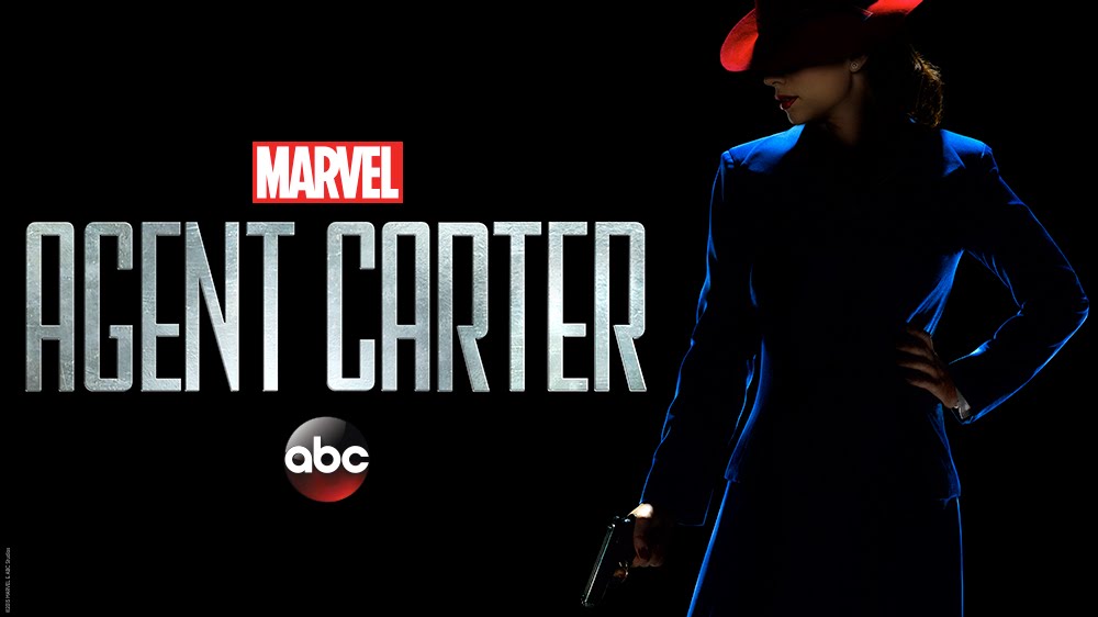
The first time we meet her, she is wearing a navy blue business suit that follows the period to the T. This is, probably, her most iconic look; the navy blue with the red fedora matching her lipstick. It's certainly a striking image that defines the character from the get-go.
The most important element to achieve that is the color palette, which will be maintained throughout the first season: blue, white and red. Why this specific palette? The answer is simple.
First of all, it sets her apart. Look at the picture above. She is the only one wearing any sort of popping color. She is not the same as the rest. It's a quick and simple way to establish her situation: she is a woman trying to thrive in a world of men.
Her trademark look is the red custom ladies Stetson Stratoliner hat, a burst of color in a sea of grey fedoras. Working in man's world she needed to stand out, and she did that using color in her wardrobe. --- Giovanna Ottobre-Melton, costume designer ---
But that's not the only reason behind the choice, there is another one, even more thematic. What other character in the MCU is famous for wearing blue, white and red?

Well, the answer is rather obvious; Captain America himself. Dressing her in his colors marks her profoundly emotional and ideological connection to her lost love and ally. She, like him, believes in justice and the bravery to do what's right for the right reasons. And so, she is presented to the audience also draped in the colors of the flag. True, hers is a much more conspicuous way, but she is a spy after all.
So yes, color is important. But it's not the only element that helps define her. Take a close look at her choice for head-wear. The fedora is a clothing item closely associated with men. So, by making her don one, the show is equaling her to all the other fedora-wearing men around her. She is no less worthy than them. And she knows it.

This particular design was used in all the promotional images for the show. And it's hardly surprising. It summarizes the spirit of the character to perfection with three simple tools: shape, color and the preconceived notions the audience has of certain items (the fedora, in this case).
And these three tools, are used in every single one of the rest of her designs for season 1.

Her "office look" is quite simple, clearly reminiscent of wartime fashion. Let's not forget that the show takes place in 1946, which was a purely transitional period between wartime fashion and the later, more feminine, Dior's "New Look". The war allowed many women to take traditionally "masculine" jobs. This, coupled with wartime rationing, meant that female fashion became more austere and masculine-like: the A-line skirts that Peggy wears, as well as the blouses, are prime examples of the period. But, unfortunately, when the war ended and the men started to return to their old jobs, those working women were forced back into the house and out of the office and into more feminine fashions.
It's only logical that as Peggy clings to maintain her job after the war (when she is repeatedly told that she is not needed anymore), she also clings to the masculine and overly simple fashion of the war.

And so, her daily SSR look is an overall hourglass style with clean lines and strength in the tailoring and defined shoulder, which is what gives the more masculine feel to the silhouette.

Also, she also usually uses custom-made belts, which not only compliment her waist fantastically but also help underline the masculine feel of the character.

That masculine feel is even more underlined by the numerous jumpsuits and pantsuits and the likes that fill her wardrobe.
 |
| original design by Ottobre-Melton |
The thing is, during that era, pants weren't an exactly desired or accepted look for women. Women who wore them were usually put down as "mannish". And, in many cases, pants were explicitly forbidden in the workplace. Sure, the show has some margin on that, because it does not take place in our own exact reality. But it still maintains the general idea of the period regarding women and pants.
Because of this, if you look closely, you'll realize that whenever she is seen wearing pants, it's always during the night-time or when she's not at work (mainly during her nocturnal escapades with Jarvis and similar dangerous outings). And that’s why she’s in skirts for a lot of her missions. She hasn’t had time to change out of her office attire and she’ll go right out in whatever she has on.

This jumpsuit, despite its simplicity, is one of my favorites out of her "down to work" looks. And it's clearly inspired in these wartime factory jumpsuits for women (pictured below).

During the final episodes, it's the first time that she is seen in pants by her coworkers. And that's basically because she has been accused of treason and she spends half of that time running away from the SSR, so she doesn't need to follow office etiquette.

It's in that look, the classier pantsuit look, when the Katherine Hepburn influence in her design becomes unavoidable.

Katherine Hepburn wasn't only a Hollywood star. She was also a strong and fierce woman and one of the first public female figures to actually wear pants. Peggy Carter shares a lot of her spirit, and so, it's only logical that she would also share some of her sense of fashion.
But, even though she prefers comfortable clothes to feminine clothes, she has to fit in several evening dresses due to her undercover work. The most iconic is, without doubt, the "Veronica Lake" look she sports during her first undercover mission in the pilot episode.

The idea for the design was to turn her into the classic femme fatale, with the blond waves and the gold lamé fabric. But, because these dresses are so delicate (you can't move around a lot in them), the designer had to bone the inside of the dress so that the fabric would not rip during the action scene. Which sort of proves the reason why she needs the pantsuits.
Last but not least, let's not forget that Peggy is, during this first season, living a double life. For the rest of the girls and management of the Griffith Hotel (and all-girl apartment where she rents a room), she is a refined Brit that works as a telephone receptionist, not an international spy. So, as such, she needs to look the part, which allows for some really nice 1940's dresses.


This last one is certainly one of my favorites, and it was really nice to see it reappear in season 2. And it also follows the color palette established for the character, which makes it even nicer.
CONCLUSION
All in all, the designs for the show, and this character, in particular, are certainly worth talking about. It's era-appropriate, it's clever and it speaks to the character and the world she inhabits. Which is everything we should expect of any costume design. But, let's not fool ourselves, this was a risky product; it's expensive to produce and it has a ton of characters, so, in the hands of a lesser designer, this could have been a disaster.
Which makes the cancellation of the show even more of a tragedy. But, all we can do now is enjoy the two seasons that we have and pray that they come to their senses and produce a third one. Until then, I'll keep appreciating what we have. See you next time!
--------------------------------------------
Up until now, I've covered Peggy Carter's designs only for season 1. I was going to cover also season 2 in this article, but it started to be really long. Too long, for sure. Because of this, I decided to make this a two-parter article.
But then, I realized that I also had quite a lot to say about the designs for the male characters and the rest of the female characters. And so it became a three-part article. And so, you can expect much more Agent Carter to appear on the blog during the summer.
---------------------------------------------------------------------------------------------------------------
If you enjoyed this article and would like to support the blog,
consider buying me a Coffee? 💛💛
If you want more content like this, subscribe! Or come say hi on Facebook, Tumblr, Twitter, Instagram and help us grow!
DISCLAIMER: I claim no credit for images featured on this site unless noted. Visual content is copyrighted to its respective owners, and inclusion here is under fair use for criticism, comment, and news reporting purposes. If you own the rights to content here and wish it removed, please contact me.
Comments
Post a Comment