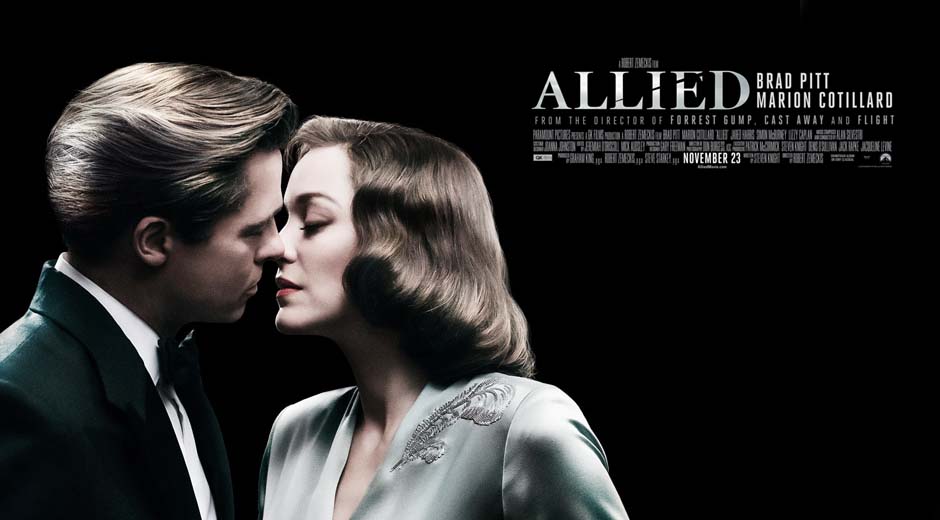
Allied is a World War II romance with an old Hollywood flair. This newest Zemeckis' movie is definitely trying to be the next Casablanca or the next Notorious. And, while that is a good goal for a movie to have, it's not as good when if fails to actually get there. The sad truth is that Allied lacks the passion, driving force and creativity to be either of those movies.
Still, despite its most glaring flaws, Allied certainly has not a lack of ambition. Quite the contrary; it attempts to be a triumphal fanfare that both pays homage and injects new life into the great war movies of the 30's and 40's.
Unfortunately, despite their efforts, it hardly amounts to a shallow imitation that it's lucky enough to be entertaining enough at certain points of its story.
But, this movie's greatest fault is not its lack of spark or originality. Its worst crime is to contain two radically different movies in tone within its two-hour run-time. What do I mean by that? The spy-thriller action that the trailers promised ends at the 40-minute mark only to give way to a slow-paced romantic drama that happens to involve spies for the following 90 minutes.
Despite all this, I have to clarify that there are two saving graces in this movie: the first one is the always splendid performance of Marion Cotillard, who continues to prove that she is one of the best actresses of her generation, and the second one is the stunning costume design.
IN REGARDS TO THAT...
I need to recant my previous statements in regards to this movie's costume design. Yes, I did say that these were "bland and forgettable costumes" when the nominations were first announced. I have to recognize that I had not had the chance to see the movie back then and was judging only from the promotional stills and trailers, where the extreme digital retouching (especially in the posters) made the otherwise beautiful costumes look fake and cheap.
Thankfully, the costumes on-screen couldn't look better. And I am not too proud to recognize that I was actually wrong, so... there it is. With that said, let's continue.
OLD GLAMOUR AND STYLE
The costume design for the movie was created by Joanna Johnston, a very familiar name when it comes to designing costumes for World War II with a very long trajectory with works such as Who Framed Roger Rabbit (1988), Indiana Jones and the Last Crusade (1989), Back to the Future Part II (1989), Back to the Future Part III (1990), Far and Away (1992), Forest Gump (1992), Saving Private Ryan (1998), War of the Worlds (2005), Munich (2005), Valkyrie (2008), War Horse (2011) and Lincoln (2012), for which she received her first Academy nomination.
The main idea behind the design was to recreate the look and feel of the Golden Age of Hollywood. To bring back to life the world of glamour that Dietrich and Bergman inhabited in the '30s and '40s. And it needed to feel natural to the story and the characters whilst also managing to visually represent each character's personality and each character's arc. Certainly not an easy act to balance, but Johnston certainly made the most out of it.
MARIANNE BEAUSEJOUR: A SHROUDED IDENTITY
Marianne, as beautifully played by Cotillard, is a renowned French resistance intelligence asset undercover in Casablanca, Morocco, when we first meet her. She is, above all, a spy. And a very good one at that. This means that her whole personality and character is shrouded from us. Covered in a layer of mystery. It's only fitting then, that she's wearing a dark and mysterious purple silk dress the first time we actually see her.

The use of a darker color helps accentuate the aura of danger and darkness that exists around the character and that will come into play later in the movie, whilst also serving as a visual shorthand to indicate the femme-fatal aspect of her character.
The other great merit of the design is the fact that it's created with the scene in mind. The designer took into account that the first time she would appear on camera, she'd be facing away from us, so all that we could see would be her back. And, accordingly, worked into the gown a sexy, yet classy, open back in order to highlight her allure and Max's immediate fascination with her. It all was crafted so that's we'd get a memorable impression of her even before we saw her face.

I wanted it to be sexy, but subtle—not over flashy in any way. I knew that we would see her back first, so I thought 'let's have the sexy, attention-drawing aspect be an open back.' I wanted her to be feminine, so I had the front high because I liked the juxtaposition. -Joanna Johnston-
Another clever aspect of this gown is the use of this shimmer-like material that helps to highlight that dreamlike quality that she builds around her. She's presenting herself like this "shinny, pretty thing" and dangling herself in front of Pitt's character.
Also, the design as a whole serves to create this retro/glamour feel that the whole movie aims to have. It's a very Hollywood-like costume. And it's something that Lauren Bacall, or any 1930's movie star, could have worn.
Last but not least, we need to praise the design for its restraint and subtlety. A lesser designer would have dressed her in red in such a scene. Johnston, instead, manages to create an alluring and sexy outfit that speaks of the character darkness and mirage-like personality without falling into the usual tropes of "red dress" and "plunging neckline".
Her next outfit is, in many ways, the radical opposite of the purple gown. It's a breezy white nightgown with a silk, floral robe over it. It's the complete opposite in color and texture. But it's unified by the sense of stylized glamour that both have and share with most of her outfits.

Marianne, at this point in the story, is completely veiled behind this layer of glamour and chic costumes. And the fact that this nightgown is, in fact, more of a movie costume that a real sleeping garment, helps to underline the idea that she has built a façade around her and that she's only showing Max whatever she wants him to see.
Also, the contrast it creates with her previous purple gown helps highlight just how much control she has over the image she projects: she's able to build herself into this classy femme fatal only to then get home and turn into the caring and devoted wife that really wants to "satisfy" her "husband".
That idea of a constant façade will be a common thread throughout the movie's costumes for her character. And what this achieves, is to give the audience the feel that we are not seeing the real Marianne, that, at most, we are seeing a part of her. The part that she wants us to see.
The façade she takes on in Casablanca is one of glamour, class, and elegance. Because of that, all of her dresses for this first part of the movie share that Hollywood-vibe that was so heavily advertised.

The other common thread for these designs are the bright, vibrant colors: the blues, purples, oranges... and the light, breezy materials. All of which help denote the heat and high temperatures of Morocco. As well as capturing the vibrancy of Marianne's adopted personality.

They also manage to walk a very thin line between casual and extremely chic and elegant that allows her character to feel incredibly sexy and alluring even in day wear.
I wanted this diagonal check design, and this whole skirt is cut in one, so the printers printed on part of the dress and the rest is left plain. It’s kind of shirt-dress, so it’s casual but chic. I liked the box pleats because when she’s walking it’s a very pretty, elegant movement, and when she sits it falls so nicely. -Joanna Johnston-
And the fact that she's always so well dressed and styled also manages to highlight the feeling that she's always the one in control of the situation. That she's always on top of the circumstances.

Also, the use of beaded decorations in some of her gowns to create a sense of radiance around her is very clever, design-wise.

The use of certain materials is also very clever. In this orange dress, for instance, it's particularly important the use of silk satin, which brings out this liquid-like quality to her movement. That liquid feel also highlights the malleability of her character; she's always what she needs to be.
Her next outfit is a military-inspired outfit that she wears during a gun training session with her "husband", and it serves as a confirmation of that malleability.

She can be chic, but she can also be more than a pretty girl. The costume actually manages to balance the two ideas flawlessly: it's classy yet utilitarian.
It's one of the first visual clues we get that she's always going to "be" what the situation requires her to be. There is no real "Marianne", only a fantasy. A mirror that reflects back whatever people want to see in it.
But, despite that duplicity, there are brief moments where we are able to get a glimpse of what is there behind the façade. One of the most noticeable occasions is the scene where they chat in the desert right before the infamous "sex scene".

This is the first moment, up to this point in the movie, where we see a certain honesty and vulnerability in her character. It's only logical, then, that she's dressed in the most simple and casual dress up to this point. It's still very elegant and pretty, but it's very simple. It's a white cotton day dress with no flourishes or jewelry. And it's that simplicity which helps underline her truthfulness and vulnerable honesty at that moment.
Also, on the more practical note, it was designed to be easy to take off... a very wise move, considering the "wild sex" scene that follows.
I wanted to keep their clothes very simple—and in fact they're both in pale colors. I didn't want there to be a distraction with their clothing. She had a detail of beautiful drawn thread-work on her dress, and underneath it there were layers of underwear to peel off in pale peach silk satin. The action was in the forefront of my mind in this design. -Joanna Johnston-
Her next dress, the embassy ball gown, is the crown jewel of the movie. The whole publicity campaign has featured it heavily. And it's already pretty iconic. Which I understand, because it's stunning and a damned good piece of design.

This statuesque, column-style evening dress is both designed to be functional (she needs to be able to run) and stunningly classy and elegant. And it manages both perfectly.
Again, it's this sort of old-fashioned quality, but it also had to be quite functional; she had to be able to run in it and do all those things. At one point she actually had a weapon underneath it, in the skirt, so there was a lot of stuff about that [laughs]. So I added some fullness in the skirt to give her room to move. -Joanna Johnston-On a character level, the dress, by using silk satin again, manages to create this very fluid feel around her. She is as shifty and liquid as her dress. It might sound corny, but it's a great way to visually point that she's "like water": adopting the shape of whatever container needed.
I wanted to do a classic column-style dress—very statuesque. I wanted the fabric to be quite liquid. When she's on the move, she's got this liquid quality to her, which silk satin does beautifully. Because it was nighttime, the light hit all those highlights [in the fabric]. -Joanna Johnston-
Also, the fact that the embellishing beats are on her left shoulder and right hip gives the whole look an asymmetry that once again, works perfectly for the character.
And with this amazing gown, the Casablanca section of the film comes to a close. And so do the colors, brightness and glamour that have characterized the character so far. Once she hits England, Marianne "the spy" disappears and is replaced with Marianne "the housewife".

The first obvious stylistic change is the textures. Suddenly, once she's in England, the liquid silks and shimmering fabrics are gone. These are replaced by matte fabrics with no reflections whatsoever.
Another major change is the abandonment of the chic-look. She no longer dresses to be the most elegant and refined woman in the room. She's a wife and a mother now. Not a spy.
Her wedding dress is the first example we get of her new look. It's a pretty dress, but it's a far cry from the stunning embassy ball gown.

The dress is a greyish blue and the fabric hasn't that liquid feel that was so prominent in Casablanca. It's, definitely, the first clue we get that she's taking on a different role. A more traditional role.
This shift becomes crystal clear in the next scene, where she's wearing a flowery blouse, a dark purple apron and a very simple hairdo.

Then when she goes to London, she embraces being a wife and a mother, so she's in tweeds and wools, but there is still a tiny nod to France, like a mint green blouse with a little pattern on it that I modeled off a style of French blouse I found. I liked the idea that she takes on the mantle of what she thinks is the appropriate look to have wherever she is. -Joanna Johnston-
It's a very matronly look. Very traditional. A complete 180 from her look at Casablanca. Now she hides behind the façade of the English countryside; darker colors, tweed and wool.

This change of look makes her seem almost like a completely different person, which is only logical, as she playing a different role.
Anther addition to her style is the color red. This, I didn't actually realize until I re-watched it for the review, but she never wears red in Casablanca, it first pops up when she's already in England. And it makes sense because it's when everything starts to spiral out of control for her. It's a very nice and poignant foreshadowing.
On top of all those changes and additions, as the third act advances, her clothes start to become darker and darker, foreshadowing her descent and tragic ending.

The whole costume design is put together in a way that it all creates a crescendo of visual tension that leads us perfectly into the ending, where she's dressed in this dark red/mauve coat.
That might be a simple design, but it works perfectly in the last scene as it gives her an aura of guilt and regret and, with the hood on, creates a beautifully tragic image.

In the end, the greatest achievement of the Costume Design for this character is not having crafted a stunningly beautiful set of costumes. The greatest merit is to have perfectly captured the shifting identities of Marianne through style, color and texture alone.

When you go to London, Marianne is not Marianne still. She takes a mantle of what she’s pertaining to be. In Casablanca, she’s a chic, stylish French woman, living in a hot country. The design is very clean. [...] When she goes to London, she goes, as you say, darker. She goes into wools. She’s more hairy in the cloth. Her patterns are more muddled and there’s slightly less definition to her. -Joanna Johnston-
MAX VATAN: THE FOOL IN LOVE
At this point, you might be wondering why did we review first Marianne if she's not the protagonist of the movie? Why not start with Max? Well, she might not be the protagonist, but she's the one with a dramatic arc and a more interesting role. And that is directly reflected onto the costumes. So, plain and simple, her costumes are much more interesting to talk about.
Max Vatan, a Canadian intelligence officer, is a good man. He is loyal to the cause and he is in love with Marianne. Unfortunately, he is not very interesting as a character because he never makes active choices. He just reacts to what happens around him. Also, the fact that Brad Pitt seems to be sleepwalking through the entire movie does not help.
With that out of the way, let's focus on the costumes. The main visual idea behind the character is to create a Cary Grant feel for this character: dapper-wholesome would be the concept.

Then his suit is a simple ’40s style, very classic masculine influence from the time, [like] Cary Grant … Just super elegant and super clean. He also looks absolutely brilliant with just a shirt and his pants, these beautiful high-rise pants and suspenders. It was actually Pitt’s idea on the outset that we keep the jacket off initially, and he was right. -Joanna Johnston-
Also, unlike Marianne, he doesn't get a significant change in style or palette once he goes back to Britain. The only changes are logical changes in response to the obvious weather differences between Morocco and the UK. For instance, in Casablanca, his suits are made of lighter fabrics and are less layered, whilst, in Britain, they are made of thicker materials and include more coats and jackets for the cold weather.

The clearest example of the consistency of style for this character is the fact that, in the end, his color palette remains the same throughout the movie: ochres, browns, greys and blues. This palette doesn't change once he gets to Britain, it only darkens to fit the winter feel of the location.
Also, color becomes very important, once again, during the third act, when his increasing worry and desperation are clearly reflected through a slow color evolution towards black in the last 15 minutes of the film. An evolution that culminates with him in an all-black ensemble for the final scene.

It's a simple idea but works within the narrative of the movie.
Another important aspect of the design, although easy to overlook, is the need to have believable military uniforms. He is an air force pilot for the Canadian Army. His uniform needed to accurately reflect that.

We looked at a lot of original uniforms for the Royal Canadian Air Force uniform that Max wears. Actually, we started with some original uniforms from the date, because they last quite well there. They’re quite a heavy cloth. -Joanna Johnston-
And, to be honest, there's little to say about anything else. Don't get me wrong; all of his suits and costumes are beautifully tailored. But, unfortunately, because this is such a bland character, the design has almost nothing to work with in regards to evolving the style throughout the movie to fit the character's arc. Mainly because he doesn't have one. Because of this, it becomes really hard to do the costume-by-costume review that we usually do here, as it would be tediously repetitive.

So, just to clarify once again, we are not trash-talking the design (they are awesome) but the script (which is considerably less awesome). The designer, in the end, was only making do with what the script gave her. And for what that was, Joanna Johnston did an amazing job.
CONCLUSION
Allied is a highly ambitious and deeply flawed movie that tries to recapture the glamour and grand storytelling of the '30s and '40s. It's not a bad goal to have, but it's wasted on a script that could have never lived up to that.
Despite that, the one aspect that did live up to that goal is, undoubtedly, the Costume Design Department, which turned out exquisite designs for both characters and managed to give the look of the movie a very retro and glamorous look.
So, though this was never my favorite candidate to win, it is certainly a deserved nomination.
---------------------------------------------------------------------------------------------------------------
This is the fourth of the Oscar Retrospective 2017! Join me next time when I'll be closing this series by looking at Fantastic Beasts and Where to Find Them. Meanwhile, check out last year's Retrospective covering: The Revenant, Cinderella, The Danish Girl, Carol and Mad Max: Fury Road.
---------------------------------------------------------------------------------------------------------------
If you enjoyed this article and would like to support the blog,
consider buying me a Coffee? 💛💛
If you want more content like this, subscribe! Or come say hi on Facebook, Tumblr, Twitter, Instagram and help us grow!
DISCLAIMER: I claim no credit for images featured on this site unless noted. Visual content is copyrighted to its respective owners, and inclusion here is under fair use for criticism, comment, and news reporting purposes. If you own the rights to content here and wish it removed, please contact me.
I just love this Brad Pitt Allied Jacket ...this is made of brown suede leather right?
ReplyDelete