Bright star, would I were steadfast as thou art —
Not in lone splendour hung aloft the night
And watching, with eternal lids apart,
Like Nature's patient, sleepless Eremite,
The moving waters at their priestlike task
Of pure ablution round earth's human shores,
Or gazing on the new soft-fallen mask
Of snow upon the mountains and the moors —
No — yet still stedfast, still unchangeable,
Pillow'd upon my fair love's ripening breast,
To feel for ever its soft swell and fall,
Awake for ever in a sweet unrest,
Still, still to hear her tender-taken breath,
And so live ever — or else swoon to death.
John Keats


These beautifully woven words of romantic poet John Keats are at the very heart of the movie Bright Star, which focusses on the last three years of the poet's life and his romantic relationship with Fanny Brawne.

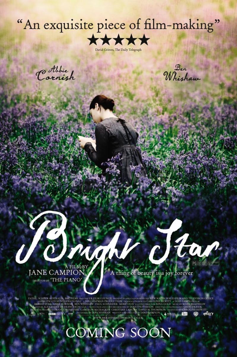
Bright Star is a 2009's British-French-Australian biopic directed by Jane Campion with the same exquisite sensibility that she already demonstrated in The piano (1993).
The movie is quite out of the ordinary in regards as how it tackles the romance and the story itself. It shies away from a more standard narrative and focuses solely on emotion. And by doing this, it manages to translate the poetic experience into the cinematic experience. It feels and reads as a two-hour dive into the poetic world of Keats and the romantics and it's worth every minute of it.
It's a very well blended mix of classical filmmaking with very modern sensibilities and cinematography that manages to immerse you into the world of these characters and bring to you the full experience of love and loss.
This very poetic approach to storytelling seeps into every aspect of the movie; from cinematography to set design to, of course, costume design.
ABOUT THE DESIGNER
The costumes for Bright Star were designed by Australian Janet Patterson (who is not only a costume designer but also a production designer). She's a specialist in 19th century costuming and amongst her credit there are such glorious designs as those of The Piano (Jane Campion, 1993), The Portrait of a Lady (Jane Campion, 1996), Oscar and Lucinda (Gillian Armstrong, 1997) and Far From the Madding Crowd (Thomas Vinterberg, 2015).
She's been nominated four times for an Academy Award but still has won none. Said nominations were for The Piano, The Portrait of a Lady, Oscar and Lucinda and Bright Star. She won a BAFTA award for Best Costume Design for The Piano, and has been nominated and won in various categories for the Australian Film Institute.
In Bright Star she worked as both costume designer and production designer, making her work for the movie even more impressive.
THE POETRY OF COSTUMING
The movie takes place in Hampstead between 1818 and 1820, coinciding with the last years of the Regency period. And it takes full advantage of the period, cleverly combining typical "white dresses" of the Regency with more wild and colorful gowns more befitting of the 1820s.
Fashion plays a key role in this movie; as it centers around a seamstress, Fanny Brawne (played by Abbie Cornish). And as such, she sews her own gowns, and so, the evolution of the style and color palette as she falls deeply in love is almost crystal clear.
 |
| The movie actually begins with Fanny sewing |
The character of Fanny Brawne is a very well rounded one, both through story and through visuals. She's introduced to the audience in one of the most ridiculous dresses ever put to screen (fairly historically accurate, but still ridiculous). It consists of a white muslin Regency dress with a red jacket and a red bonnet with feathers. The cherry on top is the addition of a rather large ruff around the neckline.

The fact that she, herself, has sewn and designed this, helps us quickly understand certain aspects of the character: her main interest seems to be fashion, therefore, she regards her clothes as her main form of expression.

One must not forget that she is a very young girl, and like most young girls, she experiments with her looks and clothes. Most of the time, resulting in rather ridiculous outfits.
With a sense of homage to how young women behave—then and now. Even right in Sydney, I see young fashion and art students, beautiful young girls experimenting with things that perhaps they could never carry off at another time in their lives. Really, it’s quite fabulous. For me, Fanny was the kind of girl with an instinct for her own nerve and beauty. She’s able to pull off this experimental stage of expression. --- Janet Patterson ---
And so, at the beginning, her attempts at creating a spectacle and being more noticed mean the costumes are ridiculous more often than not.
She is constantly made fun of it by Mr. Brown (Keat's companion), who accuses her of being an airhead with only feathers and ruffs on her mind. And she certainly looks like one when she appears on the neighborhood ball in a satin white gown with a peacock-like neck and long purple globes.

I particularly like the inclusion of the butterfly motif on her hairstyle during her first real conversation with Keats, as butterflies will become such a central element to their relationship later in the movie.
During the most part of the first third of the story, the design plays up her eccentricity, her need to define herself through clothing. This translates itself into big bonnets, big necklines and bright colors.

She is, basically, a young girl screaming for attention. Trying to be heard and have a voice of her own. It really doesn't matter that this is a period piece, this is a rather universal feeling, so it comes across as sympathetic, rather than vapid.
Her last "outrageous" outfit is this wine and burgundy dress with gold detailing that she wears at a party.

These are pretty ugly dresses, undoubtedly, but story-wise are very much perfect. Fanny is, at this point, almost desperately trying to stand out in a world that won't listen to her. And she does it in the only way that she knows how: through dress. Through the loud colors and the big shapes. The bonnets, and feathers and bows.
But this all changes after Keats's brother's death, when he finally notices her and a very timid friendship starts to blossom through his mourning period.
Gone are the loud reds and purples. Instead, she starts to favor browns, burgundies and blacks. And the shapes are also softened a bit.

Here, we can see her reusing the overdress she wore on the party early on, but with a white see-through chemise, instead of a red one.
There is still a certain "experimental" side to her clothes (that transparency is a bit fashion-forward for the time) but as she no longer needs to get his attention, her clothes become less extravagant.

As she starts to partake in poetry lessons with John, she shows up dressed in a very modest brown chemise and a black overdress that makes her beauty pop up even more. The deep regret for Keats's brother's death justifies the dark colors, as she tries to be as respectful as possible with his grief.
Still, fashion and the desire to be fashionable is intrinsic to her character, and even when she's dressed at her simplest, she maintains that. Take this brown coat and lace cravat that she wears to one of her lessons. Simple, elegant, yet terribly fashionable.

This leads us to the other very modern issue of the movie: the impossibility of society to reconcile the idea of feminine beauty and feminine interests (such as fashion) with a really profound intellect. Even to this day, society has a hard time believing that a pretty girl can be smart or that a smart girl can have a real interest in fashion or other "feminine" pursues.
This is something that Fanny encounters when she tries to get invested in poetry and Keats' more intellectual pursues.
I think that’s still a contemporary dilemma that it is hard to reconcile — a love of fashion and fine looks with intellectual ability. It can still be a terrible legacy for a girl to be brilliant and beautiful, when people prefer that beauties be lightweights. --- Janet Patterson ---
This is something that both the director and the designer had constantly in mind when working on the character.

One of the key designs of the movie is the pink dress she wears on Valentine's day. It's a sheer linen dress with a very fashionable ruff.

It's one of the most narrative designs in the movie. The scene goes as follows: she receives a valentine letter from Keats' friend, mocking her, but John takes it as him making an advance on her and confronts them both.
The scene begins with the opportunity of love (as she believes the valentine to be from John) and ends with the disappointment of reality. And thus, the dress starts the scene fresh and profoundly romantic, but, as it gets wet, it turns into a rather ugly dress (for linen is a material that easily deteriorates and it's not very good looking when wet).
I used the romantic Valentine’s theme to select the fabric, and I thought it would be good if the fabric was a sheer linen that would would deteriorate in the rain. Well, it actually deteriorated a little too well and provided for some dramatic filming. But it worked well because the scene is about a moment of opportunity in their love affair and also a betrayal. There is an ambiguity there; Fanny looks fresh and beautiful, and then when it starts to rain, she looks like a wet rag. --- Janet Patterson ---
It's the joy and disappointment in love in one single design (albeit a great one).

Still, as he comes back to the house the next spring she has become a much more confident young woman. She has grown out of her adolescent insecurities and is entering womanhood. In order to project that to the audience, she appears dressed in a very simple white linen dress with light purple ribbons and a simple bonnet.

This dress stands in stark contrast with anything we've seen her in so far. There are no feathers, loud colors or outrageously big shapes. And she looks radiant in it.
This design is perfect to highlight her natural beauty and also serves to highlight the differences in character between her and Keats. She's light and optimism and he, with his weak health and dark semblance, is gauntness and melancholy.

Let's pause a moment and look at John Keats. He is an extremely poor poet that lives from the kindness of his friends and who is constantly afflicted by illness.

To visually underline his lack of personal wealth, the designer chose to dress him in old and worn-out clothes.

His character is also shown repeatedly wearing the same ensemble, which helps to get through the idea that he has no money to be fashionable.
Why underline so much his poverty? Because that single element becomes key to the story. He is so poor that he can't even contemplate proposing to her. He has no money or fortune to marry anyone, which profoundly affects their relationship.
Also, his palette consists, basically, of blues and browns, clearly reflecting his introspective and reflexive personality.

Because of this, he poses a stark contrast next to Fanny's bright colors and fashionable outfits. But that contrast never seems to separate them, instead, they seem like two halves that complement each other. Her light to his darkness.

This white striped dress with the red-striped jacket is a very good example of her "mature" style. The design still transpires a great deal of creativity, but now it seems as if she has finally found herself in that creativity.
This, coupled with her blooming romance with the poet, start a glorious summer of happiness and love. These two elements will seep into her costumes and will translate them into brighter, more pastel colors and soft, simple shapes.


This period of their romance will be defined (design-wise) by pastel blues and whites, soft silks and very simple high-waisted dresses.


There is one gown that stands out amongst that segment of the film: an extremely simple, deep purple, high-waisted gown that she wears during a montage of one of his letters.

This dress was clearly designed for this scene, as it's only worn briefly while she frolics on a lavender field. This creates an absolutely striking image, as she seems to fuse with nature itself (for both the dress and the lavender flowers share the same color), lost in the dizzying sensation of love.
But at the same time, the darker color of this design, underlines, at a completely unconscious level, the darkness ahead; the fleetingness of the moment that we (knowing that Keats died really young) know it's doomed to be ended by death.

As Keats' health starts to weaken (with a very badly-diagnosed tuberculosis), she goes back to the brown and black palette but maintains the simplicity and easiness of design that she found during the "summer of love" (as I call it).

On occasions, she will try and go back to the blues and whites, but the ever-worsening health of the poet will always be present in her designs as well.


As he is forced to move out of the house and into a small apartment in town, Fanny tries to put on a brave façade and wears a light blue dress. But it's just a façade.

Fanny, throughout the movie, will remain a stronghold of hope and strength for his more pessimistic personality and this will be reflected in the last third of the movie, where, despite the certainty of his illness, she will continue to wear floral motives and breezy materials as she continues to love him unconditionally and manages to convince her mother to allow them to be engaged.

It's not until their last night together before his departure to Rome (for his doctors determine that he will not survive another English winter) that that extreme optimism will give way to despair in Fanny.
As they hold each other with the almost certainty that they will not see each other again, Fanny wears a dark burgundy satin overdress with a dark burgundy chemise and a striped ribbon.

And so, her despair and pessimism are also reflected in her dress.
For the next few scenes, as she awaits news from him she will be constantly dressed in a simple, black linen dress with a white chemise as if she were already anticipating his death.

And when death does indeed come, she dresses herself in black from head to toe (even cutting her lustrous black hair), which brings perfect (yet painful) closure to her character and her story as she recites the poem that he wrote for her, entitled: Bright Star.


AN ODE TO LOVE AND LIFE
The magic of this movie is how it manages to capture the love at its full specter; from anticipation and hope to pain and betrayal, all through a very poetic language.
This is also applicable to the costumes. From deep reds and outrageous designs to black and heavy coats, the journey of Fanny is perfectly reflected on every single gown she wears. From adolescent insecurities and the need to call attention to oneself to the confidence that comes with adulthood, and from the hope of love to the despair of loss.

---------------------------------------------------------------------------------------------------------------
If you enjoyed this article and would like to support the blog,
consider buying me a Coffee? 💛💛
If you want more content like this, subscribe! Or come say hi on Facebook, Tumblr, Twitter, Instagram and help us grow!
DISCLAIMER: I claim no credit for images featured on this site unless noted. Visual content is copyrighted to its respective owners, and inclusion here is under fair use for criticism, comment, and news reporting purposes. If you own the rights to content here and wish it removed, please contact me.
Comments
Post a Comment