Every genre has its own pre-established set of conventions: a list of characteristics, both visual and narrative, that helps us put them in their neat little boxes. And, though not often considered a genre, the fairy tale format can often be defined in a similar manner.
For decades, and thanks to Disney, fairy tales followed a very recognizable set of visual and narrative patterns. But, like many things in the last couple of decades, this format is being tampered with.
This is very clearly visible when comparing two movies such as Mirror Mirror and Snow White and the Huntsman.

To clarify, both of these movies have completely zero reasons to exist beyond the fact that the current trend seems to be to remake every single movie that has ever been financially successful. Also, clarify that both movies are bad. You might or might not like them, but they are bad, for very different reasons, but still.... bad is bad. With that said, let's get back on topic.
2012 OR THE YEAR OF THE FAIRY TALE
Within the span of a few months, 2012 saw the release of two movies adapting the same classic fairy tale. And both took radically opposite routes in doing so, both story-wise and design-wise.
First came Mirror, Mirror, an American production directed by Tarsem Singh, a very peculiar Indian director with a very particular style. Then, a month later, Snow White & the Huntsman was released; a Hollywood Blockbuster with epic airs directed by Rupert Sanders, a rather unknown director (and irrelevant, this is clearly a studio movie).
Both movies tried, in their own particular way, to redefine what it means to be a fairy tale in the 21st century. So, what does it mean? And how does that translate to the costume design? In the next two articles, I am going to take a closer look at that and try to answer those questions. And I am going to start by talking about subversion.
SNOW WHITE AND THE HUNTSMAN: SUBVERTING A FAIRY TALE

Snow White and the Huntsman chooses to transform the classic fairy tale into a grand epic, a gothic action-adventure and finds its inspiration in movies such as Lord of the Rings much more than it does in the classic Disney fairy tale.

Here, Snow White is a princess trying to reclaim her country from the hands of an Evil Queen-Witch that sucks the life out of the young maidens in the land in order to keep young. With big monsters, stunning effects, a huge battle charge and an assault to the castle, lead by Snow White, this movie is trying much more to look like this:

Than this:

This 360º degree change in direction is meant to be subversive. The movie wants to subvert the fairy tale tropes and standards, and by doing so, create a new type of heroine for the new century. Also, it's trying to cash in in the "epic" craze that has plagued Hollywood since the bombastic success that was Lord of the Rings, let's not try to fool ourselves.
And to create a visual look for these new subverted characters, the Studio chose legendary Tim Burton costume designer: Colleen Atwood. A perfect fit, really, for she's been subverting classic tales since she began working, creating such iconic pieces as Edward Scissorhands (1990), Mars Attack! (1996) and Sleepy Hollow (1999) amongst others.
So, let's start out main character: how do you subvert Snow White?
I. A WARRIOR PRINCESS

This is a new take on a very well known character and, therefore, needs a new iconic wardrobe if it ever means to become as relevant as past incarnations.

She is introduced to the audience in the "maiden costume", which consists of a knee-length suede dress and boots which incorporates both the "princess" ideals and the "warrior" standard. This is, probably, the most important costume in the movie, for it has to stand toe to toe with Disney's most iconic princess dress to date.

She starts by wearing a full dress version of it (as seen in the right corner of the panel) that, throughout her escape in the woods, gets cut short for comfort. The whole design has a very practical approach to it, as well as a very sound and realistic reasoning behind the creative process.
I kind of backed into Snow White’s costume because it’s similar to what the servants in her castle wore. She had been thrown in prison young, and it seemed reasonable that she would have been given something similar to [a servant’s uniform] to wear all of those years. - Colleen Atwood
The design is quite striking in its simplicity and how gracefully it is assembled. But it seems to be trying too hard to NOT be Snow White's iconic yellow, blue and red dress. To do that, it takes from a myriad of influences that create a more "realistic" version of the character.

The design takes, superficially, from the laced overdresses of the Italian Renaissance (as depicted by Ghirlandaio) but, essentially, from the medieval reinterpretation of the 19th century (as depicted by Waterhouse). All of that is intertwined with our own modern understanding of how a "strong female" character should look (as exemplified by Xena or Thor's Lady Sif).
But Disney's costume is so iconic, that it was, literally, impossible to avoid a certain throwback in the final design. If you take a closer look at the puffed sleeves of the dress, you can clearly see the reference to the iconic princess dress.
I wanted to do the puff sleeve as a little nod to what the expectation is for Snow White, but still, I wanted it to feel like a real piece of clothing and not a fluffy, girly thing. - Colleen Atwood
Because she carries this dress through the majority of the movie, the dress becomes central to the character, adding (through visuals alone) certain adjectives to the character: humble, simple, practical, very down to earth... But the most important job this dress has is to convince the audience that this is a more modern version of the tale. Which the dress alone does, it's really a shame that the actress and the script are constantly working against that.

But this is not the only dress she wears. After she bites the apple and dies, she is presented in a pristine white simple gown.

Both the inspirations and the intentions of this design are pretty transparent: she's supposed to look innocent and angelical as she lies dead and then, as she awakens from the spell, pure as a vision come back from the dead. That's why I call it the "phoenix" costume.

Again, it's heavily influenced by medieval romanticism and this idea of the young fair maiden.
Story-wise, she is reborn into this world and shown as a pure beacon of hope for all men to follow, and so, the white design makes a lot of sense. It's a very simple design, yet very effective.
Her next costume is the armor. This is the other key costume for our main character, for it's meant to show the fierceness of the character; show that she's some sort of Joan of Arc.

Unfortunately, the design is merely boring. It's correct but brings nothing original to the table. It's, actually, almost identical to that designed for Alice in Wonderland (2010), which also happens to be designed by Atwood.

It meshes together all the Joan of Arc imaginary possible and it becomes a very bland design. You can easily tell that she wasn't thrilled about having to design this piece of costume.
Her last design, unfortunately, also falls on the "correct yet bland" bag. It's the coronation gown and it's a red gown with nature-inspired golden embroidery.

Thematically, it fits really well, with the more natural elements to contrast with the more artificial evil queen, but there's something that doesn't work for me.

It's way to "typical fairy tale" for this movie. It doesn't have the grit and realism that the rest of the movie has, so it feels a bit copy-pasted. Also, I think there is an inherent problem with the casting. Maybe with another actress, this would not feel so out of tone with the movie, but Kirsten Steward doesn't have the physical pose to be a princess; she cannot wear this dress convincingly. When I watched the movie for the first time I thought she looked so uncomfortable in the dress, as if she didn't even know how to move and still look natural (something that I also noticed when she was wearing the armor). So, I'm not sure how much of the "meh" of this design is because of the design itself or the enormous casting mistake.
So, Snow White's designs are a mix of "really good" and "just meh" costume assembles, but it's with the Evil Queen that you finally see Atwood's full potential.
A new type of heroine always requires a new type of villain. And so, our new warrior Snow White balances of a new Evil Queen: a more beautiful and dangerous one. Instead of turning into an old lady just to give her the apple, we find out that she is an old lady, but that she sucks the souls of young maidens in order to remain youthful.
It's in the casting of Charlize Theron that we realize just how miscast Steward really was, for there is no way on earth that the young actress is fairer than Theron.
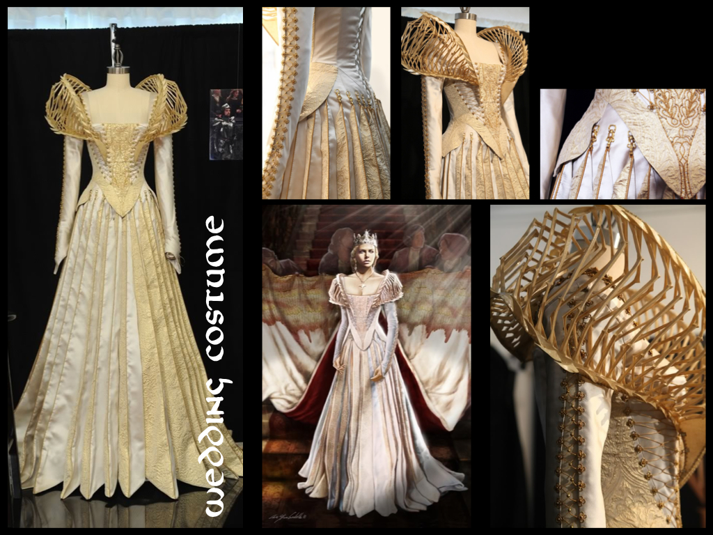
But let's focus on the designs. The Evil Queen has a very interesting evolution in her costumes; beginning with whites and brighter colors and descending to dark blues and blacks as she corrupts the Kingdom. And so, at her wedding, we are introduced to her in a jaw-dropping white and cream wedding gown.

The costume is perfect for the character: the dress being the perfect balance between the artificiality and hardness of its shapes and the youthfulness that the character desires.
The designs weave in elements from haute couture (the outlandish shapes, the details, the fabrics....) into the shapes of the more standard medieval-fantasy genre. I'm not going to do influence-panels for her dresses because all her dresses have the same ones: medieval-fantasy dresses with haute couture elements and all of her dresses do that with slight modifications to aid the narrative.
As the movie progresses, the shapes will become more artificial and the textures less innocent; edges will work its way through and elements of decay will weave themselves into the costumes. Because of this, her next costume, even though it's still white, already has some edgier elements.
This next design consists of a flowing white robe decorated with thorn-like embroidery.

The merit of such design is to make something so simple and innocuous as a robe, feel threatening. The embroidery feels like thorns twisting around her and gives the whole look a rather sharp edge.
That dangerous edge will keep progressing, and as we see her suck someone's soul for the first time, she is dressed in a gorgeous silver-scale dress.

It's, again, very simple, but very effective. The scale-like texture of the dress gives the look a very artificial edge and walks hand in hand with the crystal-like constitution of her soldiers (which dissolve into crystals when stricken down). Also, it gives her a reptilian feel which reinforces the regeneration theme running with her character.

And let's not forget the design of the crown; which is so instantly iconic that it makes me feel very sorry that this movie ended up being the mess it is. Its sharp edges make it look strikingly beautiful at the same time it feels deadly (just like the character).
As things start to go south for her (Snow White escapes, her brother is wounded...) she starts to wear edgier, sharper and more artificial designs.

As she orders the Huntsman to hunt the princess, she is wearing a black and silver dress with big puffy sleeves and a low-neck line. The highlight of the design is in the textures themselves: the stomacher and the sleeves are decorated with twisted iron creating weird shapes. And along the neckline, small, ivory-like bird skulls decorate the dress.

The addition of these elements is a very clever one; she is starting to lose control and so, her twisted personality is starting to peak under the surface and incorporating itself into progressively more scary gowns.
Also, the hanging decorations of the crown are gorgeous. They give the impression that she is wearing a veil (which in the original sketch by the designer, she was) but, instead, highlights her neck and shoulders.
As she goes to finish the job herself, she appears in a golden-scaled dress with a long feather-like cape. This is the "transformation" gown; where she transforms herself into a pack of crows.

The design, yet again, is very spectacular, with the high neck and the whole cape build of feathers, but I cannot stop thinking that this was heavily inspired by the Disney classic.
 |
| Disney's Evil Queen from the 1937 classic |
Look at that cape; it was so dramatically used every time she turned around that makes for a hard design to forget. It's funny how, no matter how much they try to avoid referencing the original Disney classic, they keep coming back to certain visual aspects from it.
With the "battle" costume, we reach the last of Ravenna's costumes. It's a scale-like dress with a feather edge and plunging neckline.

This design is the culmination of all the rest. This is the one that feels most artificial, edgiest and most dangerous. It seems as if you could cut yourself with it. It's very interesting because, as she moves, it looks as if she is made of pieces of crystal and stone.
One of the smarter elements of these designs is that none of her dresses really feel like it's organic; the fabrics used always feel very artificial (like scales, or feathers or crystals), which allows this progression to come more naturally. And also allows a visual contrast between herself and Snow White.
All in all, it's really noticeable that, for the designer, these were the costumes she really wanted to do, not the warrior-Snow White ones, because amongst Ravenna's wardrobe I am incapable to find one single "meh" design; they are all stunning.
III. A TOUGH MAN
In this movie, the role of the prince is exchanged with that of the huntsman; a rugged and weathered man who mopes around mourning the death of his wife. Or, otherwise, the biggest stereotype of this movie (and that is saying a lot).

He only has one outfit, but he really doesn't need more. The character has so little personality that I am fascinated they could even scrap one costume together.

It's very basic and very generic. It's your run of the mill tough fantasy guy costume, so there's really very little to say about it. True, it looks amazing on Chris Hemsworth, but I think that it's a case of "it's the man, not the clothes". Even Atwood herself said so:
It actually is as fun to make men’s costumes, especially if they are as good-looking as Chris Hemsworth. - Colleen Atwood
WHEN SUBVERSION ISN'T REALLY SUBVERTING
As a whole, the designs in this movie are pretty good; it's true that not all are completely on point, but they are, by far, the best aspect of the movie.
The whole visual concept (which includes the costume design, obviously) is directed to create a darker, more adult version of the tale. It stays away from the key elements of the fairy tale: the bright colors, the soft shapes the beautiful palaces and changes them for a palette of browns and blacks, edgy designs and stone-cold castles. But all this design work done to subvert the genre falls flat because, story-wise, the movie fails to deliver.
It's a very childish script filled with stereotypes that we've seen a million times and such wooden acting that one would think we were watching the live-version of Pinocchio.
It doesn't matter if you dress your heroine in an armor; if she still does nothing for herself, she'll still come off as a little girl that needs rescue. And it doesn't matter how much action you throw the viewer's way; if there is still no character to care for and too much shaky camera, no one will care about what's going on,
All in all, it seems as if the director didn't really know what he was supposed to be subverting here; like he just knew that gritty and dirty looking adventures make more cash (without analyzing why those worked in the first place). And, unfortunately, when a director (or a studio) doesn't realize what he is trying to subvert, then it all comes off as audience bait. And all this design talent is wasted on an uninspired, Lord of the Rings rip off that fails to understand what exactly makes an epic adventure truly epic.
TO BE CONTINUED...
So, from an uninspired epic to a kitsch and outlandish take on Snow White by an Indian director. Next, I will take a closer look at Tarsem Singh's movie and analyze the costumes and designs and see how they work and what they did differently.
---------------------------------------------------------------------------------------------------------------
If you enjoyed this article and would like to support the blog,
consider buying me a Coffee? 💛💛
If you want more content like this, subscribe! Or come say hi on Facebook, Tumblr, Twitter, Instagram and help us grow!
DISCLAIMER: I claim no credit for images featured on this site unless noted. Visual content is copyrighted to its respective owners, and inclusion here is under fair use for criticism, comment, and news reporting purposes. If you own the rights to content here and wish it removed, please contact me.
Stewart may not be as beautiful as Theron, but that shouldn't matter. Stewart's not ugly or too boyish, she's just not a good actress.
ReplyDeleteOf course it shouldn't matter and it doesn't, except the movie says about a thousand times that she is, like, explicit lines. And that's what I complain about. If they wanted to cast her, they could have at least bothered to remove those lines for the script, or even change the reason why the Queen wanted to kill her. They changed the story enough, why not also change that? I would prefer it if the reason the main villain wanted to kill Snow white was not because they were competing over who's the prettiest. That would be cool.
DeleteAll I'm saying, I guess, is that it didn't come off quite as we meant it. But we agree with you. 100%