Since the first promotional pictures of Disney's new Live-Action remake of Beauty and the Beast hit the internet, there has been a lot of discussion around Belle's iconic ball gown. And, even months after its release in cinemas, there still continues to be a lot of buzz around it. Why? Mainly, because a lot of people feel that it is just doesn't look that good.
The thing is, Belle's animated yellow ball gown is, at this point, an iconic staple of animated cinema. Everybody knows it and everybody loves it. And, as a result, everybody can see the new one and say "this is not the costume I know". Therefore, everyone can compare it down to the smallest detail and see that it just doesn't quite look right.
Today, my goal will be to try and dissect the design in order to answer the burning question everyone has been asking themselves: what's so wrong with the "new" dress? Or, to put it bluntly, why is it so incredibly underwhelming?
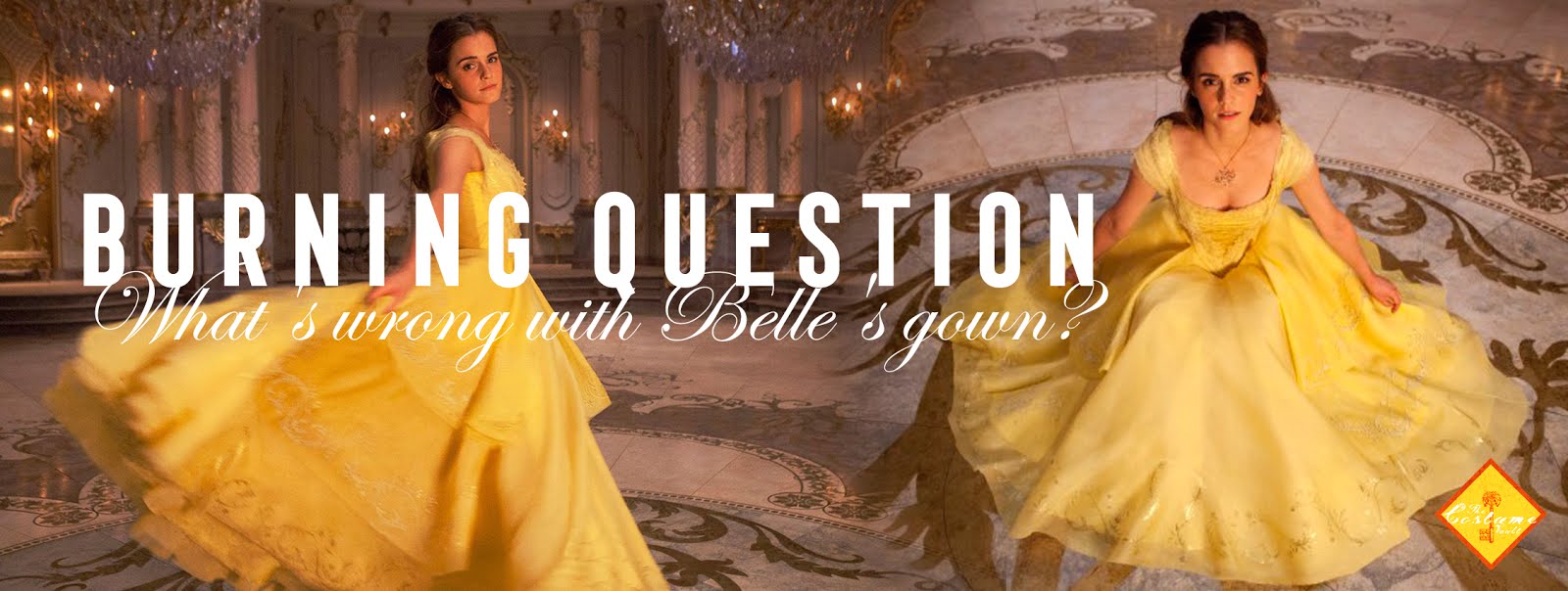
This might not seem such an important topic, but such a miscalculation in design deserves to be examined. Because, the truth is, that people are still talking about it. Twitter still is, months after the movie's release, filled with people trying to wrap their heads around it.

And once you've read most of these complaints, you realize that most people know they don't like it, but they can't pinpoint why. Most people blame it on size ("it's not big enough"), a lack of ornamentation or on being too simple. And, whilst these are the most obvious "symptoms", the problem is much more complicated. So let's try to unravel this thing.
THE ADAPTATION CONUNDRUM
1991's animated Disney version of Beauty and the Beast is a classic of cinema and animation. It was the first animated movie to be nominated for Best Picture at the Academy Awards. It garnered a lot of critical and financial success, firmly establishing once more the Disney Princess brand that The little mermaid had revived barely three years earlier, and, to this day, is one of Disney's highest-grossing properties. And, on top of that, millions of children grew up with this movie. So this is an instance where nostalgia, quality and success intertwine to create what could be called an "adaptation nightmare scenario".

What is that, you say? It is when the risk of messing up in the adaptation process becomes equal or exponentially bigger to the guarantee of financial success or critical praise that is guaranteed by brand recognition and the nostalgia factor towards the original property.
For instance, prior to 2007, the nostalgia towards the Transformers property guaranteed high financial success for any company that would attempt a remake. The fact that people were way more nostalgic about the toys than about the original show lowered the risk of messing up almost to non-existent levels.
Instead, the nostalgia towards the Teenage Ninja Turtles, being mainly focussed on the show and the 90's movies, could not override the risk of messing up the remake. Still, they took the risk and lost the gamble.
And, Beauty and the Beast, faced a similar challenge. People weren't nostalgic about the toys or the merchandise. The nostalgia centered around the movie itself: the story, the characters, the look, the music... And the fact that all those elements were genuinely good. This meant that people would inevitably compare whatever remake was made to its predecessor, which, in turn, meant that any change in the material became high risk.
How did Disney overcome that? By basically doing the same darn movie. Scene by scene. Honestly, 2017's Beauty and the Beast is not a new movie. It's the same movie with more live-action, and way less charm and singing talent. But the gamble worked for them. The movie was a box-office success and people flocked to see it.
But, despite that, a lot of people did not like it. From the story to the songs... it felt like a pale shadow of a much better movie. And, no matter how close they stuck to the source material (precisely because they stuck so close to it) people immediately noticed any change made, no matter how small. And, the change that caught everyone's eye was Belle's Ball Gown.
BIG DRESS, BIGGER EXPECTATIONS
The first and most obvious reason behind the disappointment with Belle's Ball Gown is found within the audience's expectations of what they understand as a "Disney Princess Dress". Because, for better or worse, Disney Princesses are part of a very well defined brand. A highly problematic brand, but certainly well defined (here's our very detailed article on the topic).
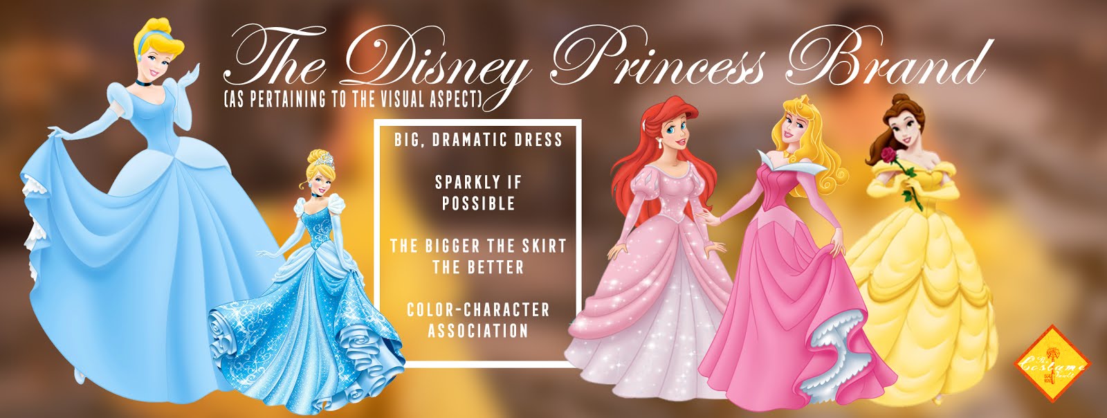
And, to put it simply, Belle's dress doesn't manage to follow the visual pattern of that very distinguishable brand. As so many people have pointed out: "it's not big enough" or "it's not magic enough", etc.

Also, it lacks that "wow" factor that Sandy Powell's design for the Cinderella remake captured so well. According to the established brand, any Disney Princess Dress should be larger than life. Disney Princess Dresses should match the imagination of young girls. These shouldn't be your regular nice dress, they should manage to be every audience's member dream dress. And belle's dress simply falls short of those expectations.
If Cinderella's new dress is the dress you'd like to wear at your wedding, Belle's new dress is the dress you'd force your bridesmaids to wear so they would not outshine you.
In the end, it's just that simple, the expectations were very clear and very high, and the dress didn't manage to fulfill them.
But, even if you look at the dress and the movie outside the branding trappings of the Disney Princess Line, as an isolated creation, there are other, more complex, problems with the design that make it come off as flat and unimpressive.
COLOR AND TEXTURE, FROM 2D TO LIVE ACTION
This might seem like a no brainer, but 2D animation can avoid being 100% realistic when depicting "reality". And a lot of times, it actually benefits from that deviation from a realistic depiction.

A lot of elements need to be simplified in animation. And, one of the most noticeable elements that need that simplification is clothing. When you animate a character wearing jeans, you do not insert realistic jean texture in your animation. You just paint the pants blue. It's our brain that fills in the gap.
Because of that, in 2D animation, yellow is often a visual shorthand to represent gold, the same way that gray is a visual shorthand to represent metal. That, in part, is why so many people scratched their heads when they saw Belle's Live Action Ball Gown was going to be simply yellow. Because, for years, your brain had filled the gap and interpreted the animated version as some kind of magic golden dress.

Look at the highlights in the animated dress: this is not yellow, it's some sort of golden/magic material. Which makes sense, considering that she was dressed by a magic wardrobe.
But, even if you thought the original dress was yellow, there is another element that doesn't translate well from animation to live-action. Spot the difference? Belle's animated dress consists of varying shades of "yellow" so that it doesn't feel as monochromatic. Instead, Belle's live-action dress is 100% yellow. Every single piece of the dress is made in the exact same shade of yellow. What this does is to flatten the image. To make it look two dimensional. Each layer of fabric pile on top of the other to create a yellow mass that, no matter how it moves, ends up being just yellow, which means that the dress loses the viewer's interest pretty quickly. It barely takes one single glance to fully see it.
Compare it, instead, to the Cinderella new dress. Every layer of fabric in that dress is dyed a different shade of color: purple, green, blue, white... The final result is a dress that is overall blue, but it has different shades in it. Not only making it look more three dimensional but also meaning that its way more engaging. Because every time I look at it, I have something different to look at.
True that, in real life, we wear monochromatic outfits. But we're neither in a movie, nor living in a magic castle, and, most importantly, we do not need to captivate the audience's imagination.
The third element that falls flat in the translation from 2D to Live Action is the texture. 2D animation, generally, is texture-less. As mentioned earlier, our brains fill the gap. Because of this, the most important task a designer faces when translating to Live Action is to create textures for the costumes. This process actually is very well done with Belle's blue dress.

By using different fabrics and different hues of blue, the designer manages to create a costume that our brain registers as "real".
Instead, the effect of exclusively using yellow silk organza for the Ball Gown creates the feeling that the dress is flat or "not-real" because it doesn't have any recognizable textures. To be fair, it's not like silk doesn't have any texture, but it's lighted and shot in a way that looks like it doesn't have any texture (I also have my suspicions that it was digitally retouched).

Also, there is a staggeringly low amount of detailing on the dress. The only decor is the tiny gold threat pattern on the skirt hem. And, whilst it's a nice touch, it feels like too little, too late, as gold on yellow barely creates anything but a tiny shimmer when she moves, and, by the time we've noticed, we're already bored with the dress.

In the end, all these elements hinder the design from really shining, and, when mixed with all the other failures it faces... it sinks it.
SIMPLICITY: A HARD TRICK TO PULL OFF
Design-wise, simplicity is a really hard thing to make work. Most of the great costumes in movie history only look simple but are actually intricate pieces of design with a lot of cool ideas that work with the character and the visuals.
The problem with Belle's dress is that it mistakes simplicity for lack of structure. The dress feels like it has too much weight. Like it's going to stick to your body instead of moving around. It feels limp because it lacks structure.
These types of dresses (big, theatrical ball gowns), base themselves, design-wise, around highly artificial shapes. That means that they need a structure underneath to shape them. From the 17th and 18th century panniers to 19th-century bustles. There is a need to create a specific shape and silhouette that can only be fulfilled by using understructures.

And the thing is, that this design heavily centers around a silhouette that needs a support structure beneath. Once again, I will refer you to the Cinderella Costume. It looks that good because she's wearing a corset and a cage to achieve the specific shape, even though that use of a corset led to a big mediatic controversy.
This leads us to the big elephant in the conversation.
THE RISKS OF MAKING STATEMENTS
It was highly publicized, on the months leading up to the release of the movie, that Emma Watson had been categorically about refusing to wear a corset or, as she put it, "she definitely, adamantly would not be wearing a corset".

The idea was to modernize Belle so that she would be even more of an emancipated woman. And while that is something I can get behind, they focussed their attention on achieving that through avoiding having her wear a corset, because, as the theory went, she was someone that would refuse to wear a garment that would make movement impossible.
Unfortunately, that notion of the corset might be more derived from watching too much Pirates of the Caribbean and not from actual research. 18th-century corsets served the same purpose as a bra does now a day. All it does is place your boobs where they should be in order to make the dress fit.
Oh, and it also served another essential purpose: to help the dress look like it was intended. Going back to the bra comparison; wearing one of these dresses without a corset is the equivalent of wearing a strapless dress without a Wonderbra. It just doesn't look that good.
And, whilst I do not doubt the well-meaning intentions that she might have had, she ends up harming the final result more than anything.
I actually think that, if she really wanted to really make Belle a feminist statement, she should have pressured the studio into risking deviating more heavily from the original script. The whole dance scene and its context should have been changed to match her idea of Belle. Instead, what they ended up with, was the same scene with the same whimsical tone, both of which the tone of the new dress constantly disrupts. In the end, you end up not enjoying the scene nor the dress. Changes needed to be made beyond refusing to wear a corset.
Also, I found an article at the awesome FrockFlicks site that got me thinking. So I'll just leave you with their very interesting thoughts on the topic.
My question is, “What’s really setting the unreasonable body standards, here? The corset, which artificially creates a slimming effect without punishing dieting and exercise? Or the other thing … The actress … Who has to keep a punishing dieting and exercise routine in order to land parts?” -- FrockFlicks on Top Five Ways Movies Screw Up Corsets --
And also.... isn't it sort of not right to imply that real emancipated and modern women (feminist) don't like big dresses...? It's hard enough to be a woman in this world, wouldn't we be better off if we stopped telling each other what is the right feminist thing to do?
I know this is a tricky subject, and I'm 100% sure she did it with the best intention at heart, so I'm not going to insist any more. Because, in the end, it still is only another misguided step in this mess of a dress.
THE MAGIC OF CONTRAST
In Costume Design, a design doesn't exist in a void that separates it from the rest of the movie, it exists as part of a whole. Because of that, it needs to rely on contrast to create the ensemble of costumes that will populate the movie. Most design ideas are transmitted through contrast with the designs of the rest of the characters rather than individual elements.
For instance, in HBO's Game of Thrones, we understand that Arya is different not because she's wearing pants, but because no other woman around her is. Or, in Crimson Peak, Edith's yellow dress works to signal her as unique because everyone around her is dressed in ominous dark clothes.

The list of examples goes on and on... But that's because the trick works. And thus, designers create ideas through their costumes by setting a default and implying the difference only through the absence of the established default.
It works with types of clothing, color.... and size. That's why, in the fairy tale prototypical narratives, the designers go to great length to ensure that the "magic princess dress" is the biggest you see in the movie.
And that's something that the new Beauty and the Beast completely throws down the gutter. Not only are there bigger dresses than her Yellow Ball Gown: there are a ton of bigger and more spectacular dresses throughout the movie.

This makes it very hard for us to feel wowed by Belle's dress. Our brain has already set the bar for "spectacular dresses" and it expects that the "big dress" for the center set piece will actually surpass that bar. Anything that falls below it, it immediately registers as a disappointment.
And yes, the creators said that this was done on purpose, in order to show that she's not like everyone else. That she's different. But that has already been established repeatedly throughout the movie. And there are other, more creative, ways they could have shown that whilst keeping up with the rest of big dresses in the movie.
It's that which actually leads us to our final yet rather essential point.
PERIOD OR FANTASY?
The one original aspect of the Costume Design of this Live Action remake is the idea of making the costumes much more rooted in period than any previous animated Disney movie had done up to this point. The designs take heavy inspiration in 18th-century fashion and tweak it to make it feel more fantasy-like. And, for most of the movie, it works.

But that has a rather monumental side effect, as it causes the more "modern" costumes (the one that sticks closer to the original animation) to stick out like a sore thumb. And the dress that suffers the most from that is the Yellow Ball Gown.
It is so incredibly removed from any historical basis that it starts to feel like it doesn't even belong in the movie at all.
Originally, designer Jacqueline Durran tried to make the dress work with a more distinguishable 18th-century silhouette, but the studio and director preferred to stick to their guns and make a "reinterpretation" of the original. They never gave any reason for that, but one must assume they were convinced that a more modern version would help sell more costumes at the Disney Store.
But, sticking closer to period, would not have only avoided the final design from looking like an overpriced Prom Dress, it would also have allowed that scene and Belle's character to feel more unique and original, instead of being an over-glorified copy of something else.

And this, to me, was the worst mistake in this whole mess. Because not only makes the dress objectively "uglier", but also harms the coherence of the whole movie's internal logic and robs Belle of her own unique feel and look.
It's the exact equivalence of accidentally shooting your toes off.
SO, WHAT'S WRONG WITH BELLE'S GOWN?
In short, everything. It's an array of poor design choices that come together to create the most baffling and underwhelming design I've seen in a major Hollywood movie Blockbuster in a very long time.
At every turn, they opted for the worst possible option. From the choice of color, to texture, to ornamentation, to understructure and layering, to avoiding historical elements and sticking with the original... every single choice was the wrong choice. And it all amounts to a huge pile of tiny miss-concepts that create a big mess of a dress.
And it would be easy to blame it on the designer, but in these types of blockbusters, we all know that the designer does what the studio mandates. So, in my eyes, the fault lies solely with the Disney Company.
They ruined their most iconic image all because they were afraid that people wouldn't accept some originality in their profoundly unoriginal remake... But, thankfully, what this will do, will be to highlight the genius of the original. And that makes me happy.
---------------------------------------------------------------------------------------------------------------
If you'd like to read more essays about Disney and Costume Design:
we've also talked about Cinderella and Jasmine.
---------------------------------------------------------------------------------------------------------------
If you enjoyed this article and would like to support the blog,
consider buying me a Coffee? 💛💛
If you want more content like this, subscribe! Or come say hi on Facebook, Tumblr, Twitter, Instagram and help us grow!
DISCLAIMER: I claim no credit for images featured on this site unless noted. Visual content is copyrighted to its respective owners, and inclusion here is under fair use for criticism, comment, and news reporting purposes. If you own the rights to content here and wish it removed, please contact me.
Great article. It's like with the color or Cinderella's dress that the new dress seems to be looking the flat promotional images of the dresses for the colors so they are blue/yellow instead of silvery white/gold and yellow as they should.
ReplyDeleteIt's also dissapointing that Emma seems to have not researched corsets (dispite apparently studying feminism, I guess her studies did not touch clothes or she did just again about the myths like so many do). I think she and the director might really be to be blamed here for trying to make a modern statement and not Disney Company you seem to be sure is to be blamed. The other Disney dresses have not been micromanaged to look marketable as far as I am aware. But who knows.
In these types of movie, the producers have to green light everything. So, if they have an actor that wants to go x direction with the costumes, they are the one with the final say. That's what we meant. So, in the end, they had the final responsability to say "NO, this is not going to work". And, my guess, is that they didn't because they though that Watson's star power would be enough to pull people to see the movie.
DeleteThe whole anti-corset attitude is really sad, and I was so pleased you included that. As you mentioned, they really weren't that different from modern undergarments in terms of purpose, and authentic versions don't have to be uncomfortable. They can actually feel great, though muscles may tire from wearing it long, since nowadays we aren't used to having the sort of upright posture a corset demands. (And they absolutely have to be seasoned, so a person and their corset can get used to each other...something many people skip.)
ReplyDeleteGreat article!
Thank you!!! Absolutely, and what shocks me the most is that whilst there's a lot of people who are "anti-corset", they generally do not complain about stiletto heels being a tool of the patriarchy... and they are torture to wear.
DeleteI make 18thC based corseted wedding gowns & refuse to make them tight, just fitted, as they're worn all day. I've seen clients spend the whole day in them quite happily. High heels are far more challenging. I design them to have a supportive shelf for boobs & a held, supportive feeling around the torso & alot of clients actually like the fact that it encourages good posture & supports your back. Tight lacing is quite different.
DeleteAbsolutely, people can't seem to differenciate between tight lacing and a regular corset. And they are quite different both in purpose and confort level.
DeleteI'm honestly kind of against modern undergarments, so I can totally understand being anti-corset lolol
DeleteYou have a new fan!!! I can even begin to explain how genius this article is. You covered everything from the importance of catering to the nostalgic fans, the difference between the mediums and why Emma watson should've stayed in her lane with the development of the dress (sorry Emma. I love you). My boyfriend, who has no interest in costume design whatsoever, not only enjoyed the article but agreed and understood why I and so many others were upset with Belles iconic dress. Bless you you wonderful writer.
ReplyDeleteP. S. If you ever cover fashion week please make it a YouTube commentary or a series because I would live to hear your critiques on fashion as well as costume.
Thank you!!! You are making me blush :D I'm so glad you enjoyed the article, it was very thoroughly written and took quite a lot of time. About youtube... we have been thinking about making the jump to youtube, but work is keeping us too busy, and its hard enough to publish regularly on this site, let alone adding youtube to the mix. But if we ever manage to do it, we'll let everyone know!
DeleteThere are still ways to do pretty well defining understructure without a true corset, though, and I think it could have been managed. The color and fabric choice are the bigger concern, and I wonder how much Disney branding was an issue here.
ReplyDeleteIn the parks Belle wears this precise yellow, as well in all the products. So I suspect that part of the issue was from the upper level management wanting to keep the look consistent.
A great part of the issue was exactly there. They wanted to keep the look consistent when it came to marketing the movie and creating the merchandizing. But it hurt the final product more than anything....
DeleteAs somebody whose researched some of the 'face characters' outfits, they may be the same shade of yellow...but they are different contrasting fabrics and textures giving more visual interest. Which is another wall banger with this gown...it's been done in 3D on real people for YEARS in the park characters and on the Broadway Show...not to mention all the various cosplay versions. There was no reason to get it THIS wrong.
DeleteFirstly.... really great article, very thorough & spot on in your analasis. I am a couture bridal designer & have several period based gold gowns in my collection, different to the animated Belle dress but 100% more 'Belle' than the live action dress.
ReplyDeleteA group of us did a styled wedding shoot with one of my loosley, 18thC based designs https://instagram.com/p/BPtbTpxA2QU/
before the film came out & I don't think it occured to any of us that in a live action film that dress wouldnt be gold & so magical it outshown that baroque ballroom. The real dress was such a sad little dress. Not even youthful in an adorable way. Tbh i wanted a bit more from Cinderella's too. I wanted a touch of CGI sparkle & butterflies that took off & landed & sprinkles of glitter in the air as she moved. It was 95% there for me but actually is was the stepmother's costumes that stole the show for me. Zac Posens Costume Gala dress for Claire Danes demonstrated the next level of magic I needed to see from Cinderella.
Regards, Chanta Mallett.
I'm in love with the costumes in your instagram account. They are sooo pretty :DD !!!!!! And yes, they are absolutely 100% more Belle like
DeleteThankyou x I march to the beat of my own drum & create what I imagine xxxx
DeleteQuite. If you google the video for Devon Mayson, you only love me when youre drunk, it demonstrates exactly what you can do in a non tight lacing corset :)
ReplyDeleteHmmm... I feel like this article missed many major points and failed to consider the impracticality of including an undershaping of the dress while she was dancing with Dan Stevens who was on STILTS. Also, you still failed to really put a nail on what the problem with the dress was even though that was supposedly the main point of this jargon filled article and you never recognized what is probably the biggest problem of all which is the sleeves. If the dress had sleeves that were more open shouldered like the original and a better dumping of glitter, it'd probably be what the people were waiting for. Tis all.
ReplyDeleteWe didn't consider the impracticality, because that's, in all honesty, the last thing considered in filmmaking. Yes, it would be impractical, but in the end, you need to
Deleteprioritize the final result on screen.
Also, we are sorry you feel we didn't succeed in putting a nail on the problem. But we still abide by our analysis. And I would like to adress the solution you propose.
I do not understand why would you consider that the biggest problem are the sleeves. Particularly because the original dress did not have sleeves, it had gloves, and most of Disney's princesses do not wear sleeves (except Aurora). It's actually quite out of brand. I do prefer sleeves, on a personal level, but I do not believe that would fixed the overall problem.
Also, the "big dumping of glitter" might have succeed in fulfilling the expectations of some Disney fans, but the dress would still feel dull, limp and way too simple. Let's say that, in our opinion, the failings of the design go beyond letting down the fans. If it was a good design that somehow managed to let down hardcore fans, we wouldn't be talking quite so much about it. The unfulfilled expectations generated by the fan base are only a problem that is put on top of everything else. The dress still feels like it doesn't belong in the rest of the movie.
Of course, you are entitled to your opinion, and we respect that. Not only, we appreciate the debate, So thank you for commenting and we hope we can see you again on a topic that we both agree on. Cheers!
It's gratifying that the 1991 toon was so well liked and such a hard act to follow. Honestly, we weren't trying to consciously craft a "masterpiece"...we only wanted to make a movie that people would enjoy and would stand with the great Disney classics of the past without being embarrassed. I have to cut the live action crew some slack...I think they did a damn fine job. if it were me doing the 2017 version, I might have made some different choices, but I think they did good.
ReplyDelete-Gary Trousdale
Director, Beauty and the Beast 1991
Your Beauty & the Beast is my favourite animated Disney movie - you really did create a masterpiece Gary & it really has stood the test of time.
DeleteSomething else to consider that hit me as I was trying to figure out why this dress seemed so 'wrong' and then I learned that Emma had a hand in designing it....
ReplyDeleteLook carefully, the yellow dress has many elements as the Yule Ball Dress Emma wore in Harry Potter. Seriously remove the cap sleeves and enlarge the skirt a bit and make it one shade of yellow...and you have a remarkably similar dress! The problem is they didn't take as many elements as they should have. The Yule gown was mostly pink...but had multiple shades of pink, and IIRC differing fabrics giving an incredible amount of contrast to the outfit.
Another problem is Emma's hair in the scene, while in the original movie it's a simple hair style but still very elegant and formal compared to her normal ponytail look. In live action? It looks like she spent a few minutes doing her hair...the goal was "She's not appearance obsessed! SEE!" but not realizing that if you are a woman being invited to a Formal Ball, by an ACTUAL Prince, even those who are NOT appearance obsessed will at least try to put on the best appearance they can muster.
Absolutely!! Hadn't even made de connection, but it's true!
DeleteTwo things. One "The only decor is the tiny gold threat pattern on the skirt hem. " I think was meant to be thread? And second, it wasn't even embroidery at all! Close up shots of the dress on display showed the detailing to be cheap glitter fabric paint. That likely added to the overall underwhelming effect as there's a reason costume designers looking for real sparkle go for cut crystals like Swarovski instead of glitter paint.
ReplyDeleteActual Gold Thread embroidery would have been a MASSIVE improvement. The uber expensive version of the doll wearing this dress has heavy textured lace on the bodice and ACTUAL EMBRODIERY on the three tiers of the overskirt. You could see this detailing on a 16 inch doll across the store! Why the flippin heck couldn't they have done it on the actual gown?!
DeleteAbsolutely right, an actual gold thread would have been such an improvement. It would help it not to feel so cheap.
DeleteI think Emma's refusal to wear the corset probably comes from the previous live action rendition princess -- Cinderella. Lily James's waist was impossibly tiny and she's said in interviews that it was so tight she literally couldn't digest food properly while wearing it and had to be on a strictly liquid diet.
ReplyDeleteWould Emma's need to be as extreme? No, and she probably could have worn one and still kept her foot down about it not being insanely tight... But that is her predecessor's look in the same Disney family. I can see why she took the stance she did.
And You can even "Fake" a corseted look without wearing a corset! I've done it! With a Belle gown (the Christmas one...not the gold one) even! It's called flat lining the bodice with heavy twill and inserting just enough boning to give the bodice the smooth look of a corset.
DeleteAlso in the animation the top layer of the dress is rounded swags, whereas in the live action version it's panels of material that just hang there separately.
ReplyDeleteI discovered your blog through this article and now I want to read EVERY post ! Anyway, I'm surprised I seem to be the one (because I don't read any opinions on this) to have been annoyed with Belle's square neck bodices. There's the lack of corset but it's not just this. They all seem (especially the first blue one) to be "not straight". I mean, if you look at the border, it is uneven, and several times, it made it look like Belle's bust was lopsided. It looks like her left breast is half the size of the right one sometimes ! I don't know if it's made on purpose (to make it look like she dresses up quickly and carelessly ?) but it bothered me several times through the movie.
ReplyDeletenice post!
ReplyDeleteVery extensive, ambitious review! Fantastic critique and points! But you know, I think it actually mostly comes down to one thing. I think the tiered overskirts look really, really bad. I think they look like limp rectangles hanging off her skirt. In movement, they look beautiful. Like in the sketch for the dress, it shows the overksirts in motion. But all in all they just look bad. They should have done something that looked extremely close to the original animated dress, if the movie was going to be so close anyway (you're right, it's almost the same damn movie, lol).
ReplyDeleteUr article is 100% my same sentiments. As soon as I saw how underwhelming the dress was, I knew the movie was going to suck. From the singing, to the acting, to that dress, the movie was more cartoonish than the original animated one. I'll stick wit the 1991 thank u very much. Here's hoping that Princess Jasmine's costume in the live action Aladdin movie will b gratifying cuz, frankly, the animated version of her main outfit can benefit greatly from the transition to elaborate 3d to feel more worthy of an Arabian royal. Life is wine, cheers +_0
ReplyDeleteI actually fell in love with Belle's dress in this movie. I loved the simplicity of it with the added gold accents. I feel like the fact that it wasn't too bold allowed Emma to shine as the gorgeous woman she is. An overwhelming dress would take away from the gorgeous hair and her natural beauty.
ReplyDeleteI guess we are in the minority. I also had no complaints about it.
DeleteSo first of all the idea of a corset being a bra is not accurate. In the Victorian era corsets deformed the skeletal structure of women, as well as squeezing their organs up and down in an unnatural manner. Your facts are not entirely accurate in this area. If you dont believe me look up corset deformity in Victorian era. I do not agree with you on this. I think the fabric of the dress had a beautiful flow and design. It was magical in that respect. The small detailing on the dress can barely be seen on a screen. The audience is not looking at the dress from a foot away in person, but farther distances from a screen that reduces the detailing from the transfer of cameras. I do not agree with this article Beauty and the beast was my favorite Disney movie growing up and I like the live action version better than the Cinderella live action. I respect your opinion but please fix your facts.
ReplyDeleteCorsets did not exist in the XVIII century, they were stays, which are shorter, and give a conical shape to the torso, but are not meant to constrict the waist. If you wear a massive pannier you don't need to adjust a stays too tight, because the massive structure of the skirt will create that illusion automatically. Another FACT is that stays had hand stitched eyelets, and you cannot pull a cord through them very tightly or they tear the fabric. The metal eyelets that allowed for tight lacing were invented a century later. And yes, stays were like bras because everyone, every single woman wore them, and you cannot do heavy work in the fields or factories with a tight laced stays. If your organs shifted by wearing a stays (like Emma Stone claims for The favourite) clearly they weren't fit properly.
Delete
DeleteFACT TIME my dear Unknown: I only refer to "corsets" in the article because both Emma Watson and the press kept talking about "refusing to wear a corset". Visually, the costume design is really reminiscent of the XVIII century, in which case, as it has been pointed out by Anonymous, she would wear stays. Which were like bras. Fact.
Also, about Victorian Corsets: yes they allowed the practice of tight-lacing, but that doesn't mean every woman did that. Most women did not tight lace their corsets, the same way that the fact that today there are available 10-16 inch high heels, doesn't mean all women wear heels that high. (I'm using the heels comparison because the repeated use of high heels can also cause bone problems both in ankles, knees, and hips and yet no one would talk about them the way you talk about corsets).
Last but not least, it's great that you like the movie! I'm glad not everybody had to go through the suffering I had to go through while watching it!
The story is set in 18th century not Victorian era.18th century stays were meant to provide a conical shape to torso rather than shrink the waist.Lack of stays is another thing,but how could belle manage to get glitter for her dress.The dress is just a slap on historical accuracy.
ReplyDeleteI actually really enjoyed Belle's live action dress. The whole reason I connected with Belle growing up was that she wasn't like the other Disney princesses. She was intelligent and she had no problems letting people know that. Therefore I was ecstatic when I learned Emma Watson was going to be playing her. She was the embodiment of Belle: An independent and intelligent woman. Although I understand people like "pretty princess" dresses I think the simple dress is a better fit for her character. People judged the live action movie so harshly because a lot of people are threatened by Emma Watson's ideas, visions and passions. It is similar to how the townsfolk judged Belle for being so outspoken, intelligent and "odd".
ReplyDeleteI think you might be giving peoples perception of Emma Watson a bit too much credit in regards to their perception of the dress. Look how many comments here specifically state that they enjoy Emma Watson. Then, also look at how many other factors there are to why this dress fell flat on screen. Not having the proper support structure underneath is simply one part of a whole.
DeleteAbsolutely! Also, the fact that the dress didn't have a proper support structure is only partially her fault. She did pressure and campaign for it, but the studio agreed. And studios, in the end, don't make that kind of choice because an actor is pushing for it exclusively. They believed that it would garner good publicity, so they went for it.
DeleteAlso, I feel I didn't specify it, but I like Emma Watson and I still don't like that dress. She's amazing, but it's an underwhelming design.
I find this article rather interesting, however, I really do like the dress in the motion picture. At first when she came out wearing it for the first time, it kind of felt weird, because indeed: it does not look at all like the dress in the original 2D version, which is more grand and regal. Nonetheless, and as I watch the motion picture over and over, I've learned to like it; it gives me the sensation of a princess of the new era, something like Lady Di, who in her humble ways if you will, knew how to be chic and stunning without the need of the opulent additions that are still seeing so many times in today´s Royal families.
ReplyDeleteSomething that I found interesting is that no one mentioned (or at least I did not see it, since honestly, I did not read all of the comments) the fact that the yellow dress actually has 2,160 Swarovski crystals, which by the way, are not really noticeable in the movie. I believe that because of that, seeing the dress in person, so do speak, might be a really magnificent banquet for the eyes, we all know the beauty that Swarovski brings even with the tiniest of crystals.
Furthermore, the design with the different layers of cloth dropping on the sides, makes the dress very stylish in my opinion, not opulent, but stylish in its own unique way. Just a humble opinion.
Hi! No, I get what you mean, and I wrote this article a long time ago (and I stand by it), but I have to clarify that I only measured it against the original because the movie deviates so little (both story-wise and visually) from the original that it felt natural to compare it.
DeleteIt also didn't help that stylistically it was so absolutely incohesive with the rest of the movie. I'm pretty sure that if they had attempted something more conceptual/out the box/modern feel for the rest of the costumes, this dress wouldn't have felt so out of place for many people.
Also, I'm not quite sure, but I think you are mistaking this dress for the 2015 Cinderella, which indeed was coated with Swarovski Crystals. I also might be wrong. But I know for a fact that the 2015 Cinderall dress had a ton of Swarovski crystals to make it feel iridescent.
Thanks for reading and commenting. All opinions are welcomed!
I really enjoyed this article. I still have not seen the remake because there are just...far too many things about it that I knew I would not enjoy. Belle's dress was on that list. Apart from the fact that Emma Watson does not look happy in ANY of the pictures she's posing in it for, the dress is just so underwhelming. Also, her attitude about a corset was...well, it was dumb. Belle, in the time and place her story was set in, would have been wearing a stays, not a corset.
ReplyDeleteOh my goodness thank you for making this article! Watching the 1991 Beauty and the Beast growing up it was never my favorite or that special, but for some reason I still felt a burning passion for the live action dress! This article embodies everything I hate about the dress and it just annoys me so much that they could have done a better job. Also, not that this would have improved the dress, but where are the gloves?!? I love long gloves so much and adding them to this costume could have given it a little more old-fashioned feel without taking away from the "modern look" they were going for. I'm sorry I'm just a sucker for gloves.
ReplyDeleteThank you for reading it! Sometimes my articles are so incredibly long that it's hard to believe people actually put up with reading them. So thank you! You beautiful people are amazing!
DeleteI've stumbled on your article and found it very informative with keen insight on costumes and design flaws. I was a huge fan of the original movie so much I could not bear to ever watch the live version.. So I have never seen Belle's "dress" until your article. You are so right its a flop and I couldn't help wonder that they should have just grabbed one of the yellow dresses from 'Gone with the Wind' and that would have worked better than what they had. So glad I have never seen this movie, so as to never ruin one of the most beautiful animation movies ever made.
ReplyDeleteVery nice post, thanks for sharing this.
ReplyDeleteDark Gold Metallic Glitter
Green Bronze Metallic Glitter
The pros and cons of not wearing a bra look like we believed in more myths than science facts! Not wearing a bra for some time helps relax the blood flow.
ReplyDeleteAnother key aspect of character design is the overall color scheme. Cartoon Belle has chestnut brown hair, a very rich brown shade with reddish undertones, which sets off the yellow gold dress well. Her coloring is warm-neutral, so the dress and hair color compliment each other. Emma’s hair is a softer light brown with wheat highlights, but her natural coloring is neutral-cool, not warm. The specific shade of yellow used in her dress doesn’t compliment her hair or skin color, nor is there the contrast needed to replicate the original cartoon Belle. She looks like a pale imitation of the original partially because she is a (visually) pale imitation. The theme park Belles all wear wigs in the original rich chestnut brown. I do prefer Emma’s natural hair color as everyday Belle in her blue dress, but it doesn’t work with the yellow ball gown. Adjusting the lighting to give her hair more contrast, and using more dimension in the color and texture of her gown (perhaps giving it a sheer iridescent overlay of pale gold to give it a shimmering effect while toning down the yellow a bit) would have made her more recognizable in this iconic outfit, in addition to the other points you made in your article. I also feel it was a mistake to change the neckline of the dress as the silhouette was changed too much. People see the design of this dress and can immediately recognize it isn’t the OG Belle dress.
ReplyDeletebilecik
ReplyDeletevan
elazığ
tokat
uşak
NJ1C
ankara parça eşya taşıma
ReplyDeletetakipçi satın al
antalya rent a car
antalya rent a car
ankara parça eşya taşıma
1PBZ
Adıyaman Lojistik
ReplyDeleteTrabzon Lojistik
Muğla Lojistik
Bayburt Lojistik
Bayburt Lojistik
0RP3
ığdır evden eve nakliyat
ReplyDeleteağrı evden eve nakliyat
maraş evden eve nakliyat
diyarbakır evden eve nakliyat
şırnak evden eve nakliyat
FA7W6
https://istanbulolala.biz/
ReplyDelete3KQZ
muş evden eve nakliyat
ReplyDeleteçanakkale evden eve nakliyat
uşak evden eve nakliyat
ardahan evden eve nakliyat
eskişehir evden eve nakliyat
İVVİ
urfa evden eve nakliyat
ReplyDeletemalatya evden eve nakliyat
burdur evden eve nakliyat
kırıkkale evden eve nakliyat
kars evden eve nakliyat
J3S3
düzce evden eve nakliyat
ReplyDeletedenizli evden eve nakliyat
kırşehir evden eve nakliyat
çorum evden eve nakliyat
afyon evden eve nakliyat
BYBFY3
AB65D
ReplyDeleteÇerkezköy Çilingir
İstanbul Şehirler Arası Nakliyat
Antalya Evden Eve Nakliyat
Elazığ Lojistik
Tokat Evden Eve Nakliyat
Yalova Lojistik
Çorum Parça Eşya Taşıma
Ordu Şehirler Arası Nakliyat
Samsun Şehirler Arası Nakliyat
EBCF7
ReplyDeleteÇerkezköy Bulaşık Makinesi Tamircisi
Bitrue Güvenilir mi
Niğde Parça Eşya Taşıma
Etlik Boya Ustası
Hatay Lojistik
Kilis Şehirler Arası Nakliyat
Hakkari Şehirler Arası Nakliyat
Nevşehir Parça Eşya Taşıma
Yozgat Şehirler Arası Nakliyat
I think it is fine to use such critiques when people make their own fashion choices in life. We can trust the opinions of trusted relatives and friends. There are also a lot of style and fashion subscription services that can help you find your sense of fashion too.
ReplyDeleteActually it's to do with the film's timing or timeline. The original seems set in the late 1850/early 1860s. You have the clash of the peasantry in a far flung province not familiar with industrialization. Belle's father knows the way the world is heading in. Hence his obsession with engines. Disney decided to go with pre-revolutionary France rather than the second Empire era. The original gold coloured gown suggests an 1860s timeline, the live action gown is reminiscent of 1840s dress. A mid 19th century timeline of a small town cursed for decades, not years when Belle arrives from Paris after the 1848 revolution. They probably landed in a cursed small town and never realised it. Once the wedding is over and they travel to Paris, Adam would quickly find out the truth.
ReplyDeleteGood article.
ReplyDelete1CD70F1C2C
ReplyDeleteTelegram Coin Kazma
Telegram Oyun Botları
Yeni Telegram Mining Botları
Telegram Para Kazanma Grupları
Binance Hesap Acma
thanks for the information post like this 4k wallpaper
ReplyDeleteJust a little factoid to add to the discussion of the yellow dress, numerous articles (Google it) talk about the influence of Dan Stevens' five year old daughter on the creation of that ballgown. I find it amazing that she drew a picture that the costumer(s) turned into what we see on the screen. Might that be part of the problem? Just throwing it out there. My daughter is very creative and artistic but whatever her talents were when she was five would not have produced something that could be translated into a costume as iconic as this one. Enjoyed the article immensely. Keep up the good work
ReplyDeleteWonderful Blog! Super Shopper Hub is a pretty helpful website for discovering coupons and deals, and I just discovered it. The codes I tried did work, and they cover a lot of different stores. If you prefer to shop online and save money, this is undoubtedly an excellent option.
ReplyDeleteA lot of fresh grads ask Can I Get Police Clearance Without Barangay Clearance?
ReplyDeleteThe answer is YES for the National Police Clearance via NPCS online. You only need one valid government ID, no barangay clearance required anymore. Just register, pay ₱160 (or free for first-time jobseekers), book a slot, and get it same-day if no hits. Perfect for BPO, local jobs, or visa applications.
Really interesting analysis of Belle’s gown—especially how small design choices like color, texture, and structure all add up to make it feel underwhelming compared to the original . It’s a great reminder of how important costume design is in storytelling.
ReplyDeleteI also run a site about apps apkhiilcr apk , and it’s cool to see how detailed breakdowns like this keep people engaged. If anyone’s into costume design discussions, definitely take time to read more and explore the full post.