Last December, as 2019 ended, it took me a good two weeks to realize what the arrival of 2020 meant: another decade has come and gone. The 2010s are finally over, and, as any decent blogger knows, the only acceptable way to celebrate this achievement is by making my own Top 10 of the Decade List (even if I might be really late to the party at this point)!

I am not going to lie: ensembling this list has been a hard endeavor. Not because there weren't many good costume designs, or because there were too many, but because I truly have a horrendous memory and couldn't, for the life of me, remember which movies had come out in the last decade.
This, coupled with the fact that the early 2010s, basking in the post-economic crisis dread, weren't very welcoming to the idea of big productions with luxurious visuals and out there costuming, made the list hard to put together.
A brief reminder before I unveil my fabulous list!
What makes a great costume design? Well, it takes more than a pretty dress to qualify. A great costume design needs to be visually iconic, true, but it also needs to be an intrinsic element of the storytelling. It needs to represent the character and their evolution. Other elements that help qualify: bringing new elements to the table and adding layers to the movie's theme.
With that in mind, take into account that here I will not be looking at the quality of the movie itself, but at the quality of their costume design.
Last but not least, despite my hate of ranking movies I have tried to rank these 10 costume designs from best to "still really good, but the least good of these 10 heavyweights", because honestly, if you are in the top 10, you're are already winning.
With that said, I still think all of these Designs stand on their own and can't really be properly listed.
So, without further ado, I leave you my Top 10 Film Costume Designs of the Decade!
10. STAR WARS: THE LAST JEDI (Rian Johnson, 2017). Costume Design by Michael Kaplan.
This decade has seen a resurgence in sequels/prequels/reboots of classic blockbusters, and, as the mother of all blockbusters, Star Wars couldn't miss the party. Right after Disney bought LucasFilms back in 2012, the Mouse Corporation announced its intention to relaunch the saga with a new trilogy that would play as a sequel to the original saga. Three years later, in 2015, Star Wars: The Force Awakens was released in theaters, followed by Star Wars: The Last Jedi, in 2017, and The Rise of Skywalker, in 2019, which finally put an end to this new venture.
Creating a new generation of Star Wars, posed a particular challenge to the Costume Design Department as it needed to create something that would feel at home in this visually iconic Universe. And looking back at the completed new trilogy, Costume Designer Michael Kaplan certainly delivered.
But it takes more than that to raise to the level of great costume design: it also has to help forward the characters, the story and it needs to bring something new to the table. That's why my number 10 pick for Top 10 Costume Designs of the Decade goes specifically to Star Wars: The Last Jedi.

Here, the designs take Johnson's ideas and themes and highlight them beautifully.
Rey's costume though kept mostly the same, undergoes a palette change, leaving behind the dessert tonalities of The Force Awakens in exchange for greys and darker shades.
This is meant to reflect the conflict within the character and to tease her self-doubt, the temptation towards the darker aspects of the force and her own ignorance towards herself, her past and her own abilities.

Similarly, Kylo Ren's costume mutates to fit the changes within the character. As he starts to doubt Snoke's commands and his own destiny, he slowly starts to lose most of the visual callbacks to Vader. First, he smashes his mask, then he loses the cape. This is a great way to underline his self-doubt and emotional turmoil: he no longer knows who he is, where he stands and what is expected of him.

But, for me, the most interesting addition to the costuming is the highlighting of feminine traits for the female characters in command.
Both Leia's and Holdo's Designs shy away from the more standard military looks often assigned to female characters that are meant to be seen as leaders.
Why? Both Kaplan and Johnson have repeatedly stated that this was a conscious decision taken to underline the idea that femininity and traditionally female associated traits are not incompatible with positions of power and command. Women do not need to take on traditionally male associated traits to be taken seriously.
This decision was one of the many that sparked conflict and controversy within the fandom (some legit ones and some racist and misogynist ones), but I definitely support it wholeheartedly as I consider it a worthy commentary on the default visual look of power and people on positions of power.

To sum it up, The Last Jedi gave us some good old Star Wars and some great new Star Wars. That, alone, guaranteed a spot on this list.
Star Wars: The Last Jedi was included on my 2017's Top Favorite Costume Designs List.
9. LADY MACBETH (William Oldroyd, 2016). Costume Design by Holly Waddington.
In hindsight, it should not have come as such a surprise that this little independent film hit as hard as it did. Florence Pugh, back then practically unknown to moviegoers, hand in hand with director William Oldroyd delivered a powerful adaptation of Nikolai Leskov's novel Lady Macbeth of Mtsensk: a bold and uncompromising movie that brought forth a riveting, magnetic and incredibly tense tale about power, oppression and the creation of monsters.
But, whilst the subtle directing choices, the nuanced acting, and the sublime photography are real standouts for this movie, the beauty, and subtlety of the costumes created by Holly Waddington haunt me to this day. That's why my number 9 pick for goes to Lady Macbeth.
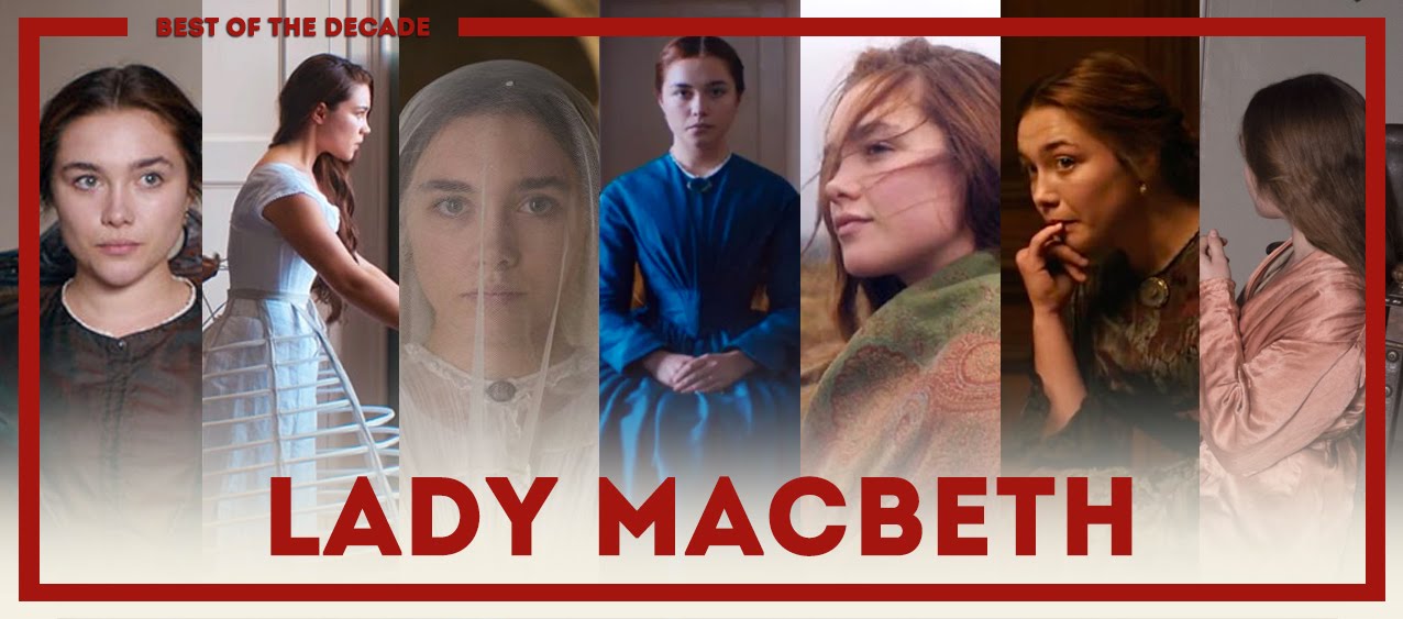
The Costume Design manages to find the delicate balance between respecting period-appropriate costuming and character-based design.
The standout for me is the use of period-accurate restrictive garments to underline the feeling of oppression in victorian society: she can't move freely, both metaphorically through social pressure and expectations and literally through corsets and hoop skirts that confine her to the inside of the house.

The costuming is also used to highlight the fact that she is treated by her husband and his family as a decorative object, meant to look pretty and stay silent.
Later, as she breaks free of her shackles, driven to murder and cruelty, the costumes start allowing more freedom of movement, even growing to break the established social rules of propriety.

All in all, Waddington manages to do a lot with a really constrained budget: she combines period-accurate clothing with expressive storytelling and manages to make period feel modern without twitching it.
Lady Macbeth was included on my 2017's Top Favorite Costume Designs List.
8. MAD MAX: FURY ROAD (George Miller, 2015). Costume Design by Jenny Beavan. Best Costume Design Winner at the 88th Academy Awards.
The fourth installment in the Mad Max Universe is a blockbuster like nothing you've seen before. It's simple, to the point and as nuanced as a movie with a guy with a guitar strapped on war truck can get. It is precisely that narrative simplicity that allows the breathing room to visually create a whole world that feels fresh and unique and coherent with itself. That's where the costume design really comes in to play.

Beavan's visualization of the post-apocalypse is haunting yet fun. A mish-mash of steampunk regulars and brand new ideas to rejuvenate this 80's iconic character.
She based Max's costume on the idea that he is a wanderer that picks up stuff from wherever he goes. This idea is further underlined by having him add elements to his costume throughout the movie itself.

But truly, the standout design of this movie is Furiosa's. She has, probably, the best costume design for a female character this decade. Part of this is due to the cool factor of the look, of course, but the core reason why the design works is that it speaks of her strength, but also of her humanity.
If you take a closer look, the fabric of her top is very reminiscent of the fabric worn by the wives, whilst the hard fabric of her pants is more reminiscent of the clothes worn by the many mothers. This points to the character's cultural patchwork, and speaks of overcoming traumas, as it is highly implied that she began as a sex slave after she was captured (therefore the visual link to the wives).

Last but not least, through the designs of the wives, the many mothers, the war boys, and Immortan Joe and his generals, the costume department draws the world in which Max exists: a world of cruelty, of abuse and lies, where everything and everyone is reduced to mere property.

Beavan's costumes manage to be iconic and narrative: a perfect combination of theatricality and decay. They manage to capture the essence of the wasteland in which they are meant to exist. That's why it is my number 8 pick.
Mad Max: Fury Road was included on my 2015's Top Favorite Costume Designs List
and on that year's Oscar Retrospective.
7. PHANTOM THREAD (Paul Thomas Anderson, 2017). Costume Design by Mark Bridges. Best Costume Design Winner at the 90th Academy Awards.
Paul Thomas Anderson has always been a very unique filmmaker. A director fixated with men driven by their own desires, demons, and obsessions. It was only a matter of time before he realized that if he was looking for that, the world of haute couture was the place to turn to.
Phantom Thread details the strange relationship between a couture designer and his young muse in 1950's London. The movie obsessively lingers and focusses on the way a garment is designed, how the fabric is draped, fitted and sewn, which allowed costume designer Mark Bridges to not only create beautiful couture garments but to shape the characters and the story itself through them. Thusly earning its spot as my number 7 pick!

The challenge Bridges faced was to create, from scratch, the ethos and visual style of a completely fictional couture house that would not only be true to the period but would reflect the personality of the character behind the design.
The costumes had to mirror the main character's vision of the world, of beauty and of women. They had to mirror him through the lens of fashion. And so, his couture creations were assigned a very distinctive look: heavy rich colors, heavy fabric, velvet, satin, heavy doses of lace with a nod to historical references. Delicate, elegant and the vision of a true artist.

It's that very vision that he imprints on Alma, his muse, lover and later, wife. Despite the exquisite designs created for Woodcock's fashion shows, it's in her costume design where we can truly appreciate the level of subtle detailing and thought poured onto the designs for this movie.

Alma, a fisherman's daughter, is swept off her feet and transported to a life of luxury and creativity where Woodcock is the absolute master. He drapes his vision onto her by dressing her in his designs. For him, she is the landscape and the blank canvas on which to paint it. An idea which is beautifully expressed through the costume design.
For instance, when we first meet Alma, she's wearing a burgundy uniform with a white apron. Later in the film, he designs a deep red dress with white lace on the skirt that resembles an apron. A dress that she is made to model for his costumers.
Through his dresses, he reinterprets her. He takes what he first saw in her and reshapes it to fit his needs.

In the end, Bridges designs work because they manage to give a quiet emphasis to the drama and subtly tell the story in the most visual way possible. He focuses not on creating a period piece, but on telling a story through couture, and he ends up imparting us a masterclass in creating character through costume.
6. ANNA KARENINA (JOE WRIGHT, 2012). Costume Design by Jacqueline Durran. Best Costume Design Winner at the 85th Academy Awards.
British director Joe Wright entered the decade as a name to look out for. After the critical darlings that were 2005's Pride and Prejudice and 2007's Atonement (both literary adaptations of renowned pieces of literature), it came as no surprise when he chose a brand new adaptation of Anna Karenina as his next project. Teaming up once more with his then muse, Keira Knightley, and costume designer Jacqueline Durran, he turned up a highly stylized and out of the box adaptation that would, unfortunately, be his last interesting directorial endeavor.
Here Wright delivers a poetic, conceptual and highly artificial take on Tolstoy's work. To highlight the absurd and theatricality of the Russian court in the 1870s, he shot the movie entirely inside a decaying theater, definitely setting his movie outside of the realm of historical realism. A tone, feel and concept that was heightened explicitly by the work of the costume design.

To reinforce Wright's vision of decadence and artificiality of Anna's world, Durran created a unique and whimsical wardrobe that reimagined the 1870s through the lens of the 1950s, as if to draw a parallel between the stiff social rules and hypocritical double standards of Russia's 1870s and America's 1950's.
By doing this, Durran adds a conceptual and thematic layer to every garment, cleverly combining two apparently unmatchable aesthetics and reimagining the world of Anna Karenina. This stylistic mash-up adds a sense of extravagance and luxury that connects the story to multiple places and multiple times as if to say: "there have been people like Anna and unjust social systems all through history and they continue to exist".

On top of that, Durran exhibits a sublime use of color and texture as a narrative tool all through the film. This is most noticeable at the ball where Anna meets Vronsky. Here, Anna is dressed in a dramatic black gown, with Vronsky in pristine white, whilst everyone else is wearing pastel colors.
Here, Anna's black gown functions as a visual way to create the idea of "polar opposites attraction" between herself and Vronsky. But it also signals Anna as someone who is standing out against social rules (here represented by the pastels in which the court is draped).

In hindsight, seeing her later work, this comes as no surprise. Durran has made a career out of creating reinterpretations of period costumes. But looking back, this is her crowning achievement. Here she takes chances and experiments to find a highly expressive use of color and silhouette that fill the visual spaces of this film with thematic ideas. And that's why it proudly stands as my number 6 pick.
NUMBER 5 IS... TO BE CONTINUED HERE
---------------------------------------------------------------------------------------------------------------
If you enjoyed this article and would like to support the blog,
consider buying me a Coffee? 💛💛
If you want more content like this, subscribe! Or come say hi on Facebook, Tumblr, Twitter, Instagram and help us grow!
DISCLAIMER: I claim no credit for images featured on this site unless noted. Visual content is copyrighted to its respective owners, and inclusion here is under fair use for criticism, comment, and news reporting purposes. If you own the rights to content here and wish it removed, please contact me.
This Beetlejuice Red Suit is absolutely stunning! The bold red color really captures the iconic look from the movie. Whether you're going for the Beetlejuice red tux or the signature red suit Beetlejuice style, this suit is perfect for any fan wanting to channel that unique, spooky vibe. The attention to detail is amazing, making it an ideal choice for cosplay, special events, or even Halloween. Definitely a must-have for any Beetlejuice fan!
ReplyDeleteموقع https://thecinemana.org/
ReplyDeleteمن أفضل المواقع التي جربتها لمشاهدة الأفلام وسماع الأغاني. يتميز بسرعة التصفح والمحتوى المتجدد باستمرار.