If the current mainstream cinematographic trend regarding fairy tales is to subvert the traditional format, does that mean that making a traditional fairy tale is actually more subverting?
Indian director Tarsem Singh seemed, to many, an odd choice to direct a retelling of a beloved children's story. Well known for his twisted and extravagant visuals and out of the box storytelling, many people questioned his incorporation to the project.
And though, yes, it is not a good movie, it has some really good elements. The best of these is, undoubtedly, his choice of making this movie a classic tale above all. It's outlandish and extravagant, but, at the same time, really what you would expect (both story-wise and visually) from a fairy tale.
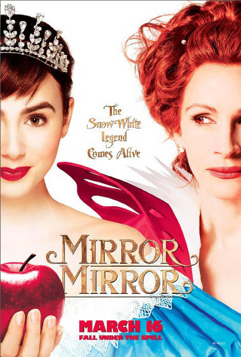
MIRROR, MIRROR: A CLASSICAL EXTRAVAGANZA

Mirror, Mirror took a more classical route in adapting Snow White; turning it into a family adventure. Here there is no action sequences, no big armies and no princess in armor. And, in its best moments, it captures really nicely the Disney spirit (even though this adaptation has no affiliations to the Studios).
This would not have been possible without the stunning costume designs by acclaimed Japanese designer Eiko Ishioka. She is a one-time academy winner for best costume design for her work in Francis Ford Coppola's Dracula (1992) and a heavyweight within the graphic design world. Unfortunately, she passed away right before the movie was released.
Ishioka was nominated posthumously for her designs in Mirror, mirror, which was her fourth collaboration with Tarsem Singh. Amongst said collaboration, we find design masterpieces such as The Cell (2000) and The Fall (2006).
I. SNOW WHITE
So, what does a classical Snow White need? First off the bat; a princess dress.

She is introduced to the audience with a wide, yellow skirt, a pink corset and puffy, green taffeta sleeves. All decorated with embroidered flowers and plants.

This is a very well put together a design that does a very good job of introducing the character and establishing the tone of the movie; it's a very clear statement. This is going to be a traditional "big-colorful princess dresses" movie.
And, as I said, it establishes the character as a wide-eyed and kind young girl. Also, the whole floral theme incrusted on the dress sets her connection to nature from the get-go.
On top of that, Ishioka designed every single dress taking into account the sets, so that they would create a visually interesting image. So take a moment to notice how gorgeous the dress looks against the blue backdrop of the set. This may seem stupid, but if the set wall had been any other color, the effect wouldn't be as neat and the colors of the dress wouldn't pop as much. These kind of silly details are really important in order to create iconic visuals.
As for influences, because it's trying to evoke the classic fairy tale feeling, the designs take from everything and anything between the 16th century and the 19th century.

But let's look at this specific dress. At first, I thought they had taken the skirt from the Victorian Crinoline, but it's clearly inspired by the shape of the 18th century "robe a l'anglaise". The main difference between the two is the shape; the crinoline is completely circular, while the "robe a l'anglaise" is flatter when seen from the side than from the front, just as Ishioka's design.
From the 18th century to the 16th; the corset is a simplified version of the Tudor bodice (minus the sleeves, of course), especially on the lower rim.
It also adds to the mix the traditional puffy sleeves of the 1850s (as made famous by Sissi's famous white dress immortalized by Winterhalter).
And as the cherry on top, it references the classic Disney's Snow White with the use of different colors for every part of the dress: yellow skirt, pink bodice and green sleeves.
This eclectic mix of influences creates an almost timeless feel, underlining the classic tone of the movie.
This first design has a cloak added on later. It's a full- length cloak that's bright yellow on the outside and soft pink on the inside.

It's a very visual design, again, and it creates really interesting shapes. Perhaps the biggest blunder is that she wears this in order to be conspicuous and sneak out of the palace, and I doubt anyone would use a bright yellow cloak to be conspicuous. That's perhaps the only thing I have against these designs; sometimes they focus so much on the visual that they are not really serving the narrative. But this is a fairy tale after all and logic has never been the order of the day, even in the narrative (this movie has a lot of wacky narrative elements, so the not-so-discreet cloak might even be intentional).

The usage of very soft and bright pastel colors is perfect for the character. The soft pink and the yellows highlight her very pale complexion and her hair as well, two of the most important features for the Snow White character (I'm looking at you, Huntsman movie). It also highlights the idea of the character as someone very innocent and pure-hearted.
Her next design is the one she wears at the Queen's Ball, where she also happens to meet the prince. It's a costume party, so she's dressed as a Swan; with a white, princess-style dress and a swan-like cap and wings.

It's a pretty outlandish design, but it's also perfect for the movie. The choice of having her dress as a swan is already a very good starting point; first of all, it works with the narrative. She's a beautiful creature that is trying to fly away from her designated life (which makes the element of the wings in the costume work really well). Secondly, it creates a great contrast with the Queen, who is dressed as a peacock. Innocence and elegant beauty against arrogance and over the top decorated beauty.
Snow White's Ballgown is a gigantic outfit; measuring from 5’8” to 6’ in circumference, and handmade from 25-35 yards of fabric. But, despite the size, it still feels very light and soft, befitting of the character that's wearing it.

As for its influences; we find a fine blend between the 1850's crinoline skirts (with the layer upon layer of silk and gauze) and the 1880's upper half (with the fitted bodice and the long gloves). The decorations (the cap and the wings) take a different route instead; taking inspiration from the 1770's masquerades and extravagantly decorated wigs.

Again, this mix is meant to breathe a familiar life and feel into this new story. Big princess dresses are nothing new, but it shouldn't be. Through its influences, this movie wholly embraces its roots and its inheritance from the Disney movies. The movie acknowledges where it comes from while trying to stir the genre back to its intended target (and away from the grand epics).
This is made even more noticeable with her next outfit. After the ball, she is forced to escape into the woods and finds refuge with a band of thieves that happen to be seven dwarfs. Because a 6' wide skirt is not the most comfortable garment to run around, they give her some new clothes for her to be in; a black, wide pair of pants, a cerulean chemise and a black bodice.

This is a more "rebellious" look for her; a more "free" look that perfectly matches her newfound freedom. As she explores and slowly brings out a more adventurous part of herself, her costume becomes more daring and risqué.

The best part of it, though, is that it never loses the "magic" feeling of her other dresses, and it still allows her to remain a certain innocence and kindness to her. This is, in part, because the pastel colors are still there. The cerulean blue chosen is a very deep and vibrant one. And the golden embroidery is very much in line with the embroidery in her past outfits.
In regards to influences, this is probably the less history-inspired of her costumes. It's basically a weird mix between real gypsy attire, the Hollywood version of it and Steampunk fashion.

The laced bodice with the chemise is probably the most identifiable element in the mix. But that's ok, because this design isn't meant to be identifiable it's just meant to be really different from the rest of her gowns.
The last of her designs is the wedding dress; which happens to be my favorite design in the whole movie. It's a unique and very impressive piece of design and it also brings the biggest innovation into Snow White's designs.

It's a gorgeous silk dress with a low neckline and a huge bow on her back, and a stunning color combination: mixing light blue with dark vibrant blue and bright orange.

This, first of all, is a very refreshing wedding design. Most of the wedding dresses shown in movies are white. Here Ishioka chooses to go wild and create a very vibrant wedding dress. It actually makes a lot of sense, especially within the narrative of the movie. The wedding represents the beginning of a new life for her (one as a woman, not a child) and one free from the clutches of the Queen. And so, if throughout the movie she has worn this really pastel, really light innocent pinks and whites and childhood-related colors, now she changes to really bright and vibrant adult colors which underline the vibrancy and freedom of her new life.
The influences on the dress are also very unusual; it mainly takes from various fashions of the 17th century, which is usually very much ignored.

This strange combo mixes the 1660's elongated corset shape, the 1630's neckline and the 1660's double sleeve with the outlandish dresses of the religious paintings of Zurbarán (a 17th-century Spanish painter). From him, Ishioka takes the bow idea and the concept for the double skirt. She also takes the from him the idea of the long sleeve under the double sleeve.
On top of that, she adds the vivacious colors, which are Bollywood inspired. The choice is only logical; on top of being a nod to the director's roots, the movie's credits roll over a Bollywood-like musical number, which makes it even more appropriate.
All in all, Snow White's designs are both over the top and delicate, managing a fine and difficult balance.
II. THE QUEEN
As important as the main character's look is, there is no good main character without an iconic baddie. So how does Ishioka define this villain visually? Mainly, through contrast. Most of the Queen's dresses are designed to pose a rigid contrast with Snow's look.
The Queen is introduced to the audience with the "peach dress"; a gigantic crinoline-type peach outfit with numerous embroidered patterns and rather large shoulder pats.

The first noticeable element (and the key element also) is the size itself. This is a larger than life dress expressly designed to be a statement of power. The character dresses to show power and, therefore, she has the biggest dress in the room, which is a feature that will be constant throughout the movie. Her costumes are always ridiculously gigantic.

I say "ridiculously gigantic" because the dress also is a bit ridiculous (which is also valid for all her designs). This is because her character certainly is. The design incorporates the notion that she is trying way too hard to be the "fairest of them all" and therefore she looks more ridiculous that actually gorgeous.
As for influences, most of her designs are clearly inspired by the 18th-century extravaganza: look closely at the hair. This specific case mixes the crinoline shape with the gigantic dresses of the mid-18th century Versailles and some high couture elements (like the shoulders). The basics are that she takes the most extravagant elements of each period and mixes them to create the epitome of extravagance.
This poses a great contrast with Snow White, who next to the Queen looks simple and elegant.
The Queen's next dress is the "golden dress", which she wears as she first meets with the prince and which she will later wear every time she goes to talk to the mirror.

The design is a 1630's inspired bright yellow dress that appears on scene both with and without the ruffles. It's the only dress of the whole movie that, were not for the color, could pass for a period piece. The over-the-top ruffles are actually historical and it's really nice to see a designer use the real extravaganzas of history to design a fantasy wardrobe.

For this specific gown, the ruffles are included to create the visual effect of a lizard, highlighting the reptilian nature of the character.
Her next dress is not inspired by reptiles, instead, it finds inspiration in the idea of the peacock to reflect another aspect of the character.

This huge piece of design consists of an early 18th-century type skirt with a corset lightly inspired by the 16th century and a peacock tail as decoration.

Again, this gown is designed to pose a strong contrast with Snow White's elegant white Swan costume; from the shape to the color, everything is meant to highlight that difference. The movie portrays her as someone who needs to be the center of attention constantly. Because of this, Ishioka very cleverly dressed her entirely in red in a room where everyone is dressed in whites and creams. She is, literally, screaming for attention.

Her next costume is on screen only for a very brief scene, and yet it's a gorgeous piece of design that is hard to forget. It consists of a green silk dress with long taffeta white sleeves.

This design is worn in a scene where the Queen dines with the prince and all he is able to talk about is how charming Snow White is. The dress, very fittingly, is therefore envy-green.

This is probably the less historically influenced gown she wears, and it mainly takes from haute couture shapes and textures. Still, it does a great job of defining the character, who is always a tad too tacky to actually be considered beautiful.
Her next design is the golden robe she wears when she pulls an enchantment on the prince. The outfit is heavily influenced on late Tudor fashion and is, just as her other outfits, big, shiny and over the top.

All of her designs are always a bit too overly-decorated and therefore, never feel quite perfect. But it works fantastically with the character.

Undoubtedly, the biggest dress in the whole movie is the Queen's wedding dress. This is a mammoth of a dress weighed a toppling 60 lbs and was 8 ft in diameter.

Once again, the dress is a bit too much overly-decorated to be truly beautiful. With the thousands of feather-like decorations and the enormous skirt, the dress feels too heavy and too false. This character is trying to look like something she is not.

Note how this is the only time in the movie where she's dressed in white (a color that early in the movie has been associated with Snow White). This is because she is trying to project the image of a young innocent new-bride to be (which she's not, considering that we are told that she's been married a few times).
Her final costume change happens after she's been defeated and she's lost all her youth and power. And so, she appears to Snow White's wedding in a brown and ochre cape, as she offers her an apple.

This is a very simple design, yet very clever. The color and the texture and printing are clearly inspired in the decaying forest, thus highlighting the decay of a character obsessed with never getting old.
The Queen's designs are characterized by being over the top, overly-decorated pieces of kitsch and that's probably the most clever idea of the whole movie. They clearly reflect the personality and obsessions of a character obsessed with youth and youthful beauty and capture the mind of such a vain woman in the most visual way. True, she never looks really dangerous, but she's not meant to.
III. THE PRINCE
The prince, just as his counterpart in Snow White and the Huntsman, is of little relevance to the overall story, but here, he has at least a distinct and funny personality. He is, basically, any given Armie Hammer character; a bumbling idiot that is somehow very much adorable and kind in his idiocy.

Because he is not very relevant, he has basically one basic look throughout the movie: the loose white shirt with the fitted pants and the knee-high boots and the jacket or the waistcoat.
This look is mainly inspired by the Regency hero; the Jane Austen male heroes and the like. Were it not for certain extravagant elements (the boots are a bit too wide at the top. the hats are a bit too large...) this would be a total Regency look.

Aside from his main look, he has one other outfit: the ball costume. The Prince presents himself at the Queen's ball dressed in a rabbit costume with white pants, shirt and waistcoats and a black full-length jacket with bright red lapels and a top hat with bunny ears.

The same way as dressing Snow in a Swan dress and the Queen in a peacock dress is really clever, so is dressing the prince in a rabbit costume. This helps to highlight his adorably useless persona.
All in all, his character might have little relevance, but he is way more memorable than he could have been had he not been played and dressed as he was.
WHY DO WE SAY THAT SOMETHING THIS CLASSIC IS CONSIDERED EXTRAVAGANT?
All things considered, most of the costumes of Mirror Mirror are no different than most of the designs in any given Disney fairy tale movie: bigger than life, colorful and lightly inspired by 16th to 19th-century fashion.
It's funny, then, to see this movie often described as "extravagant" when is nothing if not "classical" in regards to the fairy tale genre. When faced with this, it is impossible to deny the fact that the industry has gone through a 360º change in relation to fairy tales, and now, only want to produce big epics based on them. Huntsman was one of the first but look at Alice in Wonderland, at Maleficent... it's pretty undeniable.
In such an industry, a classic fairy tale is labeled as extravagant because is completely out of their standards and market needs.
Because of this change in trends regarding the fairy tale genre, doing a classical fairy tale is becoming, more and more, an act of subversion towards the mainstream, ironic as it is.
Mirror, mirror is, by no means, a perfect movie. I don't even think it's a good movie. But what's good about it, it's really good, some of the best I've seen recently; the designs are perfect, the tone is great, the casting is great, certain visuals are great... but it's not what people want to see. And that's a shame.
At this point, having seen many of these supposed grand epics of fairy tales, all I can say is: keep subverting and go back to the classics.
---------------------------------------------------------------------------------------------------------------
If you enjoyed this article and would like to support the blog,
consider buying me a Coffee? 💛💛
If you want more content like this, subscribe! Or come say hi on Facebook, Tumblr, Twitter, Instagram and help us grow!
DISCLAIMER: I claim no credit for images featured on this site unless noted. Visual content is copyrighted to its respective owners, and inclusion here is under fair use for criticism, comment, and news reporting purposes. If you own the rights to content here and wish it removed, please contact me.
Mirror Mirror was great! It was entertaining, fun, whimsical, and told the story in a new way. The dwarves stole every scene they were in, and they were REAL dwarves. The acting was on point, the costuming was amazing, and even the pacing was pretty good. It's not the best movie, but it's certainly one of the best re-tellings of Snow White I've ever seen. And...no kissing a dead person! Yeay!
ReplyDeleterivka alice porcelainaballerina
ReplyDeleterivka bonkowski ' rivka alice bonkowski' pretty
ReplyDeleteWow, this is an amazing article! Thanks for showing all the choices the designer made. I'm glad I'm not the only one who loved the fashion in this movie, and your point about making fairy tale stories into epics instead of classics is really interesting, I hadn't realized that, but it makes so much sense.
ReplyDeleteI completely agree that a mirror is more than just a reflective surface it’s an essential part of home décor. The right mirror can make any room feel larger and brighter. I recently explored Vibecrafts’ mirror collection, and their designs truly blend function with style, especially for modern Indian interiors.
ReplyDeletemirror from Vibecrafts is designed for everyday use, helping you get ready while making your space feel more open. Suitable for bedrooms, bathrooms, and living areas, Vibecrafts offers practical mirror options that fit easily into different layouts and keep your home simple and organized.
ReplyDeletemirror designs from Vibecrafts are suitable for bedrooms, bathrooms, living rooms, and dressing spaces. These mirrors help improve room appearance while supporting everyday use and better lighting reflection. Vibecrafts offers simple mirror styles that match different home interiors and help maintain a clean and balanced room setup.
ReplyDelete