Fantastic Beasts and Where to Find Them is the first of the planned spin-off/prequel series of the Harry Potter Saga and the screenwriting debut of J.K.Rowling, the mind behind the Harry Potter books.
This new installment is an ambitious attempt, both in scale and in narrative, as it tries to tell both a brand new story with brand new characters and also be linked to the original saga through the character of Grindelwald.
The problem is that this juggling act forces the movie to fit in together two stories that have little to do with each other. On the one hand, there's Grindenwald and the Obscurial's story and on the other, the bizarre adventures of Newt Scamander as he tries to fetch back his creatures. Separately, these two stories, could have made for two entertaining movies, but the problem is that, together, they just don't mix very well. On top of that, the radical changes in tone throughout the movie only manage to drag the final product further down.

But, despite the many narrative problems regarding the story, the movie has an undeniable visual excellence, both in the Production Design and in the Costume Design. This last aspect, in particular, gets to shine because, unlike the previous installments in the Saga, this is both a period film and a fantasy piece. A difficult combination of genres which allows for a very detailed and creative design.
COSTUMING A PERIOD FANTASY
The costume design for the movie was created by the great Colleen Atwood, whom we've talked about at length a couple of times in the blog before. She's one of the biggest names in Costume Design, as for the past couple of decades, and she can boast of having been nominated for her craft a whooping 12 times throughout her career, 4 of which she won. And she's most famous for her collaborations with her long time friend, Tim Burton, with whom she's been working since 1990.
She's the mind behind Edward Scissorhands (1990), Wyatt Earp (1994), Ed Wood (1994), Little Women (1994), which earned her her first nomination, Beloved (1998), Sleepy Hollow (1999, read more), Chicago (2002), which was her first win, Big Fish (2003), A Series of Unfortunate Events (2004), Memoirs of a Geisha (2005), Sweeney Todd: The Demon Barber of Fleet Street (2007), Nine (2009), Alice in Wonderland (2010), Snow White and the Huntsman (2012, read more), Into the Woods (2014) and Miss Peregrine's home for Peculiar Children (2016), only to name a few.
So, as you can see, her name itself is synonymous with Costume Quality. Which is why she's able to make this Costume Design look so deceptively simple.
The main idea behind the designs for this movie was to manage to create a look that would help define these brand new characters and this brand new story in a fresh way whilst also being reminiscent of the look of the original saga as to make believable the fact that they take place in the same world. And that, is a hard thing to do, but she achieve's it gloriously, which is, probably, why she ended up winning this year.
NEWT SCAMANDER: THE ODD BALL OUT
The new protagonist for this new saga is an awkward, borderline autistic, yet kind magizoologist played by Hollywood-darling Eddie Redmayne. He arrives in New York with the intent of setting free one of his magical creatures in his natural environment and, instead, stumbles into a whole bunch of hijinks as the rest of his creatures decide to escape and wreak havoc in the city. And, because of the unexpected turn of events for Newt, he, as set in the script, runs around the city in the same clothes throughout the same movie.
Design-wise, this poses a serious, and often overlooked, challenge. Atwood needed to conjure a way to visually capture Newt Scamander through one single costume, and, on top of that, it had to be fresh enough so that it would not become tiresome to the audience after 120 minutes of staring at it.
The principal actors don’t change costumes, so you have to create something that you are happy looking at – for over an hour and a half. It has to be interesting, but you can’t over design. [...] In this case, the costume for Newt has to say who he is very quickly, because you can’t evolve their character through costume changes like you normally would do.... - Colleen Atwood, Costume Designer -
Because of that, it all became about finding the right silhouette and the right color; that's all they could work with. And, in the end, what they came up with is, without a doubt, an immediately iconic look for a not so memorable character.

The ensemble consists of a deep turquoise wool coat over an ochre waistcoat and dark pants that are a perfect blend between 1920's fashion and Victorian fashion, which allows the design to fit within the period the movie takes place in and still feel like it's set in a fantasy setting.
I was designing period, but I was putting a fantasy twist on a period as it moved into the magical world. - Colleen Atwood, Costume Designer -
That blend serves as a necessary foundation on which Atwood builds the look of this character through all the tools at her disposal. The most noticeable tool she uses is, undoubtedly, color. Because, through her choice of turquoise for Newt's coat, she is able to visually reflect so many aspects of his personality.
The thing is, a lot of [Scamander’s] creatures had sort of luminescent color, and I wanted him to have a sense of being one with them, but not standing out, like he’s in some neon outfit in the middle of the street. I came to this blue with a lot of green in it, and it has a little bit of brown undertones. It’s an interesting blue because in different light, it photographs differently. I didn’t want it to pop too much, and I played with it a little bit. - Colleen Atwood, Costume Designer -
Having Newt's main coloration closely resemble that of his creatures is a very clever way of visually telling that this is a character that has more of a common understanding with his animals that with the humans around him.
Also, take notice that he is the only character wearing that particular shade of blue. In fact, most of the world around him is, exclusively in black, grays and earth tones. Which, inevitably, makes him stand out as unique and helps indicate the audience that he, should be the focus of their attention.

But, to further prove the artistry of Atwood, she is to be able to do that without actually making it that obvious. It has enough contrast to make you notice him more than the rest, but it's still similar enough so that your eye will be able to look at the other elements of the frame as well.
If you put it around black and navy and the colored coats—the grays and all the colors around it—it’s still going to work okay. It’s not going to be the only thing you see in the frame. - Colleen Atwood, Costume Designer -
This particular color also allows us to appreciate the incredible texture of the wool coat, something that would not be half as noticeable if they had used a darker color.
The other main tool she uses is the shape itself of the outfit, which is entirely designed to help the actor in his performance and facilitate his movement.
We played with the shape of it a lot, that coat, because Eddie squats down on his case a lot—does a lot of up and down movement—and he has a sideways gait to him that he evolved for Newt. It’s almost like an animal walk, in a way. I really wanted something that served him, too, and we did a lot of rehearsals with it to make sure it all worked for him, with his acting. - Colleen Atwood, Costume Designer -
Because he needed to have a lot of mobility, she loosened the silhouette, allowing him a more fluid movement.
I felt like he was a bird or one of his fantastical beasts. I wanted him to look regular in the world to pass, but also to be exceptional in a sort of subtle way. - Colleen Atwood, Costume Designer -
Also, that loosened silhouette makes the clothes look more ill-fitting, something that adds a necessary bit of quirkiness to the character. Because of that same reason, Atwood also gave him a pair of shoes that are ever so slightly big for his size.

She also sewed multiple hidden pockets into his coat as a nod to the character's personality, to help Redmayne get into character and, most importantly, to add a layer of verisimilitude to the outfit. It had to appear to be functional. A character like Newt would never choose a piece of clothing unless it was 100% utilitarian.
We put in all kinds of pockets, where he could keep potions and cures and, of course, some of his little friends. Most of the secret pockets are inside his coat, so [audiences] see very little of them, but they all have a reason for being there. - Colleen Atwood, Costume Designer -
All in all, every single element of the design manages to come together to create a rather iconic look that is both simple, familiar and yet somehow otherworldly. No small feat considering that she needed to achieve that effect with just one costume which, more than probably, is the reason why it won this year's Oscar for Best Costume Design.
THE GOLDSTEIN SISTERS: BRAIN AND GRACE
Next to Newt, as part of the movie's new line up, stand the Goldstein Sisters: two American witches with radically different personalities that will come to befriend and help Newt in his quest. On the one hand, there's Tina, a former agent of the MACUSA with a steely determination and a practical approach to problems. And then there's Queenie, a kind and rather peculiar Legilimens with highly heightened emphatic capabilities.

Because of the limited amount of screen-time that could be dedicated to them, their distinct personalities needed to be clearly drawn through the visuals as much as through the script. And that need is perfectly fulfilled by the costume design, which manages to create unique and distinct outfits for the two of them that both capture their core character traits and highlights the contrast between the them.
The most noticeable element when it comes to creating that contrast is, undoubtedly, the use of color. Tina is always dressed in dark grays and pale, muted blues, whilst Queenie is mostly dressed in various shades of pink and peach tones.

That is a pretty straight forward way of differentiating the two. Queenie is the more traditionally feminine one, so she's in pink, and Tina is the more modern and work-focus, so she's in the more masculine grays and blues. That very basic color coding is used throughout the movie in their different outfits.
But, the finishing touch that makes this basic identification feel fresh is Atwood's clever addition of blue, a color identified with Tina, to Queenie's main outfit.

This serves as a visual queue that highlights Queenie's strong relationship and deep connection with her sister, despite their apparent differences, and it's a very clever use of color coding on the designer's part.
The other main element used to build their contrasting personalities is the style itself: Tina, who displays a more "traditionally male" disposition (being borderline workaholic and being so professionally driven) is always in pants, whilst Queenie, who is the radical opposite of Tina, is always in shape-hugging dresses.

Tina is something of a modern girl, so I made the decision to put her in trousers from the start. It wasn’t so common at that time, but it did exist. - Colleen Atwood, Costume Designer -
Also, Tina's outfit, with her dark trench coat and suit, has a certain gravitas to her. It's easy to see that she means business. On the other end of the spectrum, there's Queenie; all her clothes have this sense of air and light. There's a lightness to her that heavily contrasts with Tina's seriousness.
Atwood is so consistent with her visual approach that this difference in style is even found in their pyjamas, even if these only appears ever so briefly.

Actually, on the only occasion where Tina actually wears a dress is in the clandestine Jazz Club they go to get information, and it's heavily implied that she would not be able to enter otherwise. So she only wears it because she has no choice.

It's also worth pointing out that this is the only time where Tina is not dressed in her standard gray/blue palette, instead leaning more towards the peach tonalities of Queenie. So it's very visually clear that she's not exactly being herself in that scene.
So, through a clearly established color scheme and a very simple stylistic guideline, Atwood manages to both visually represent these two characters and visually contrast them against each other.
JACOB KOWALSKI: THE NO-MAJ
Jacob Kowalski, the no-maj sidekick, functions within the story as the audience's avatar; the uninformed stand-in for every audience member. Because of that, Kowalski is a rather unremarkable and common 30 something man, albeit a very funny one. He also has not a single clue about the magical world. And all that needed to be reflected in his outfit for the character to be believable. His outfit needed to underline and highlight his non-magical nature.

Because of this, Atwood created for Kowalski the only 100% historical costume in the movie. He's dressed like a low-income individual in New York in the 1920's would dress.

The only main difference is that he doesn't have a coat, which would be a rather essential element back in the day. This was a conscious choice by the designer in order to emphasize his vulnerability and financial situation.
He doesn’t have a coat and that makes him look vulnerable, and his clothes have little mends and patches on them that you don’t see, so he had a ’20s comic look. - Colleen Atwood, Costume Designer -
Also noteworthy, is the chosen color palette: muddled grays and dark browns. Which, in turn, gives him a very common appearance. There is, literally, nothing remarkable about this outfit, just like there is nothing "remarkable" about his character.
PERCIVAL GRAVES: DISGUISSED DARKNESS
Any fantasy-adventure movie is only as good as its villain, so it was particularly important for Percival Graves to be as visually unique and recognizable as the good guys. He needed to be memorable without being overtly evil-looking.

Graves is the President of the Magical Congress, therefore, a powerful figure with a lot of influence within the magic community. That power and strength was something that needed to be felt in his costume. This was achieved, mainly, through the silhouette: emphasizing and highlighting certain aspects of it.
I wanted him to feel powerful and to really have a costume that gave him presence and set him apart from the other people—so I exaggerated certain things, like the length of his boots and his shoulders. - Colleen Atwood, Costume Designer -
On top of that, dressing him in such a dark and rich blacks was a quick and effective way to point him out as the villain.
Unfortunately, there isn't much more to the costume, but, to be honest, there isn't much more to the character either. Graves is a rather flat villain. More utilitarian to the plot than actually interesting.
CREDENCE AND THE BAREBONE FAMILY: THE PURITANS
Alongside Graves, the Barebone family stands as the main threat for most of the movie. Mary Lou Barebone, the matriarch of the family, is a religious zealot in charge of a crusade against Witches, Wizards and Wizardry under the name of the New Salemers. She is, literally, trying to start a Witch Hunt to purge American cities of Magical individuals.
Her backwards thinking, bigoted ideas and borderline puritanical behaviour needed to be reflected through her costume, as well as through the costumes of her "children", mainly because they do not get that much screen time dedicated to them. And what better way to reflect all that than by heavily adapting the costumes on 16th century American Puritan Fashion to smoothly fit in with 1920's fashion.
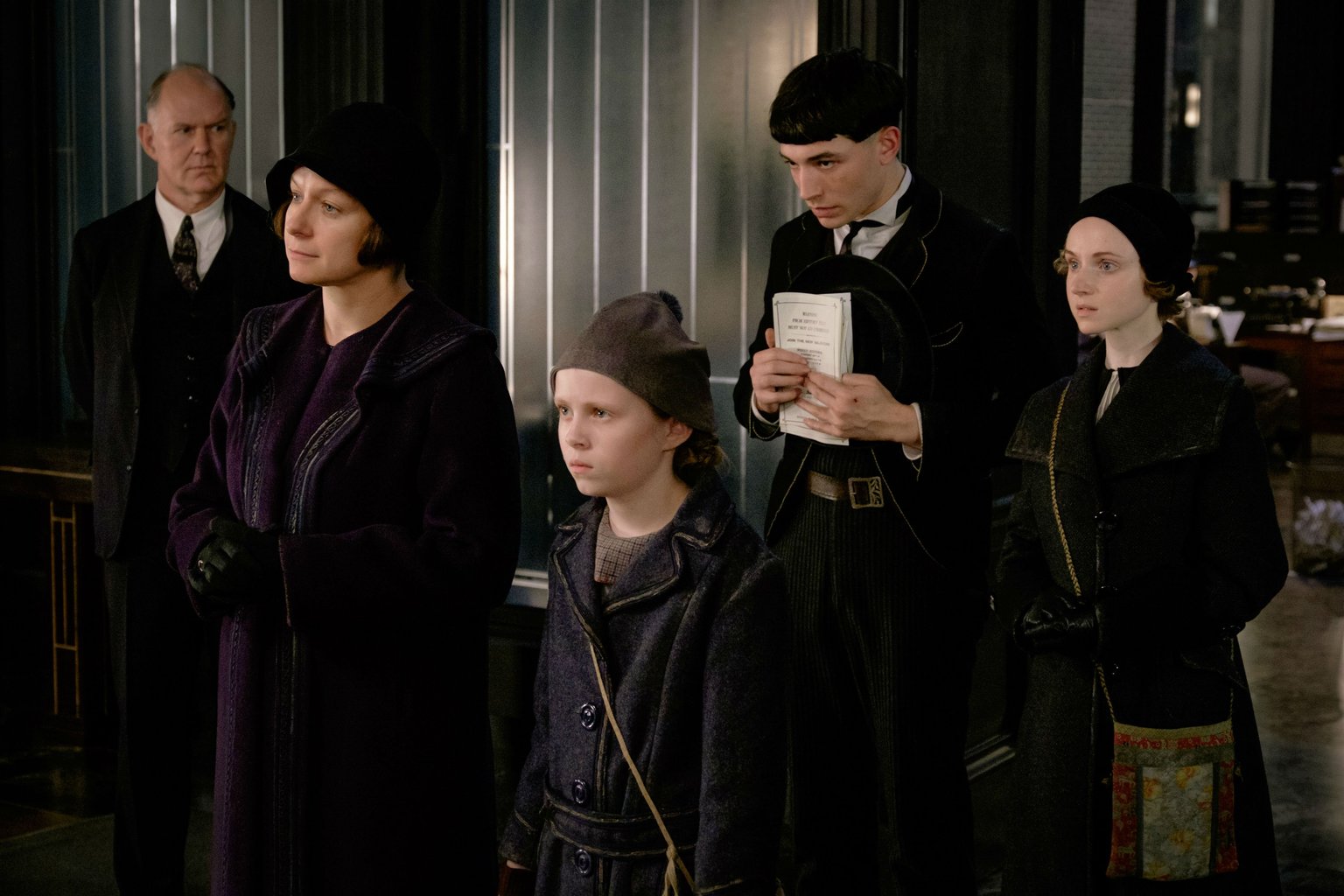
From their subdued, grey-toned clothes, their cap-like hats and their humble fabrics, the Barebone's look almost like they belong in the Salem trials.

Also, note how the hat worn by Credence, a black, broad-brimmed hat, bears a more than a passing resemblance to the so-called "pilgrim-hat".

It's a very slick mix of a 1920's fedora with the stark rigidity of the pilgrim's hat, and it basically serves to create this sense of someone living in the past and also highlights his role as an outcast.
The simplicity of these designs, and the fact that they center around one single idea, turns them into very effective designs. Their intent is clear and the visuals they create are striking and effective.
SERAPHINA PICQUERY: POWER THROUGH COSTUME
Despite being a relatively minor character, Seraphina Picquery stands, design-wise, as the biggest eye-candy, having some of the most original and creative outfits in the entire movie.

As head of the Magical Congress of the United States of America, she's an extremely powerful figure (which makes it even more of a shame that she doesn't do much in the story) and her costume design, therefore, aims to show her power and her status as much as possible. It's all about power-dressing.
She has several outfits throughout the movie, but it is undeniable that the most spectacular is the gown she wears during the Congress Meeting in which Newts is arrested. The sheer scale of it is impressive, as is the weight and power it projects.

Both through the choice in fabric (heavy velvet) and in coloration (dark, rich blue), Atwood is establishing her as a seat of power. She also sewed onto the dress the phoenix that stands as the symbol of the American Wizard Community, furthering cementing that status.
And, as the cherry on top, she added this dazzling Indonesian-inspired headpiece that adds a lot of presence to her character.
Because there were people in ethnic attire from all over the world in that scene, I wanted her to have something with scale that would hold up in that room. And the way [cinematographer] Philippe [Rousselot] placed it in that shot. … I walked in and went, ‘Oh, this looks amazing.’ [...] The back of that’s kind of a turban, but the front’s a huge kind of garden crown, and it gave her scale. She was in quite a huge room for that shot…I mean, it added probably ten inches to her height. Not to mention the shoes I had on her, but just to give her a very vertical and powerful sense in a room of powerful people. - Colleen Atwood, Costume Designer -For the rest of her scenes Seraphina appears dressed in powerful suit dresses and an ethnic turban.

She wears a turban the rest of the time, just to set her apart from people. I wanted her to have this sort of tribal beauty to her, but also feel powerful. - Colleen Atwood, Costume Designer -
CONCLUSION
Fantastic Beasts and Where to Find Them is a very polarizing new entry to the Harry Potter Universe, with some fans loving it and some fans loathing it. The truth is somewhere in between. This is a competent movie made by a director that knows what he's doing and actors that try their best with the material. If you add to it the excellent visual design, we could be facing a really entertaining blockbuster. Unfortunately, the script is simply not up to it and it drags everything down.
And it's truly a shame because the visuals really work. Particularly Atwood's design, which is amazingly good at achieving a lot with very little. It's original, memorable and overall enjoyable. Atwood brings magic into the real world in a way that none of the previous Potter movies had managed to do. And it was no easy feat.
So, yes. This was a deserved win. Certainly not my personal favorite of all the nominees, but it is not an outrage that it won.
---------------------------------------------------------------------------------------------------------------
This is the fifth and final article of the Oscar Retrospective 2017! Join me next week when I'll be talking about the much controversial Belle Yellow Gown in Disney's new Beauty and the Beast! Meanwhile, check out last year's Retrospective covering: The Revenant, Cinderella, The Danish Girl, Carol and Mad Max: Fury Road.
---------------------------------------------------------------------------------------------------------------
If you enjoyed this article and would like to support the blog,
consider buying me a Coffee? 💛💛
If you want more content like this, subscribe! Or come say hi on Facebook, Tumblr, Twitter, Instagram and help us grow!
DISCLAIMER: I claim no credit for images featured on this site unless noted. Visual content is copyrighted to its respective owners, and inclusion here is under fair use for criticism, comment, and news reporting purposes. If you own the rights to content here and wish it removed, please contact me.
I honestly loved the film (even if it has some issues but nothing major imo) but then again I am a huge Harry Potter fan.
ReplyDeleteWhile I think the costumes are well executed there is a bigger issues I have with them that Atwood could do nothing about. The wizarding world should have more of their own fashion style and culture which they do in the books (muggle clothes are only worn by children during summer and some other occasions) but the previous Harry Potter films decided to disregard robes for most of the characters and even the robes that were there were not well designed. People say that robes would look bad. But you should be able to design good looking robes that are somewhat influenced by muggle fashion but still their own thing like from a different culture that is influenced by the other one a bit. It would set the worlds better apart and made the wizarding culture more rich. The fact that there is no as difference between male and female fashion there is with muggles when both wear robes would have emphasized that there isn't the same cultural sexist attitudes with men and women as well. It's just annoying missed opportunity and the school outfits for Hogwarts students are most annoying since they looked so bad even the films stopped using them.
So Seraphina's main outfit was the only one I really liked but it does not seem to fit well with how other people dress so it stands out a bit too much for me. Also Newt could have dressed like he did actually since he was traveling with muggles, so that outfit was nice since it wasn't typical muggle fashion but ordinary enough and great for the character.
I couldn't agree more with you in reggards to the costume design of the Original Saga. There were so many missed opportunities there. And I get the feeling they went with such standard clothing as not scare off the people that claim "not to like fantasy". But I really would have loved to see more Wizarding robes and consistent school uniforms.
DeleteAlso, I think that Atwood did her best with what she was given and it shows. Because the costumes for this look so much better than the one in the Original Saga. But I get your point. it would be much nicer if there were more outfits like Seraphina's.
I like the description of Newt Scamander's coat and inside pockets, Stan Laurel of Laurel and Hardy comedy, always had a coat with pockets he could pull surprises out to irritate Oliver Hardy. Could be a means of humor, but seems the coat and amazing creatures a bit frightful? Costume analysis here was good, so much to read and watch film again. It is very popular in the public library here in our rural town. atk
ReplyDeleteHonestly, you’re take on the film is really dumb.
ReplyDeleteIt’s not your part to see the “film is two separate stories”, because it isn’t, it’s one story with a multitude of plot threads that do go together. Where there are threads left dangling, we can assume they’ll be tied up in future installments, as it’s a 5 part story.
You aren’t, apparently, able to comprehend narrative elements like “beards”, red-herrings, subplots, etc, because if you did, you’d realize there isn’t “two plots”, there’s one: the hunt for the obscurus, to stop it from attacking the city.
There also isn’t a split tone. You’re selectively attending to that which is lighthearted in the film to reach this determined conclusion, but the film’s tone, and themes are consistently dark. A film is allowed to have a comedic moment here and there without it being criticized for it.
Your criticisms are weak and don’t support the negative assertions you make: “the script pulls it down”, no it fucking doesn’t, you idiot.
Thank you for your opinion. We clearly disagree on the topic. I would, nevertheless, suggest a more congenial tone to your comment. Your insults are completely out of line.
DeleteYou can disagree with me as much as you like, and If you'd even cared to look around the blog you'd see that I encourage people to let me know what they think.
What I do not tolerate is you being so incredibly rude. If this is the tone you are going to take, I'd rather you just turned around and read something else aside from this blog.
The next time you disagree, just let me know. But another message with this tone and I'll block you. Sorry, not sorry.