
Agent Carter: 1940's superhero espionage. Part III

Up until now I've been focusing exclusively on Peggy Carter, our amazing lead in ABC's canceled Agent Carter, but this retrospective wouldn't be complete unless I also focussed on the wide array of supporting characters that make Peggy's adventures that much more amazing. One must take into account that she is as defined by her own personality as she is by the world around her. But, because there are just so many amazing characters to talk about, in this third entry I am going to just focus on the men in her life and how are they defined through costume design.


Why the men? Well, she works in a world of men and, therefore, she is, more often than not, surrounded by men.

Before starting, take into consideration that it would have been very easy, considering they are working with a TV budget and that these are supporting characters, to simply dress them all in standard 1940's suits and call it a day. Instead, the designer chose to use the possibilities the period offered her to visually define every single one of the supporting male characters. It's such attention to detail what makes this show great.

EDWIN JARVIS: THE HELPER

Edwin Jarvis is the overly attentive, British butler of Howard Stark, and the usual sidekick for Peggy's adventures. He's a polite gentleman, caring, and responsible. Also, working for Stark, he is a well-paid employee, which means that he can actually afford to dress classy.


But let's break all that down. First of all, he's British. And accordingly, he's dressed in a totally distinctive way from all the rest of the American male characters. He is, therefore, visually defined by an overtly European style. That is achieved by dressing him in tweed suits (which Britain is famous for) and the occasional subtle plaid.


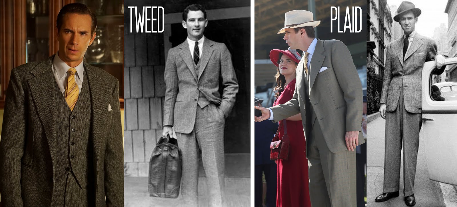
He's also the man in charge of Stark's affairs, which means that he has to dress up for work. He needs to look polished; which perfectly explains the choice of dressing him always in costume-made 3-piece suits which are finely tailored. After all, millionaire Howard Stark wouldn't allow his butler to go around in a cheap suit.


But despite having access to that luxury, he is not rich, and therefore he doesn't have a large closet. He suits might be really nice, but he has only a handful of them and he goes back and forth between them. Which is a nice detail for his character. He's classy and elegant, but he is not rich nor spoiled.

In the end, with a couple neat 3-piece tweed suits, the designer manages to reflect both his British roots and visually differentiate him from the rest of the male characters.

HOWARD STARK: THE PLAYER

Howard Stark is a millionaire inventor, engineer, movie director, businessman and founder of Stark Industries. He is also a cocky womanizer, an eccentric genius and an egocentric yet charming jerk (much like son). He's a self-made man. Born to poverty, Stark has raised himself to the top. He's a rebel.


And in order to highlight that, you'll notice that he is the only male character that is not dressed in the standard 1940's suit. Instead, he is more prone to wear open-necked shirts and casual sports jackets. And hardly ever wears a tie unless he really has to.


His style is casual, but high-end nonetheless. All his clothes, even though casual-looking, are custom-made, as befits a man of his fortune. He is going for a luxury playboy look, which only gets more accentuated when he moves to Los Angeles in Season 2. His look is very clearly inspired by Howard Hughes, which is a logical choice considered that the character itself was inspired by the eccentric millionaire.


Another very important element is the sheer size of his closet. Unlike Jarvis, he has a never-ending supply of cool jackets and fancy shirts and other glamorous items. Let's say that restrain is not Howard Stark's forte; he has money and he likes looking dapper. In the end, the size of his wardrobe is made to fit his ego.

THE SSR'S MEN

With Jarvis and Stark out of the way, it's time to focus on the men of the SSR. Most of them are outfitted with more typical American suits for the period: pleated and cuffed high-waisted pants, wide lapels, and short, wide ties. But let's have an individual look at each one of them.


Chief Dooley is a middle-age, war veteran that leads his team with a strong hand. He's a very fatherly figure, but rather condescending towards Peggy. It's not that he thinks she's useless, but he has this very conservative view that a woman shouldn't be in a position where she could get hurt. And as a way to reflect that conservative mindset and the fatherly aspect of his figure, he's dressed in a very classic and mature style for the period: a double-breasted suit.


Such a choice makes perfect sense; it's an iconic look for the American '40s, but also a power statement much suited for his position as Chief.


Also, note that, unlike Stark, he never shows up without a tie. He does things properly, as "God intended" as he himself would say.

But he is not alone in the office. Jack Thompson is the up and comer. He's much younger and much more ambitious than the boss. He's after Dooley's position, and, therefore, he always dresses to impress. And so, he's generally presented sporting a single-breasted suit coupled with suspenders, a look that, at the time, was considered more fashion-forward and edgy and was favored by the up and coming young stars of Hollywood such as Alan Ladd.


It's only logical, Thompson dresses in a "new" edgy style, whilst Dooley favors the "old" classy style, therefore posing a clear visual difference between the two. It's old versus new.


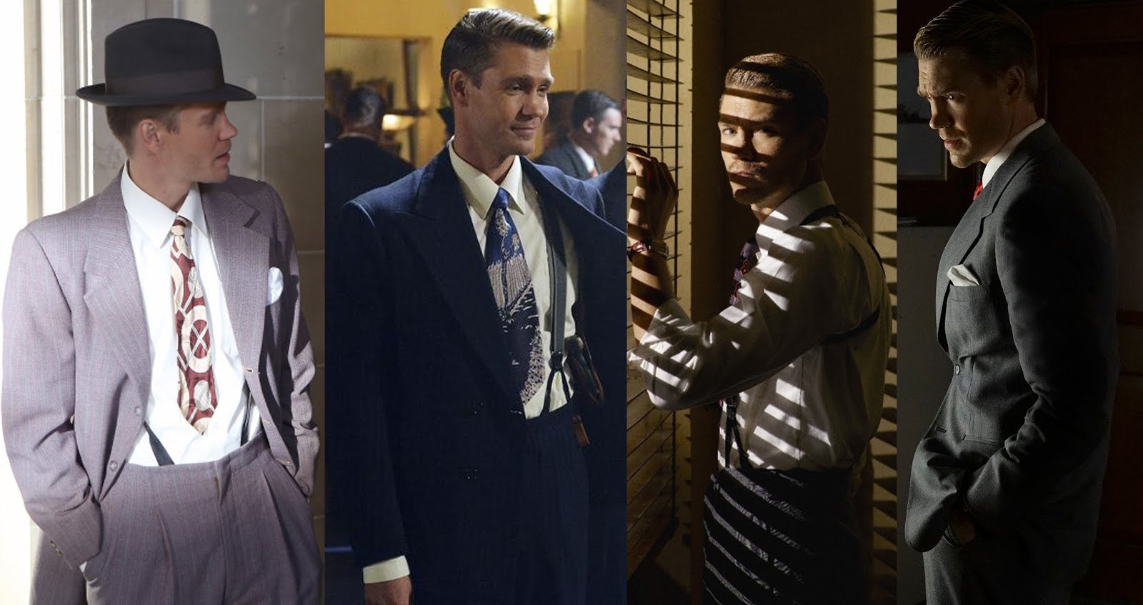
The designs for Thompson certainly underline his confidence in his own abilities and himself. Something that Daniel Sousa certainly doesn't have as much.

Sousa is a broken soldier. He returned from the war with a serious leg injury that left him crippled. So he has relatively restricted mobility, which heavily affects his self-confidence. Because of this, his style is much less edgy than Thompson's, usually sporting simple pleated pants and a sweater vest under his sport coat.


It's all about comfort for him. His leg makes things complicated enough for him to dress uncomfortably. Also, his physical vulnerability stirs him away from the "macho" stereotype, turning him into the most approachable male character in the office for Peggy. By choosing such a style for him, that approachability is very effectively transmitted to the audience through the designs alone.


This style is carried through to season 2 with light changes, mainly due to the weather. And so, as he moves to L.A, Sousa vanquishes the comfortable and warm vest in favor of a shirt and summer jacket. It's a necessary change. Still, his overall look continues to be approachable and comfortable.


The last member of the SSR offices is Ray Krzeminski. He is quite the opposite of Sousa. He is a bully. He is big, violent and inconsiderate. And, appropriately, he dresses in a much more careless style: sport jacket and open-collar shirts that, most of the time, are badly pressed and stained with food. He is a slob; the kind of guy that doesn't care at all about how he looks at all. He's all brawn and no brain.


Everything about how this guy looks screams at carelessness and tactlessness, which helps define a character that doesn't get much screen time but is still necessary for the story.

CONCLUSION

In the end, the designer manages to transmit a lot simply by twigging with details: add suspenders, add a vest, remove a tie... etc. These are really simple designs. But they work. The characters and their personalities set the route the designs will take, and in return, the designs help create the character in the audience's mind.

It's a masterful lesson in male costuming. Designing for male characters (at least any male character set in the 20th or 21st century) is probably the hardest task for many, because it needs to be much more toned down and subtle that female costuming and male costuming simply doesn't have as many elements to play with. But Giovanna Ottobre-Melton shows us just how much can be achieved with so little.

--------------------------------------------

As of now, there's only one article left to write in this Agent Carter retrospective, and it will focus on the designs for the female supporting characters., thus wrapping up the series. See you next time!


---------------------------------------------------------------------------------------------------------------

If you enjoyed this article and would like to support the blog, 
consider buying me a Coffee? 💛💛

If you want more content like this, subscribe! Or come say hi on FacebookTumblrTwitterInstagram and help us grow!

DISCLAIMER: I claim no credit for images featured on this site unless noted. Visual content is copyrighted to its respective owners, and inclusion here is under fair use for criticism, comment, and news reporting purposes. If you own the rights to content here and wish it removed, please contact me.


Comments

Popular posts from this blog

Burning Question: What's wrong with Belle's gown?

Since the first promotional pictures of Disney's new Live-Action remake of Beauty and the Beast hit the internet, there has been a lot of discussion around Belle's iconic ball gown. And, even months after its release in cinemas, there still continues to be a lot of buzz around it. Why? Mainly, because a lot of people feel that it is just doesn't look that good. The thing is, Belle's animated yellow ball gown is, at this point, an iconic staple of animated cinema. Everybody knows it and everybody loves it. And, as a result, everybody can see the new one and say "this is not the costume I know". Therefore, everyone can compare it down to the smallest detail and see that it just doesn't quite look right. Today, my goal will be to try and dissect the design in order to answer the burning question everyone has been asking themselves: what's so wrong with the "new" dress? Or, to put it bluntly, why is it so incredibly underwhelming?

A look into Star Wars: Padme's Dresses. Annex B

Love her or hate her, Padme and her costumes can never be far from our minds. They are too iconic, and probably one of the few memorable aspects of the prequels, so it's really fun to talk about them. And so, I've decided to continue what I started and focus on the costumes I left behind from Episode II . So let's dive back into it! A BRIEF REMINDER What are the Annexes? Well, the Annexes focus on all the costumes that were "left behind" in my selection of Padme Costumes for the A look into Star Wars: Padme's Dresses series. Here, I point out influences, likes, and dislikes, and anything that might feel relevant whilst digging into the gigantic wardrobe of this Galactic Queen. With this out of the way, let's go! ANNEX B: THE ATTACK OF THE CLONES Episode II: The Attack of the Clones brings the character and her designs to a completely different level; she is not a queen anymore, which unfortunately means that she no longer has amazingly weird an

Disney's Cinderella(s) and the evolution of the "princess" aesthetics

Every girl, at some point in life, has wanted to be a princess. It has become undeniable that the concept of the "princess" is, for better or worst, inseparable from girlhood. We live in a "princesses" obsessed era, and we have for a long time now. And a lot has been said about it, with loud people yelling over the internet about the positive and negative aspects of it. So it was about time for me to join the yelling contest, I guess. If I'm going to talk about princesses, the logical place to go is to the Global Mogul Conglomerate that has led the trend and, in many ways, defined it: Disney. They have, undeniably, redefined the fairytale and have turned the term "princess" into a best selling Licensed Entertainment Character Merchandise. The thing is, even though princesses have been part of the fairy tale canon for a very long time, they didn't become the central figure until Walt Disney placed them there. In the tales that the G

Historic Accuracy in Costume Design: The 16th century

I've never been a purist with historical accuracy as long as the changes made have real reasoning behind (generally a narrative or symbolic one). I will always think that La reine Margot (1994) costume design is one of the most gorgeous and smart designs ever, even if said designs' main premise is to purposely bend the period in regards to costume. But there are certain things that bother me in regards to historical accuracy in costume which I realized when I found myself constantly irritated while watching The other Boleyn Girl (2008). This led me to post a question: when is it right to bend history? why is it interesting sometimes? whilst other times it's simply horrendous? To me, when these changes are made for the narrative's sake, I'm usually on board (like the 2012's "Anna Karenina" designs, which mixed the 1870's fashion with 1950's fashion in order to enhance the sense of theatricality and falsehood in Imperial Russia). But wh

Why Oh Why? Peaky Blinders and the mystery of Grace's Crappy Hair

There are many unanswered questions out there. Many, many mysteries that will never be unraveled. But amongst those, the one that keeps me up at night is why was Grace's hair so crappy during the first season of Peaky Blinders ? Don't get me wrong, I absolutely love Peaky Blinders . I'm human, believe it or not. I've watched all its five seasons (twice) and I'm impatiently waiting for its sixth season with bated breath. And I can vouch for it: it's a quality show. Good storytelling, good acting, great photography... and for the most part, great character design both in costume design and hair and makeup. That's why I'm still baffled by the decision of having Grace's character sporting what amounts to limp California Beach Waves for the whole of the first season.  Because, while it is true that the first season had a considerably lower budget than its following installments, a shitty approach to historical accuracy wasn't the general tone for the

Cleopatra or the Most Undeserved Oscar Win ever

There is a reason why I usually do not review movies from the "golden age" of Hollywood (which means any movie prior to the 1970s), and that is because back then they cared even less about historical accuracy in costuming than nowadays, which is saying a lot. Because of this, most of the "historical" movies generally ignored the period and just did whatever was fashionable at the time with a spice of the supposed period. This is something that usually makes me laugh, rather than angry, because it results in very funny outfits (peplums particularly created a lot of funny imaginary). And Cleopatra , 1963's epic about the Egyptian queen, was for most of my childhood one of those movies. I knew the costumes were not accurate, but they fascinated me anyways in their ridiculousness. That is until I heard that the movie had won an Academy Award for Best Achievement in Costume Design, the same year that " Il Gattopardo  was nominated for Best Costume Design. A

Crimson Peak: Dressing Edith Cushing. The Butterfly

"Beautiful things are fragile" - Lucille Sharpe - Opposite Lucille stands our main character in the movie: Edith Cushing, a young and naive American with ambitions to become a writer. She meets and falls in love with a handsome and charming, but impoverished, English baronet: Sir Thomas Sharpe. They eventually marry and return to England, to the Sharpe's dilapidated mansion: Allerdale Hall. There they live with Thomas's sister: Lucille. The deadly apparitions that haunt the house will force Edith to slowly uncover the buried secrets of Crimson Peak. And so, Edith is to become a fragile butterfly caught in a moth's trap. PART II: THE BUTTERFLY Edith has considerably more frocks and gowns than Lucille does. It's only logical. Edith is our protagonist and, as such, has a bigger emotional arc throughout the movie, and she undergoes bigger changes. These are, in part, expressed through the costumes she wears and how these change throughout the mo

The FollowUP: Disney's Jasmine and the evolution of the "princess" aesthetics

Previously in this blog, I talked about how the aesthetics of the Disney Princess Brand have changed through the different iterations of Cinderella (read here ). Since then, Disney hasn't stopped rehashing and remaking its old animated classics. On the contrary, it has doubled down on this business model and its remakes have become more common, more widespread, and more successful. Since the 2015 remake of Cinderella , Disney has remade The Jungle Book (April 2016), Beauty and the Beast (March 2017), Dumbo (March 2019), Aladdin (May 2019), The Lion King (July 2019), Lady and the Tramp (November 2019), Mulan (scheduled for release July 2020) and Cruella (scheduled for release May 2021). Remakes for Snow White and the Seven Dwarfs , Pinocchio , The Little Mermaid , The Hunchback of Notre Dame, and Bambi are in development. Clearly, the live-action remake has become a staple of the brand and it cannot be ignored. Unfortunately. Seeing that this industry trend will not go any

Moulin Rouge and the art of Kitsch

The spring of 2001 saw the release of Moulin Rouge! unexpectedly shake the movie industry and the box office simultaneously. Despite the many awards, including 8 nominations at the Academy Awards, and the impressive box office numbers, the movie quickly became very polarizing for audiences. Love and hate seemed to be the only two possible reactions to the movie itself. But that should not come as a surprise. The film was directed by Baz Luhrman, who has consistently been, throughout his career, one of the most polarizing filmmakers of his generation. I still have to meet anyone who simply doesn't mind his movies (which include Romeo+Juliet , Australia and The Great Gatsby ); it's either absolute love or absolute loathing. There is no middle ground with him. And that's mainly because he himself doesn't compromise when it comes to his style, which is so characteristic at this point (fast and frantic editing, vivid use of flashy colors and sparkle and stories a

A look into Star Wars: Padme's Dresses. Annex C

It's been a while, but I always come back to her in the end. Padmé Amidala, from the Star Wars Prequels, is a Style Icon and my personal standout from the mess that Episode I to III ended up being. Because of it, I've decided it was time to finish what I started so long ago and finally address Episode III . It took me long enough.  So let's dive back into it for one last chance to love, hate, snark and bark at the astonishing monstrosity that is Padmé's Wardrobe! A BRIEF REMINDER What are the Annexes? Well, the Annexes focus on all the costumes that were "left behind" in my selection of Padme Costumes for the A look into Star Wars: Padme's Dresses series. Here, I point out influences, likes, and dislikes, and anything that might feel relevant whilst digging into the gigantic wardrobe of this Galactic Queen. With this out of the way, let's go! ANNEX C: REVENGE OF THE SITH Episode III: Revenge of the Sith brings the prequel trilogy to a close and, ve