As I'm sure I've mentioned before, the size of Padme's wardrobe is leaning towards big. One might even say gigantic. Because of this, I am forced to choose which ones I review and which ones I don't. Otherwise, I would still be reviewing the costumes from Episode I. Thanks to this selection process, right now, in my Padme series, I am reviewing costumes already from Revenge of the Sith. But lately, I've been thinking a lot about those designs that got "lost in the selection", as I call them.


WHY WEREN'T THESE SELECTED?
Generally, those that I did not select for the series were considered "not interesting enough". But what does that mean? Well, it means two things; either they pulled from the exact same influences as any of the dresses I had already addressed (which would make for a very repetitive article) or were considered too simple and basic to talk about them at length.
And then, of course, were those that I simply did not like.
WHAT ARE THESE ANNEXES?
This will be, basically, dedicated to covering briefly those designs that were "left behind" both from Episode I and II, and III once I finish the "official selection". I will point out the appropriate influences, both historical and artistic, and also talk about my likes and dislikes.
So, with that out of the way, let's begin!
ANNEX A: THE PHANTOM MENACE
Episode I: The Phantom Menace has the most out-there, extravagant designs, probably because she is acting as Queen in it. And I certainly left a lot out of the official series.
A1. The Black Invasion Gown
This is the gown that Sabe, Padme's decoy, wears during the evacuation of Naboo at the beginning of the movie. And there's the first reason this design was left out in the first place. Despite what the promotional pictures might lead you to believe, Padme never actually wears the gown. This is worn exclusively by Sabe acting out as decoy Queen.
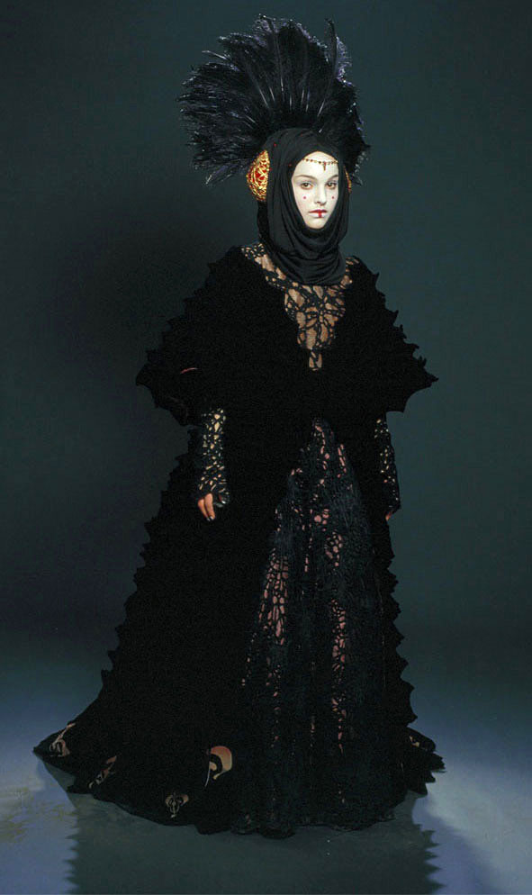
This design, as all of the designs meant for the Queen, is extremely detailed and regal. It's a black spiderweb lace robe with an immense black feather headdress with gemstone crispinettes and a black scarf covering the head and neck.
It's a very somber look, but it fits the situation; her planet has just been occupied. It's also very ceremonial, which fits the rest of Royal outfits. But despite that, it feels a little off, like it quite doesn't fit with the clearly Asiatic designs of the iconic red gowns (read here, and here) in the movie.
Really, the only thing Asiatic about it is the geisha-like makeup (which happens to be the standard of any of her royal looks). The rest of the dress is a combination of 19th-century art-nouveau, modern high couture, medieval hairdressing mixed in with Muslim headwear, and a peacock added in for dramatics.

Sure, the whole of the look creates a rather striking presence, but it always seemed to me that this was far too ornate to be a "mourning dress". Just by making a dress black, you're not making it "sad". It's sort of a rule of thumb.
The basic reason why I did not cover it might have been that Sabe, and not Padme, wore it. But I also considered that there was not much to say about it: it's weird and big, and that's about it. And it doesn't quite help the narrative either, because it doesn't make her seem particularly grieve stricken if she still had the time to assemble such an outfit on her, which is, perhaps the biggest crime of the design.
A2. The Handmaiden Gown
According to the Prequels, when brave and passionate Queen Padme is threatened, she disguises herself as a handmaiden and puts one of her handmaidens as a decoy. I'm going to refrain from commenting on the contradiction and instead focus on the costume.

On those mentioned occasions, Padme takes the role of an aide to the "Queen", whose uniform seems to be fire inspired for some reason. It consists of "simple" velvet, hooded robes that are dyed to create a spectrum of color ranging from orange (at the hood) to yellow (at the lower hem). The robes sport full, slit sleeves, through which we can see the bright red underdress. The whole look is capped off with a red sash.
It's a very monk-like look, and it reminds me of the Shaolin monks' tunics, as well as the Tibetan monks' tunics, which is sort of logical considering the heavy Asiatic influences that the designs for her character have in The Phantom Menace.
And yet, the whole hood and how it frames the face is much more reminiscent of the dressings of a Franciscan monk, which makes for a strange mix.

Also, where does this whole flame thing come from? At no point in the story is even hinted that the Naboo culture has any tradition fire-related. It's actually a watery planet, filled with lakes and even cavernous deep oceans. This flame design is much more befitting of a planet such as Tatooine. Lucas' logic, don't try to figure it out...
But, in the end, the main reason why I discarded to do an article on this design was that it was too simple, and there's really little to say about it. True, it's pretty, but you can hardly write two lines on that.
A3. The Tatooine Disguise
For some very strange reason, whilst on the desert planet of Tatooine, they decided to dress Padme in an outfit made, almost entirely, of wool. Again, Lucas' logic at it's best. Do with it what you will.

Her disguise consists of a rough, blue blouse with full sleeves,gray, rough-spun wrist bindings ("to keep out sand" according the official guide) and a smaller woolen over-shirt which reaches below her waist that is tied with a blue belt inset by a red glass jewel. She also wears black billowy pants and plain boots.
As always in these movies, it's actually a very nice design. But it truly makes zero sense. This, under the circumstances of the characters, should be an improvised costume. Something scraped from the clothes Obi-wan and his master may have lying around their ship. Not something this perfect. And the same goes for the hair.
She wears her hair heavily braided in a half-crown plus a braided bun and the rest of the braids running down her back to her waist, which supposedly "helped her blend in". But remember that, at this point, the Jedi still think that she is one of the Queen's handmaidens. And talking from experience, this hairstyle takes either time (if you're doing it yourself) or having someone else do it (and it still will take time), so why not style her hair in a simpler style? Something like Rey's in episode VII? It just doesn't make sense.
Influence-wise, there is little to comment on the outfit. The color is clearly taken from the Tuareg and other desert cultures of the Sahara, and the over shirt has very clear medieval influences (it's very similar to the overdresses worn by men of low class during the 12th and 13th century), but aside from that, I haven't been able to locate any other reference. Which means that it would make for a very poor article, which was the main reasons why it was discarded for the main series pretty early on.
And also, because it so nonsensical within the context it's supposed to be worn, and it shows just how little though was put into this character. I mean, wool for a desert planet??? really??? She was exclusively designed to look pretty all the time, and it's really annoying at this point.
A4. The Black Coruscant Gown
This somber design is worn by Padme during her stay in Senator's Palpatine's quarters on Coruscant after the Invasion of her home planet. It's a very regal gown that helps solidify the paraphernalia that surrounds the figure of the queen in the prequels. Unfortunately, not many remember this look, because it's barely seen on screen, for the scene in which she wears it, is a very short one. But that is a very common thing in the prequels as well. She has so many outfits that there are a lot which you can't even appreciate.

The design consists of a fluffy, black silk dress accented with beaded emblems on her sleeves, which are triangular in shape. Under this she wears a black underdress that is hardly noticeable. The large sleeves of the overdress are lined with a dark and lustrous Prussian blue silk. All in all, a very simple design.
Her hair, on the other hand, is not so simple. She has it arranged in a fan shape style with a prominent foreknot and small suspensas. The foreknot is done in a very intricate fashion and capped with a golden hair tip ornament, with a single, disc-shaped bead dangling from it that rests against her forehead.
This design is very reminiscent of her red senate gown (see here), only simpler and more somber. Which is good, means that there actually is some sort of consistency within the designs for this movie. And which means that the majority of its influences are, once again, mainly Asian: mostly Japanese, Chinese and Mongolian.
Despite my love for this design, it was finally discarded for the main series because it was, influence wise, way too similar to the other dresses I had already reviewed, which meant I had really little new to add. And would have made for a rather dull and uninteresting article.
A5. Sabe's Battle Gown
This is another dress that is not exactly Padme's. This is the gown that Sabe wears during the final battle while posing as a decoy for the Queen.

The outfit basically consists of a long black, velvet surcoat over a red, velvet overdress cinched with a broad black leather waistband. Plus black leather boots and a fan-shaped hairstyle over a golden cap. The irony of it all is that this was, supposedly, designed "for maximum freedom of movement". Does that hairstyle look like you can run around in it? Or even do any sudden head movement? And does that gown look truly comfortable? And velvet for a battle gown?
Sure, it looks comfortable when put next to her other queenly gowns, but still, calling this "comfortable" is quite a stretch of logic. Let's get over the list: the headdress? I can assure, by experience, that any hairstyle with rolls and other protruding elements will come apart at the seams with any sudden movement. It doesn't matter how well done it is. It's still unsafe for running. And even if it's wide, the fact that the overdress reaches mid-calf means that running won't be very comfortable or agile. And velvet? Velvet is a ridiculously thick and heavy material, would you really want the added weight in a dangerous situation? Plus, it doesn't perspire very well, which means that after five minutes running, poor Sabe would be sweating to death.
Influence wise, the design is very consistent with the other "royal regalia costumes", especially, the red senate gown (see here). Because of this, the headdress is almost directly taken from Mongolian culture and it's heavily reminiscent of the iconic headdress of the aforementioned red senate gown. As for the dress, it takes a lot from several Asian cultures. The deep red is directly taken from Chinese royal fashion, but the structure of the dress itself is much more reminiscent of the Samurais traditional day to day wear.

So, whilst the design may not win any points for comfort, it at least seems visually consistent with the rest of the movie. And, despite the obvious logic failures of the design (this is not a battle outfit no matter what the movie tries to convince us of), I still think it's one of the most gorgeous designs in the movie. Unfortunately, this is not truly a Padme design; it's Sabe's. And that's the real reason why it was discarded for the series pretty early on.
A6. Padme's Battle Gown
If I'm 100% honest, I prefer Sabe's Battledress design to Padme's. Leaving the headdress aside, the costume itself, ironically enough, looks even heavier and more uncomfortable than Sabe's, which, again, doesn't make much sense in the narrative sense.

Padme's design consists of a dark magenta colored battle velvet dress with a high collar worn with a same color velvet cloak that clasps in the front down to her waist. The full sleeves are lined with a light fuchsia fabric and the shoulder seams are lined with golden velvet. A calf-length coat skirt protects her legs. Underneath this, she wears black pants and high boots that go from dark purple to yellow as it approaches her toes. All this is topped off by a black leather belt with the emblem of Naboo.
For this look, she wore her hair pulled back into two half crescent buns stacked one on top of each other, which, at least, keeps her hair out of her way. So, at least, that's utilitarian.
But, let's go back to my initial assessment of the costume. This design has way many more layers to it than Sabe's costume and all of them are velvet. This means that the costume is heavier, which, again, doesn't make sense because it's meant to be a battle costume. But that's not the only thing that doesn't add up. She is, supposedly, dressed as a handmaiden. So, whilst I could give a pass to Sabe being dressed in velvet even though she was dressing for battle (she is supposed to be dressed as the Queen... so it could be justified that unnecessary luxury), why on earth would a handmaiden be dressed in richly colored velvet when engaging in battle? It seems like a huge expenditure for a planet currently engaged in a devastating invasion and subsequent war. But maybe that's just me.
The design doesn't seem to take main influence from sci-fi fashion itself, which is a weird choice for this character, but this is, after all, meant for her handmaidens, not her. But still, the only historical influence that I could seem to find was certainly an odd choice: the cloaked uniforms of the American Civil War.

In the end, despite the many narrative elements that work against it (and that bother me to no end), this design was discarded for the series for the simple fact that it was not very interesting to talk about. After all, I did just describe all its influence in little more than three lines. It would not have made for a very interesting article.
A7. The Purple Return Gown
This is the gown that she wears for her return trip to Naboo after her Senate intervention, and it's a design that, despite its extreme choices, it's hardly remembered by anyone. Although that may also be because this comes after what is, by far, the most boring part of the movie, and so, most people are snoozing by then.

The design consists of a glossy purple gown under a dark mauve overcoat. The skirt is full and ruffled and the sleeves are lustrous and very voluminous and billowy, almost completely hiding her arms. But the true extravaganza comes with the headdress; she wears part of her hair in two full buns at the top of her head, while the rest hangs down into her headpiece. This consists of a diadem made of gold that sits on her forehead with a purple, semi-opaque silk veil that covers her hair. The frontal part of the veil is made in such a way so that it creates a sack-like extension that is made to contain the rest of her hair. These pouches are decorated with crisscrossed ribbons.
This is, in my opinion, the most extravagant costume designed for this character in this movie and I don't think it works to the advantage of the story. By this point, she is returning to her home planet after having to almost beg for the Senate's help, and the chances of succeeding in breaking the blockade seem very poor. Because of this, having her wear one of her most regal and ceremonial dresses in such a circumstance, particularly because in this scene she is alone in her ship with the Jedi, doesn't particularly help the character. It makes her seem more concerned with looking regal than with the situation at hand. I would definitely have gone for a more modest outfit... but we know how these movies go.
The design mixes up a wide array of influences: from Japan to 16th-century East-Europe to Ancient Egypt. The makeup is clearly Japanese, whilst the headpiece is highly reminiscent of a pharaohs' crown, and the dress looks Eastern Renaissance in its luxury and volume. This mix of such diverse sources creates a particularly weird and "wacky" result. And, what's worse, this result doesn't feel like it belongs in the same culture as her more iconic queenly looks.

Which is, in the end, why it was cast aside in the series. Whilst it has plenty of influences to talk about, its over-extravagance and inconsistencies with the Naboo look (as created through the previous designs) made me not really fond of the design.
A8. The Final Parade Gown
The last of these discarded designs for The Phantom Menace is actually the most iconic of the gowns that I've talked about here, in this Annex. This is, of course, the Parade Gown that she wears in the Final Scene of the Film. And just as that scene tries to be heavily reminiscent of the final scene of A New Hope, so is this dress of the gown worn by Leia in said scene.

Padme's design consists of a luminous white/pale pink ceremonial dress. This silky gown is decorated with a banner with the Naboo emblem that hangs from her neckline. Over this gown, she wears a long cape of pink silken petals. To top it all, she also wears an aureate fan capped with jeweled beads. As a headdress, she only wears a delicate royal diadem and styles her hair into a bun with five crescent partings along the back of her head.
The main influences, as mentioned, is the white dress worn by her daughter, Princess Leia during the celebrations after the battle at Yavin IV. But it's also mixed with some historical influences. The most notable is the extremely large fanned decoration, which is literally taken from late-Elizabethan fashion. Although it's also reminiscent of the traditional Geisha parasol. Last but not least, the cape, both in texture and color, is very much reminiscent of the traditional Japanese pink flowers.

This is, without a doubt, a very striking design and, in any other context would be a favorite of mine. But I can't help but feel that it does not match the look set for this character and this culture through the length of the movie.
But, despite this, the real reason why it was not selected was that, in the end, there weren't many influences to talk about at length. A true shame, for it's a striking design.
CONCLUSION
In the end, all of these designs were cast out for either being repetitive or uninteresting or simple too nonsensical and bonkers. That's what happens when you have so many designs only for the sake of eye candy. This character didn't need a hundred costume changes. And it shows. Many of these are not created with a particular scene in mind, which, when put into the movie, they just don't make any sense. And it's a shame, because the designer, Trisha Biggar, is certainly talented in finding new visual ideas and costumes. But the bad direction taken by the filmmaker renders that talent practically useless.
I'll see you next time with Annex B (here) when I will be focussing on the discarded designs for Episode II.
---------------------------------------------------------------------------------------------------------------
If you enjoyed this article and would like to support the blog,
consider buying me a Coffee? 💛💛
If you want more content like this, subscribe! Or come say hi on Facebook, Tumblr, Twitter, Instagram and help us grow!
DISCLAIMER: I claim no credit for images featured on this site unless noted. Visual content is copyrighted to its respective owners, and inclusion here is under fair use for criticism, comment, and news reporting purposes. If you own the rights to content here and wish it removed, please contact me.
You know the prequels weren't that bad.
ReplyDeleteWell they weren't that good either, at least in our opinions. But I know that a lot of people enjoy them, and I personally wish I could. It took me forever to watch them because of the critical backlash and the fact that I really wanted to like them (I grew up on Star Wars and I really really wanted the sequels to be good). But for me they were really disappointing.
DeleteBut, like them, don't like them, it's all ok. That's what makes talking about movies so fun!
That's ok, I respect your opinion. In my opinion, I think the story was atleast good and original. I didn't like the new sequel, TFA though. It was drawn out and felt like A New Hope. I don't think critical backlash should not determine whether a movie is good or not too IMO, it only depends whether that one person likes it or not.
DeleteAnd what is Lucas logic? The flame gown is called that because it looks like a flame lol. They never call it that in the film.
ReplyDeleteIt's not that what we meant. We bash Lucas' logic because his use of costume design failed to be thematically consisten in practically any way. Do you think of a color or shape or anything specific when you think of Naboo? No, in the best of cases, you think of the Queen's Makeup, but that's not representative of the culture as is only used on the Queen. Now look back on the originals and thinks of Tatooine: reds and browns and earthly textures.
DeleteAny fantasy or science fiction movie needs to build a recognizable world and costume design plays a big part. But to do that, it needs consistency. Game of Thrones is one of the most successful, and note that it's incredibly consistent in it's depiction of each culture, creating thus an association between color, style and each region. You can tell a character is northern or southron just by looking at them; blues and browns and blacks for the North and reds for the West and the Capital and deep, vibrant blues and greens and yellows for the South.
That doesn't happen with Lucas' prequels. The only distinguashable characters by look are the ones from Tatooine, and because they were stablished in a new hope. But certainly not Naboo.
Of course we now they didn't call it the flame gown, but we critizice it because it's one of the clearest examples that Naboo seems to have no visual identity of it's own.
Sorry for the long answer! This clarification was originally in the article, but in the end it dragged the overall piece and was cut. Guess we should have kept it.
Thanks for the input!
Yes but Star Wars is different from Game of Thrones, especially with costumes. Why does color always have to go with the setting? It doesn't always do that. Also, I know this is out of topic, but in term of the appearance, the costumes in SW look better than GOT, even if they may seem heavy at times and Naboo does have an identity of being a flowery, beautiful planet. This was shown through Padmes parade gown. Anyways, I'm ok with the long answer and understand where you coming from. Thanks.
ReplyDeleteIf I'm a 100% percent honest, Game of Thrones costuming is not my favourite either, but as we're working on a series right now, it was the first example that popped up.
DeleteAnd of course that color is not the only tool, but it is the most obvious for me. So it was the easiest example to avoid the comment being unending xd.
Also, honestly, I also love Padme's dresses. I always wanted to dress as her for Halloween... (silly me). I feel I needed to clarify, because we are always bashing them.. it's the consistency that we bash, not the indepent costumes (except the purple return gown... I do hate that one).
In the end is a matter of opinion so there is no right answer.
Cheers!
I love her dresses too, they're so pretty and majestical. I'm sorry if I seemed rude or offensive, but I think sometimes my opinions get in the way with my attitude. I don't know, but I respect your opinions nonetheless. You should do more costume analysts with Padme though :)
DeleteDon't worry, it wasn't offensive in any way. I can get pretty passionate myself with my opinions. And sure, there's much more Padme analysis to come!!
DeleteThat's great! Thanks. I also like your other costume analysis too. Keep up the great work.
Deletei think what happened with these gowns feeling so disjointed is that the concepts all came from the concept art team, not the costume team, so the costume people were stuck with all these different designs and had to make the best of it. considering how good they look separate from eachother i reckon they did their job as good as they were able to, but it certainly is a bit janky in how they go into the movie. personally i reckon the prequels are good conceptually but fail on almost every level of the execution so at least the costumes look good, even if they don't make much sense taken together.
ReplyDeleteAbsolutely. It feels like the design team brought forward a lot of different options so that the director would choose which way to go, but instead, Lucas had a good long look at them and said: "I want all of them!" instead of choosing an option and following that direction for the rest of the costumes.
DeleteBut yes, individually, as pieces of clothing, are gorgeous.
I think perhaps one of the most jarring elements you'll see in Amidala's costumes is the repetition of the fleur-de-lis (devil's flower). You can see a stylized version of it clearly on the lower back and lower front edges of the black invasion costume and on the front panel of her parade gown. Now, why would the devil's flower, which is associated with French aristocracy, be featured on the robes of an aristocrat in "a galaxy far, far away?" That is the question.
ReplyDeleteCan you do a part 3?
ReplyDeleteHello! Yes! We have on our to-do list the Annex C for the costumes of Revenge of the Sith. We'll try to get to that as soon as possible.
DeleteThanks for reading and commenting!