Fairy tales are a complicated and delicate issue to tackle in this new bright century that we find ourselves in. How to break through the age-old stereotypes that pretty much define the genre and still retain the magic, charm and simplicity that are so often associated with this form of storytelling?
If you are looking for an answer, you won't find it in this new take on the Cinderella story. 2015's Cinderella is a rather unimaginative, retrograde and conservative adaptation of the age-old classic children's story.
What you will find, is a gorgeous and detailed visual interpretation of the fairy tale format. It's in this aspect, that the movie truly shines.
From the detailed sets to the precious cinematography and the amazing costumes; this movie is the definition of visual candy. It looks amazing, even though it will probably give you cavities.
THE MAGIC OF COSTUMES
The costume design for this movie was created by Sandy Powell, a heavy-weight of the industry in her own right (check the retrospective I dedicated to her on our Tumblr account). She's been nominated twelve times at the Academy Awards and has won three of those (1998's Shakespeare in Love, 2004's The Aviator and 2009's The Young Victoria). She is also the mind behind the designs for Orlando (1992), The Interview with the Vampire (1994), Rob Roy (1995), Velvet Goldmine (1998), Far from heaven (2002), Gangs of New York (2002), The Other Boleyn Girl (2008) and Carol (2015).
Her background in designing historical movies certainly comes in handy for this project, because, even though the movie doesn't really take place in any specific historical period, she did take a lot from history in order to create a relatable world for the audience.
To create this "once upon time period" (as she calls it) she took the 19th century as the main reference because, to modern audiences, "it's the one that feels most like a fairy tale" (also a direct quote). But, as it's not a period piece, she mixes those 19th-century general shapes with modern elements.
On top of that, the basic idea of the designs is very simple; very straightforward. It's using well-known color associations and using very cartoony codes. But, after all, this is supposed to be a fairy tale.
You have to remember that it has to appeal to very young people as well as adults, so for kids it’s just easier --- Sandy Powell, costume designer ---
CINDERELLA
Cinderella is quite the opposite chase from The Revenant when it comes to the ratio of costume changes per character. Here, every single character gets a ton of costumes. And our main character: Ella, is no exception.
We first meet her as a child, wearing breezy, light white dresses with floral patterns that are meant to highlight her innocence and her connexion to nature as well as a connexion to her mother (who is also dressed in very similar dresses and patterns).

Cinderella's childhood dress is vaguely inspired in the Regency fashion (1811-1820) and its silhouette, which, again, helps underline the purity and simplicity of the character (for Regency fashion is probably the least artificial one during the span of the 19th century).
All of these serve to pose a motif about her and her family: this is a family basking in love and sunlight. Perhaps because of this, Ella will maintain a rather naturalistic color scheme throughout the whole of the movie. All this, throughout the movie, will be closely related to the use of the color blue (which only Ella, her mother, and the prince get to wear).
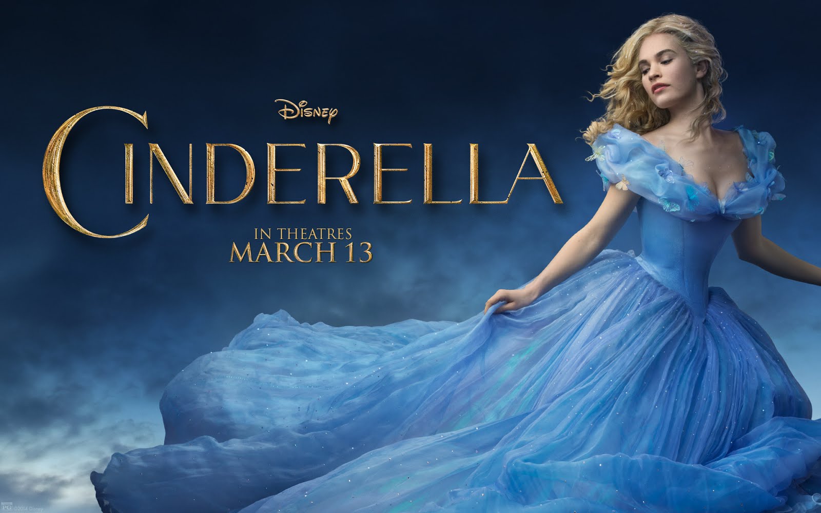
When meeting her again, once she's all grown up, she's wearing the simple blue dress that she'll end up wearing for most of the movie.

The dress, silhouette-wise, is very similar to the type we've seen her mother wearing, and so, in a way, her mother lives on through her dress. There are a lot of shared elements in it: the scoop neckline, the slight ruffles and the shirring on the bodice.


The same way that the design helps us connect her to her dead mother, it also helps us separate her from her new stepmother and stepsisters. The pale, naturalistic blue of her dress is made to sharply contrast the bright, artificial and borderline tacky colors of the stepmother and stepsisters.

But we'll talk about them, later. Let's focus back on our innocent Cinderella. One of the main ideas for the movie was that they did not want to have Cinderella in rags (as she's so often depicted). Because of this, Powell decided to use this blue dress throughout the movie and show the character's descent into serfdom through the decay of the dress (instead of just showing her in rags).

So first, they add the apron, then the handkerchief in her hair. And progressively deteriorate the fabric of the dress itself.

One very apt criticism would be that it never decays quite enough for the story that you are telling. In my opinion, the blue is always too bright and the dress too well kept to really convey her suffering. But maybe that's just me and my own twisted sense of cruelty.
Even though Powell didn't directly use the animated version as a reference, the movie strikes a lot of similar notes, including the pink dress that Ella sows for the ball.

This dress is clearly based on the 1840's fashion (and it's probably one of the few that is so crystal clear about the historical setting).
 |
| 1840's evening dress |
This is done in order to highlight the humbleness of Cinderella against the clearly modern dresses of the sisters. Though it's also definitely pandering to the animated classic (it's the only dress that breaks away from the color scheme set for her character).
Of course, this dress is not even half as relevant as the one that follows: the iconic ball gown. Having to reimagine something as iconic as this, and still make it feel both new and familiar, is probably the hardest task for a costume designer, and probably the main reason why this movie was nominated for Best Costume Design in the first place.
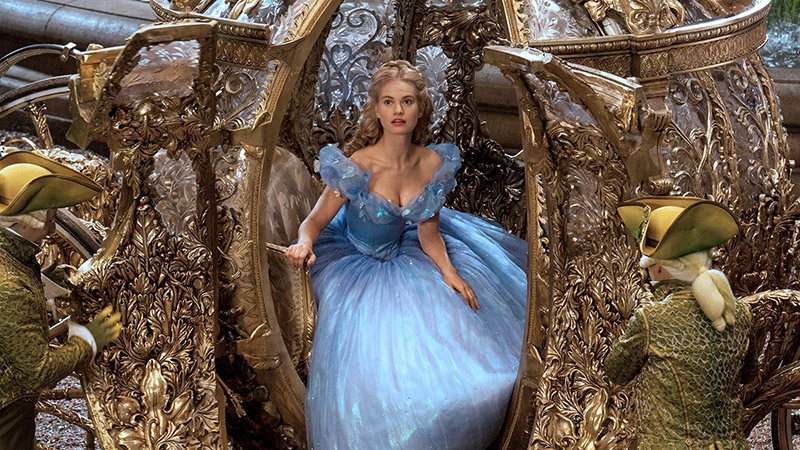
The color choice for the dress is perfect; not only it reminds us of the connection between Ella and her mother, not only gives her an almost ethereal aura but also manages to make her unique in a room full of people. If you take a closer look, you'll notice she is the only one dressed in blue (or any similar color), so she really stands out.

It’s a cerulean gown with a voluminous skirt composed of more than a dozen layers of gossamer-fine silk in different shades of pale blue, turquoise, and lavender. Obviously, we knew that it had to be big, because it’s a ball gown. I did not want it to look like a big heavy old period costume; I wanted it to look as light as air—really light. I especially thought about what it would look like when she was running away. --- Sandy Powell, costume designer ---

To achieve the desired skirt size and mobility (which don't always walk hand in hand), the construction of the dress became a feat of structural engineering.
First of all, there’s a crinoline over a wire cage. Then there are petticoats with hundreds and hundreds of miles of frills to give it the volume and the lightness. On top of that are the really fine layers of fabric. Of course, she’s wearing the corset as well to give her that fantastic shape. --- Sandy Powell, costume designer ---
The best element of the design is the watercolor effect the skirt has when it moves. This is because the skirt is not actually blue. Instead, it consists of layer upon layer of the finest silks, and each layer has a different color (lavenders, lilacs, greens...). But together, they produce the final blue that you see.
This makes the dress look even better when it moves.

And to top it all, the top layer is a silk crepe in cornflower blue covered in about 10,000 tiny Swarovski crystals so that it would have a certain iridescence (a phenomenon that causes certain surfaces to appear to change color as the angle of view or illumination changes).
All in all, this is the dress that makes the movie, and there's only one element that upstages it: the crystal slipper.

These were created by Swarovski from the sketches and references Powell had.
I don’t really want to do something that looks completely contemporary, but I want it to be elegant. And so I actually went to the Northampton Museum and Art Gallery in England where they have many old shoes on display. That was the part of England that used to make shoes for years and years. They allowed me to look in the archives of the museum and I found a beautiful pair of shoes from the 1890s that were incredibly elegant and had a ridiculously high five-inch heel. I knew I wanted to use that shape—just in glass. They lent me the shoe. I made a 3D copy of it and worked with Swarovski to really get that shape and turn it into a faceted crystal shoe. --- Sandy Powell, costume designer ---
The only problem was that the resulting crystal shoe could not be worn at all. Because of this, the shoes were digitally composited on top of her through VFX.
To wrap up the tale, we have the inevitable wedding dress.

This is a drop-dead gorgeous white dress with floral motives, and it's one of the few dresses that is 100% modern (meaning it does not pull references from anything prior to the 1950s). This dress is completely 2015's. You could wear it at any wedding and nobody would bat an eye.
My guess is that they wanted to highlight that the "happily ever after" ending does not belong solely to fairy tales, but is a very present thing even to this day.

THE STEPMOTHER
The look of Cate Blanchett's Stepmother is, probably, the best and most fun to look at. Her look was based on the likes of Marlene Dietrich and Joan Crawford. She's a very sophisticated woman, very elegant; almost as if she were a walking fashion plate.
And the most fun element of it all is that they are doing 19th-century silhouettes and fashion as if it were a 1940's Hollywood melodrama, and getting everything just a little bit wrong (purposefully, of course).

The first time we meet her, she's wearing this almost instantly iconic green gown, and it's the perfect gown with which to introduce her character.
The grandiose and over-dramatic silhouette (with the big padded shoulders, the bustle and the enormous hat) already marks the essential difference between her and Ella's mother. This is the exact opposite. Not only in the silhouette but also on the fabrics: here, instead of natural floral motifs we find highly stylized floral motifs, rendered in black and an acid-green. These patterns are as far from naturalistic as possible. Also, the velvet, silk and sequins of the dress pose a very stark contrast with the cotton dresses of Ella and her mother.
And so, with just one glance, we know that this woman will never be a mother to Ella. She's elegant (opposing her mother's homeyness) and she's stern and severe (opposing the sweetness and approachability of Ella's mother). She's envy-green instead of loving-blue.
This is the guidebook that all of the stepmother's designs follow: artificiality, high-level fabrics, sophisticated looks... In terms of silhouette, this translates to bustles, high collars, very tight bodices, and padded shoulders. This is clearly reminiscent of the great Hollywood Divas: strong, bold and edgy.
I particularly enjoy the "false" bustle, as I call it (seen in the picture below); which is the 40's interpretation of a bustle. This means that, instead of the skirt being a whole, here you have a tubular skirt and the bustle is added later, almost as a tail.

As for the colors; she's always dressed with strong colors, mainly greens, though there are also yellows and some occasional dark blues. But within her designs, there's always an element of black, highlighting her inner darkness as a person.

Her designs are consistent in terms of color palette and silhouette and help create an air of intimidation around her character.
Now let's focus on her ball gown: an extraordinary acid-green taffeta extravaganza.

This design is the radical opposite of Cinderella's ball gown: it's loud, artificial (silhouette-wise) and stiff. And it sticks out in the crowd also (which helps the narrative because we can easily identify the main players amongst the throngs of extras). This is mainly because it feels very much anachronistic. Everyone else in the room is wearing vaguely inspired 1850's-1860's gowns, and she, instead, is wearing a 1940's gown.
To wrap her fabulous designs, let's have a look at her last design, which she wears during the shoe fitting.

This dress summarizes perfectly the spirit of the character: false and artificial, envious, opulent (notice the solid gold necklace) and, surprisingly, it's my favorite design for her character.
THE STEPSISTERS
Ella's stepsisters are dressed, clearly, to be the comic relief of the movie. The main idea for the designs is to make them look totally ridiculous to match their personalities. To do this, their designs were made so that they would always look a tad overdone, always a tad vulgar. They are a pair of very silly girls, and they are dressed as such.

The bright, over-saturated color, the cheap fabrics and the tacky prints help to visualize the ridiculousness and vulgarity of these characters. They're vain and want to be fashionable at all costs even if they don't have neither the money nor the taste.

On top of all that, there's the fact that they always wear identical clothes, but in different colors (which was directly taken from the animated version). Drizella always wears the outfit in yellow and Anastasia always wears it in pink. It's like they are a combo, a double act of some sort. Not only is it ridiculous, but it also helps transmit the idea that they are spoiled little children.
All of this is maintained for their ball gowns: they are loud, big, cheap and ridiculously bright. As well as ridiculously tacky.

As I was doing their ball gowns I was thinking, 'Oh my God, these are awful.' It's the worst taste I've ever done. I think they're actually the 1980s version of the 19th century. --- Sandy Powell, costume designer ---
THE PRINCE
The look for the prince is fairly standard, basically sticking to the preconceived ideas most of us have about how Prince Charming should look. Because of this, the designs stick pretty closely to mashing up various men's wear from the 19th century.

All of his outfits previous to the ball are mainly white, green and gold, as to point to his wealth and prosperity. But during the ball, he is dressed, instead, in a white outfit with a blue-collar and blue cuffs.

It's hardly a coincidence that the blue on his collar is the exact same tonality that the blue of her dress. This is meant to highlight the fact that they belong together.

And for the expected wedding, they swap colors; he appears in her blue and she appears in his white. And once again we are made to visually see how well they complement each other.
THE FAIRY GODMOTHER
Last but not least, let's not forget that there is no Cinderella without her fairy godmother. So, how do you design her look to make her look recognizable (she has very little screen time) and yet, have her be something new?
That was another difficult one because there’s a lot of high expectations surrounding a fairy godmother, isn’t there? She had to go from the beggar woman, which was all those browns and greys and pewter colors, to a complete contrasting bright white. And I wanted it to light up. We made it happen! We had little LED lights all over it, which twinkled. You see it, but it’s not distracting. Rather, I wanted it to look like she was glowing. --- Sandy Powell, costume designer ---

And glow indeed she does! Despite the technical feat that that means, this is definitely my least favorite design of the whole movie. It's also the one that feels most out of place. The design is referencing Elizabethan Fashion and Georgian Fashion all in one when the movie has basically stuck to 19th and early 20th century references so far. It's actually a bit jarring to look at.
Also, is it me or the material looks too synthetic, as if it were plastic?
CONCLUSION
Cinderella is a kid's movie (unabashedly so) that fails to bring anything new to the table (or entertaining to most adults) which results in being a really sad waste of talent: of a perfectly good director, of a more than adequately good casting and of a wonderful visual team (cinematography, set design and costume design).
Funny enough, the movie manages to capture the feel and style of the fairy tale format (which is what I always complain about in movies such as Maleficent or Oz), but it's still missing something that I cannot quite pinpoint (beyond an actual interesting story).
So, unless you're 5, or you just want to browse through some drop-dead gorgeous dresses, I'd recommend you to skip this one and go find a better movie to waste your time on.
All in all, yes, it deserved the Best Costume Design nomination, but no, I don't regret it did not win.
---------------------------------------------------------------------------------------------------------------
If you enjoyed this article and would like to support the blog,
consider buying me a Coffee? 💛💛
If you want more content like this, subscribe! Or come say hi on Facebook, Tumblr, Twitter, Instagram and help us grow!
DISCLAIMER: I claim no credit for images featured on this site unless noted. Visual content is copyrighted to its respective owners, and inclusion here is under fair use for criticism, comment, and news reporting purposes. If you own the rights to content here and wish it removed, please contact me.
Comments
Post a Comment